
Recommended
More Related Content
What's hot
What's hot (18)
Viewers also liked
Viewers also liked (17)
Similar to Contents evaluation
Similar to Contents evaluation (20)
More from rhiannc
Recently uploaded
Recently uploaded (20)
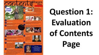
Contents evaluation
- 2. I followed the code most magazines have of having the “contents” title in the top left hand corner. I also showed synergy by using my masthead again and placing it in the top right corner, and using the same font for both texts. I followed the house style by using the same colour font and contrast of orange and black. I also showed the issue of February 2016 and placed this in a box-out of red which makes it more noticeable and adds to what is expected of my genre of being colourful and vibrant. Another code which I followed was not having the word “page” next to the number, as on my posts of drafts on my blog you will be able to see I originally did, however I quickly corrected that. I used the colour of the banner on my front cover as the colourful shape in which I put the page number in, as this created synergy. I either put the number next to the article name or placed it on top of an image which was showing the article. I also placed all the numbers in order. I also followed the code of changing the layout and the font when promoting the cover story on the contents page. As I ensured the cover photo image was the largest one and I chose this image as I found it showed the setting in which the shot was taken very beautiful and helps create the idea that this star is very natural and pure. The image also shows her outfit more. I chose to emphasise that this was the cover story by using a different shaping and colour stating “Cover Story”. I also over layered the image with text which I didn’t do on any of the other images on my contents and used a transparent box to write a summary of the article in.
- 3. Most magazines have a subscription section on their contents page, so therefore I used a vibrant colour and inserted an image of my completed front cover on to the contents page. I also used the slogan in which I used on the banner on my front cover again to help create synergy and emphasise the idea of this magazine being to a very high standard and very well liked. The deal and money saving option is clearly stated and the page in which you will find further information is stated. This part of the contents also makes it clear that this magazine is seasonal. At the bottom of my contents I provided usernames and links to social media that the magazine has, such as Facebook, Twitter, Instagram and their official website. During my target audience research I found that my target audience of 16-21 year olds all wanted to be able to engage with the latest trends and offers that Bhangra Beats has to offer through social media. Another convention I followed was the page number located in the bottom right corner. These two conventions are present in almost all music magazines. I followed the code of advertising a competition on my contents , I used a black extravagant new shape to promote a competition with contrasting colours to help advertise it. My target audience research informed me they wanted to be able to have the chance to win something if they were to purchase a magazine. I overlapped this shape over an image. The use of my bright colours have been consistent throughout as because my genre is very niche there was very few, if any, Bhangra conventions I could follow other than bright vibrant contrasting colours.
- 4. I followed the code which all magazines have despite the genre, and had a range of images on my contents. The images varied in shot type, model and scene. I broke conventions by having images of images and not places, that do not have people in on my contents page, such as the Gurdwara, the gifts and the close up shot of the candles. I felt this was necessary as it would help engage the cultural beauty that would be involved throughout the magazine and how they link to Music. Richard Dyers theory is proven here as each star is simply a fake image, as the models in the images are pretending to have musical careers and be as dressed up as they are and they would normally not be dressed as culturally and traditionally as they are shown to be. I wanted to balance out the genders on my contents page, as although the magazine is very pretty and colours and can be seen as very feminine, I wanted to ensure that the magazine was attractive to males as well and I did this by balancing out the number of images I had of males and females. I used lines to give structure to the page as a convention that many music magazines have is having structures columns so I wanted my magazine to be sophisticated and organised. Contents pages also have very little clear space on their contents page, so I wanted to follow that convention and I did this by having 15 stories on the contents page. I wanted to ensure there was a clear house style from the cover to the contents, and I made this synergy by using the logo and the same colours and the same bold orange background.