The double page magazine spread uses bold, colorful images and urban font styles to represent the rap artist Dizzee Rascal and his background. Large pictures of Rascal spraying graffiti and stereos filling the page connect his past "tags" to his current "riches" through his music career. While the layout with full page images is unusual, it draws attention through its streetwise aesthetic reflecting Rascal's upbringing.
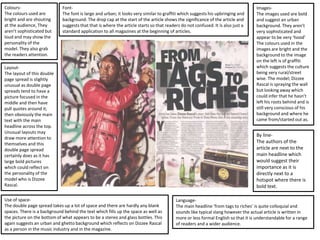
1. Layout-
The layout of this double
page spread is slightly
unusual as double page
spreads tend to have a
picture focused in the
middle and then have
pull quotes around it;
then obviously the main
text with the main
headline across the top.
Unusual layouts may
draw more attention to
themselves and this
double page spread
certainly does as it has
large bold pictures
which could reflect on
the personality of the
model who is Dizzee
Rascal.
Font-
The font is large and urban; it looks very similar to graffiti which suggests his upbringing and
background. The drop cap at the start of the article shows the significance of the article and
suggests that that is where the article starts so that readers do not confused. It is also just a
standard application to all magazines at the beginning of articles.
Images-
The images used are bold
and suggest an urban
background. They aren’t
very sophisticated and
appear to be very ‘hood’
The colours used in the
images are bright and the
background to the image
on the left is of graffiti
which suggests the culture
being very rural/street
wise. The model; Dizzee
Rascal is spraying the wall
but looking away which
could infer that he hasn’t
left his roots behind and is
still very conscious of his
background and where he
came from/started out as.
Use of space-
The double page spread takes up a lot of space and there are hardly any blank
spaces. There is a background behind the text which fills up the space as well as
the picture on the bottom of what appears to be a stereo and glass bottles. This
again suggests an urban and ghetto background which reflects on Dizzee Rascal
as a person in the music industry and in the magazine.
Colours-
The colours used are
bright and are shouting
at the audience, They
aren’t sophisticated but
loud and may show the
personality of the
model. They also grab
the readers attention.
Language-
The main headline ‘from tags to riches’ is quite colloquial and
sounds like typical slang however the actual article is written in
more or less formal English so that it is understandable for a range
of readers and a wider audience.
By line-
The authors of the
article are next to the
main headline which
would suggest their
importance as it is
directly next to a
hotspot where there is
bold text.
2. Positioning/Rule of Thirds-
There is a clear example of
how the rule of thirds works
here as the hotspots are all
filled up with something to
grab the attention of the
audience. The first hotspot has
the face of the model in it
which shows his significance
on this page. There is part of
the headline in the second
hotspot which is made to draw
the attention of the audience
to what the article is going to
be about. In the third hotspot
there is the body of the model
which leads directly up to his
face and in the fourth hotspot
there is another image of a
stereo which is important as it
reinstates the genre of the
magazine as well as what the
article is going to be about.
The text appears to be the less
important part in the space
which normally tends to be
empty which is because the
hotspots are all filled with
something to draw the
attention of the audience in
and interest them before they
even start reading.
Page numbers-
There is a page number from what we can see on
the bottom left however in the top right hand
corner it says ‘Dizzee’ which could suggest that
each of the pages have a word/name on them
which is significant to the article.
Caption-
From what we can see, there are no captions for the
images; this could be because the producer of this
specific magazine article/magazine did not deem them
as important. Captions tend to be on more
sophisticated magazines which are detailed.
Overall impression-
The overall impression we get from the double page spread is that it
is a music magazine which has featured a hip hop/urban artist in it
who comes from a very poor upbringing and is now successful and
wealthy. We definitely get the impression that the magazine isn’t
intended for adults, but a younger audience as it is less sophisticated
and quite colloquial.
Branding-
There is no sign of branding on this
page which is unusual as magazines
tend to continuously have their logo on
the pages to reiterate the fact that it a
recognised company/institution.
Denotation-
We can clearly see that the magazine is
not sophisticated, there is use of
colloquial language. It is slightly informal
and overall represents Dizzee Rascal in a
stereotypical way as a black male who
raps.
Connotation-
The magazine is quite
stereotypical as the model
is a black male who has
come from ‘tags’ to ‘riches’
suggesting that his career
in rap is the only reason he
is successful as before he
become well known for
music he probably had
nothing. It is typical of
black males to be rappers
and so this reinstates this
stereotype. The graffiti in
the back and the stereo
represents his ghetto
personality.
Quotations/Grab Quotes-
there are no grab quotes
or quotations which is
unusual as there normally
is some on double page
spreads.
3. How images and text are integrated-
The images and text are integrated as they are both street like. The images are of graffiti and suggests an urban
background as well as the stereo which represents music and links to the fact that Dizzee Rascal is now a
successful musician. The font of the writing looks like graffiti which again reinstates the fact that the genre of
the music will obviously be hip/hop or rap which shows his background. The background on the right hand side
is quite messy and appears to be graffiti too.
Mode of Address-
The text is quite informal and
doesn’t really directly
address the audience.