
Recommended
More Related Content
What's hot
What's hot (20)
Viewers also liked
Viewers also liked (12)
Similar to Kerrang! double page spread
Similar to Kerrang! double page spread (20)
Recently uploaded
Recently uploaded (20)
Kerrang! double page spread
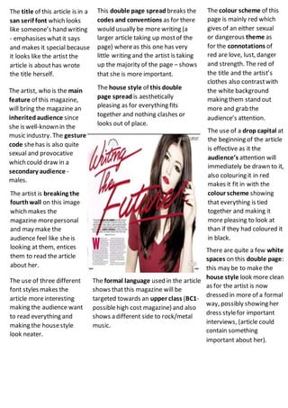
- 1. The title of this article is in a san serif font which looks like someone’s hand writing - emphasises whatit says and makes it special because it looks like the artist the article is abouthas wrote the title herself. This double page spread breaks the codes and conventions as for there would usually be more writing (a larger article taking up mostof the page) whereas this one has very little writing and the artist is taking up the majority of the page – shows that she is more important. The colour scheme of this page is mainly red which gives of an either sexual or dangerous theme as for the connotations of red are love, lust, danger and strength. The red of the title and the artist’s clothes also contrastwith the white background making them stand out more and grab the audience’s attention. The artist, who is the main feature of this magazine, will bring the magazine an inheritedaudience since she is well-known in the music industry. The gesture code shehas is also quite sexual and provocative which could draw in a secondary audience - males. The house style of this double page spread is aesthetically pleasing as for everything fits together and nothing clashes or looks out of place. The use of a drop capital at the beginning of the article is effective as it the audience’s attention will immediately be drawn to it, also colouring it in red makes it fit in with the colour scheme showing that everything is tied together and making it more pleasing to look at than if they had coloured it in black. The artist is breaking the fourthwall on this image which makes the magazine morepersonal and may make the audience feel like sheis looking at them, entices them to read the article about her. There are quite a few white spaces on this double page: this may be to make the house style look more clean as for the artist is now dressed in more of a formal way, possibly showing her dress stylefor important interviews, (article could contain something important about her). The formal language used in the article shows thatthis magazine will be targeted towards an upper class (BC1- possiblehigh cost magazine) and also shows a different side to rock/metal music. The use of three different font styles makes the article moreinteresting making the audience want to read everything and making the housestyle look neater.