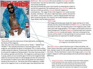
1. Mast head – the mast head is the source written in a large font with
the bold colour red, this has been done to grab the readers attention
more easily, quickly the
text that commands the cover and it stands out allowing the reader to
see the font apparently .The masthead uses a Sans Serif font where the
text has no flick ups and this connotes that the magazine is
contemporary . The usage of red in the magazine cover could connote
brutality and blood – the colour might have been used to connote the
rap culture. It may have also been , used to embody deaths that have
been caused by rap wars. For instance, the conflict between rap stars,
Tupac Shakur and The Notorious B.I.G.
Main Image:
The image used in the cover shows the rapper posing as he looks
directly into the camera the shot is a medium close up. Rick ross has
his hand on his belt. The way they pose in the magazine cover make
them seem like tough gangsters. The image is simple with no fancy or
stylish background. The grey background matches with their costume.
Fur often connotes money and royalty . Rick ross is showing he has
money and has made it in hip hop being rich and successful. He also
wears gold chains to represent his wealth and power.
Cover lines:
There are 8 cover lines that consist of black and white, sticking with
the theme of the magazine.
Also, the cover lines mention artists such as “Drake ”, “ BIGGIE” and
“PUSHA T”. This indicates that there is more than genre to the
magazine, and indicates the genre is rnb,hiphop. This is used to attract
a wider variety of audience. Furthermore, the cover lines are Sans Serif
to connote the magazine of being modern. The cover lines also show
the audience ,gender and ethnicity , the magazine is catering to which
is young adults uni-sex round the age of 18-25 as the magazine looks
explicit as hip hop has loads of rude language and also the artists that
are mentioned is modern music which young adults are interested in
and go to the concerts of . The social class of the magazine is middle
class as the magazine music is not what upper class would listen too.
Barcode- shows the legal codes and convections
of a magazine in the bottom left corner.
The colour scheme used in the front cover is black and white, red.
These colours have been used to give the page a smooth and present
look, making it easier for the reader to focus on the main elements of
the article. The fact that black is used in the image could connote the
rapper’s elegance and the grey background could symbolize edge and
difference.
Selling line/strapline – The line above attracts the reader and gives
a brief summary of the main contents of the issue successful
artists like ‘Drake 'are used as they know they will be the top
sellers , all the names are artists from the same genre of music
which is rap it gives the impression the magazine is music based
2. The image main of Rick Ross may be promote or even challenging the conventions of routine
hip hop photography. Although it is a long shot in which he is covering the entire left hand
page, you would usually expect an artist from this genre to be wearing inconspicuous clothing
such as a hoodie; yet Rick Ross is dressed in a smart black suit which presents him as being
someone of power and class and that his genre of music is classic it contrasts the music he
makes . The way he is relaxed holding a champagne glass and lifting his head high, not looking
towards the camera demonstrates his wealth and masculinity. I think the use of props,
balloons, champagne, sunglasses, expensive suits and jewellery reinforces his influence in the
music industry and definitely connotes the ‘privileged class ’ that famous people occupy.
Mise en scene suggests that Rick Ross wants to be perceived by others as rich , the reader can
connote he wants to be associated with fame also.
Mast head- specifically makes this page stand out, the way it is called ‘Man Made’ tells the audience that he
got to where he is victoriously today out of his own determination and hard work. Also underneath it has
been cleverly reflected as ‘Made man’ making the cover line stick out bold and effectively . This meaning
makes it stand out effectively as well as the way it is bold and black, standing out prominently against the
white background using these colours sticks to the theme of the magazine .
I think the heading on this double page spread is very clever and effective, but looking at other magazines.
Even though it is simple, it emphasises the strength of the artist and shows the reader that the artist doesn’t
need a catchy slogan or title to draw in the reader.
The way a bold drop capital font has been used for the letter ‘T’ is acceptable as
it makes the text look more interesting to look at. The introduction paragraph is
a feature which is also very effective as it gives the reader a basic idea of what
the article is going to be about and introduces them to the artist who it is about.
Also the use of slang ‘Ain’t’ gives the reader an idea of the artist’s personality
and maybe targets younger age groups (16+) the social class of the audience
would be working/middle class as upper class wont be interested in this genre of
music.
The reflection of the header makes
the article seem more interesting , it
is also black and bold and a bigger
font which sticks with the
conventions of a magazine having the
font bigger for the header.
Colour scheme used in the
double page spread
doesn't follow the codes
and conventions of the
cover the font is a are
different colours the outfit
has changed from fur to a
classy suit usually the
outfits are the same style .
This is changeling the
conventions. The colour
scheme also mirrors Rick
ross outfit. It shows
connotations of power and
control which mirrors his
career because his is in
power of his own record
label Maybachmusic.
The article is written in a small basic, black font which shows the
article isn’t significant as his main image which shows his image
is more important than his story.
The lightning used in the page is high-key
meaning that the image is bright and natural and
it does not have dark shadows. The natural light shows the
freshness of the music that Rickross has produced.
The name, website of the magazine and the page number is
written at the bottom of the page aside with the page
number which is sticking with the codes and conventions of a
magazine.
The unique selling point is Rick Ross his a global know artist
when fans or the public see his image they are more likely to
buy the magazine, or people that are interested in this
particular genre are likely to buy it to find out more.
Target Audience:
This double page spread is aimed at youngsters who have interest in the hip hop
and rap culture because Rickross is an artist who has younger fans between 16-
35, I know it isn’t aimed at kids as they would be more colour and the artist
wouldn’t be Rickross as his music has explicit language in it. Also the social class
its aimed at is the middle class as the magazine is $4.99 it’s quite expensive for
working class to afford as they don’t have as much disposable income