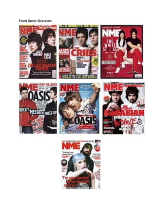
2. All the front covers shown are from NME. Therefore it is evident that they have been
specifically designed to attract people who are interested in the indie rock music
genre. Through comparing them to each other, it will help me establish the shared
features and repeated patterns within them, as well as the conventions they follow in
regards to the content layout.
The seven front covers all feature the typical layout conventions of a music
magazine. We see one main image that dominates the page, the use of puffs and
several sell-lines which surround the main image which relates to the content
enclosed within the magazine. We also see a clear bold masthead design.
Additionally there are other repeated patters featured, each of the front covers
features either two separate artists or a duo, we expect to see some kind of music
artist on the front cover as it is essentially a music publication. The constant
appearance of two artists suggests that duo’s are common in the indie rock genre. It
could also suggest that it is common to compare two solo artists in the indie rock
music industry. The fact that bands are not featured on any front cover in this
example it shows that the publication want the reader to be intrigued as to why there
is no band featured on the front cover, therefore the targeted audience will purchase
the magazine to find out why. It also build up excitement as the reader will be eager
to turn to the contents page when they have bought it to see which bands feature on
the band index.
With the two artists on the page you can see that one is more positioned to the front,
this could indicate that importance and leading status of the most recognisable
member of the duo. People are more likely to purchase a music magazine if they
recognise the artist featured on the front cover. What is interesting is that females
aren’t featured as much as males. There is only one front cover in this example that
establishes the women’s role in the music industry. It is of the White Stripes;
however it shows how insignificant or uncommon women are as she is positioned
behind the male member of the duo. The fact that women aren’t associated with this
particular genre could be due to the fact that they are seen as being delicate and
weak. The reflection of the indie rock genre is associated with noise and loud
instruments and performances that can get a bit ‘rough’ and therefore isn’t the place
for women. With my publication the women’s role will be expressed much more
effectively and they will be seen as equals.
We can see other similarities in the mise-en-scene elements that are presented on
each front cover. In terms of facial expression all of the artist have an uninterested
look, this could be due to them being caught in the moment, it can also express their
effortlessly laid back attitude. When comparing their costume they are all similarly
dressed wearing dark matt colors and costume that is low key and could be
described as a common convention in the genre e.g. skinny jeans, hoodies, graphictees. Their hair also compliments this laid back attitude as it is often messy, UN
brushed and often greasy.
3. On every front cover the NME masthead is present; it appears in exactly the same
position (top left) and is in the same font. Although the masthead has several
variations in different issues published, this shows that they have established their
brand and it is so successful that people will still recognise the masthead even with
the color changes. Also the fact that it is positioned behind the artists once again
reflects their confidence.
The sell-lines that feature are not sparingly used; this gives the impression that the
reader is getting value for their money even before they flicked through the entire
magazine. It also shows that they are more focused on the entertainment factor of
the content rather than a pop magazine that relies heavily on Images. This is why
there are a few or no feature article photographs included on the front cover.
When looking at the color schemes used within the publication the same colors
feature time and time again. Red, White, Blue and Black are the most common
colors used this represents the male genre perfectly as well as British culture as it
isn’t in a sense too fussed, it portrays the attitude like it or leave it.
Having carried out this overview, it is clear that NME has its own individuality when
regarding brand identity and also due to the fact that it can be easily recognized by
its target audience, this is maintained from repeating stylistic and layout features in
every issue produced. Helping the magazine to succeed.