
Recommended
More Related Content
What's hot
What's hot (19)
Viewers also liked
Viewers also liked (20)
Similar to Analysisof2magazinearticles
Similar to Analysisof2magazinearticles (20)
Recently uploaded
Recently uploaded (20)
Analysisof2magazinearticles
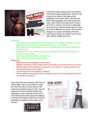
- 1. I chose this article because I like how it follows most double page spread layouts, with the main image on one whole of the page and all typography on the other sides. I also like how there’s less typography than other articles I’ve seen, which means mine does have to have a lot of text or columns. It also has a really large drop cap which made the article stand out more for me as is different and vibrant. I like the main image as it is a good connotation of the Hip- Hop industry as they are mainly men and wear dark clothing, shades and a hat. Similarities: - Both use a drop cap at the start of the articles and main headline is larger than the sub- heading and has a different but meaningful font as the main headline - Main images are on a whole page on its own, both facing the camera and models are both black men - Backgrounds on main images are plain and match each model’s top. Also, there’s no mise-en-scene in images - Same colour scheme of black, white and red - Sans serif is used for both main text body Differences: - Different amount of typography in each article - Different shot types in each image as one is a full body shot and the other is a mid shot - Different types of direct address is used as the one is the top is wearing shades so he isn’t exactly looking at the audience. - The font type if the main headline is different - The top article has the artist's name in a different colour in the sub-heading to stand out but the other one doesn’t I also chose this article because I like how the main image is also on one whole of a page and I like how they’ve mixed colours in the article and used three columns. Also, how the quotes are in red to make the article more interesting to read. I also like the font of the main title because it looks rigid and rebellious to represent the history of Hip-Hop as the font resembles to traditional prison signs, which look like...