
Recommended
More Related Content
What's hot
What's hot (17)
Viewers also liked
Similar to Task 6 -10
Similar to Task 6 -10 (20)
Recently uploaded
Recently uploaded (20)
Task 6 -10
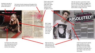
- 1. The theme of pink showing up throughout the double page spread to link back with the artist. Heading so we get an idea of what kind of person the artist is. Both are laid out with picture on the left hand side and writing on the other. I like the way that a quote that is taken from the article is made a lot bigger and acts as a sort of title, although there is a larger quote on the other article I think it works better as large as this one. Both images are more of medium shots and full body shots than the cover which are usually close ups. I like the way that this double page spread has the same background for both pages, this shows that they're both connected In some way, but it also makes it look very clean and simple. Full body shot of the artist also showing what kind of person she is and it also anchors the heading. Clean, easy to read font so that the page looks neater but also so the audience don’t struggle to read it.