1. Analysis of Music Magazine NME Contents Page
Thiscontentspage containsthe frontcoversNME mastheadonthe
top leftcorner,nexttothe mainheadingof ‘CONTENTS’, asthisis
whatmost magazinesdo as a part of brandidentityand toremind
the audience whentheyopenthe magazine andisbrandingthe
magazine sono one can copy itas theyhave theirmastheadon
there.Theyalsouse the same colourscheme onthe contentspage
of redand white toshowcoordinationasitwouldmore
presentable.
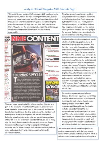
Theyhave a main image torepresentthe
sub-genre of rockbecause otherrockartists
on the bottomstrapline.Thisisalsoshown
by the boldfontand hasa fonttype that’s
fadinginsome parts as the boldsconnotes
how outgoingrock musicisand the fading
couldsymbolise how rockhasbeengoingon
for agesand that theyhave beentouringfor
a while andknow whattheyare doing.
The layoutof thiscontentspage isnot usually
whatmost contentspageslooklike asit
wouldbe all typographyandnumbers,but
here theyhave addeda storyin the middle
and withheldthe page numbersinthe and
everythingelse,thatinthe whole magazine,
on the side.Thiscontentspage reinforces the
rule of thirdsas the mainfocuspointswill be
to the tour bus,whichhas the curtainsclosed
to give the symboliccode of ‘whathappens
on tour,stays ontour’,the otherfocuspoints
wouldbe onthe reviews,the big‘T’andthe
subscriptioninthe bottomrightcorner, isa
brightyellow,whenthe colourscheme isred
and white tostandout and attract the
audience more andmake themwantto
subscribe toit,especiallybecause the word
‘JUST’ to stressthatit’snot too muchfor their
niche marketas theywouldbe of a workingto
middle class.
The main image usesdirectaddress inthe mediumclose-up,asa
part of the codesand conventionsof magazines,becauseitwill
draw the readerintowantingtogo to the tour and it anchorsthe
textsbelowitandlinkstothe strap on the top of the frontcoverof
the magazine thatwas talkingaboutthe autumntour special.
Beingthe onlypicture there,the mise-en-scene showswhattype
of tourit’ll be as the curtainsare closedandthe bus isred to imply
that the tour isdangerousandred representsbloodanddanger.
Her costume of a dungaree will give recognitionthe target
audience andcan relate tothe picture,she isalsowearingdarkeye
make-upbecause that’swhatmostteenagerswhereandit
associateswithrock.
Thiscontentspage usesthree columns
because itlooksmore organisedandisn’ttoo
busyfor the target audience togetboredof
lookingat.On eachcolumnthere isa sub-
headingtofocuson whatthat bit of
typographywill be explaining. The header
includesablackbanner,sothat the
masthead,mainheadinganddate can stand
out.This isalsoon the middle column,sothe
white wordscanstand withthe picture,which
has a white borderarounditto match with
the typography,thissectionisalsobordered
withthingsthatlooklike zipsoneachcorner.
The house style ismaintainedthroughoutthe
contentspage to anchor withthe frontcovers’
colourscheme,exceptforthe subscription whichis
yellow tostandout and yellow denoteshappiness.