CALL ON ➥8923113531 🔝Call Girls Ashiyana Colony Lucknow best sexual service O...
Presentation1
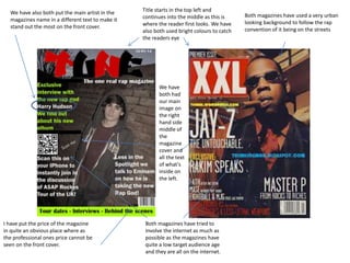
1. We have also both put the main artist in the
magazines name in a different text to make it
stand out the most on the front cover.
Title starts in the top left and
continues into the middle as this is
where the reader first looks. We have
also both used bright colours to catch
the readers eye
We have
both had
our main
image on
the right
hand side
middle of
the
magazine
cover and
all the text
of what's
inside on
the left.
I have put the price of the magazine
in quite an obvious place where as
the professional ones price cannot be
seen on the front cover.
Both magazines have tried to
involve the internet as much as
possible as the magazines have
quite a low target audience age
and they are all on the internet.
Both magazines have used a very urban
looking background to follow the rap
convention of it being on the streets
2. We have both used bars of colour to separate the main
flash lines. On the front cover
Both have quite a cool street looking main image on
the front cover as this is a rap magazine to get across
the idea it is very street.
Different colour font for important name or
details in the selling lines on the front of the
magazine.
Both have a list of features in the magazine at the
top or bottom to show the readers what they can
expect in the magazine.
3. I challenged media
conventions by having
a big masthead with
the rappers name on
compared to them not
having anything on the
professional one.
A convention that I
challenged was that
the double page
spread had to have
this really complex
look to, I went for a
very simple look on
mine and I personally
think it looks better as
it is black and white as
well.
Something I would of
liked to do but didn’t
know how to do was
to add big capital
letters at the start of
every new paragraph,
I think it looks very
professional but I
didn’t know how todo it.
Both magazines have used
a quote said by the artist
on the image page of the
double page spread
Both magazines used
the right page as the
main image play with
just an image on a quote
on, and both used the
right page for the text of
interview with the
rapper.
Use of columns to make the
block test break up more
and easier to keep your
place in the text as just
reading pure block text can
be quite hard to keep your
place.
4. There is a difference in that they
have chosen to have their main
image on the left instead on the
right where I have chosen to have it
They have also chosen to have a
magazine themed title on the page
instead of just a plain normal title I
would of done this but in the time
frame we were given it would have
been very difficult
5. Both magazines have a very similar set up on them with a large amount of space in the top left area of the page and then contents middle-top
right and then the key page numbers in the magazine listed on the right hand side
In the
background of
both
magazines is
the first letter
of the
magazine
name spelled
out it a cool
way
I have
challenged
professional
conventions
by having an
image for one
of my
contents.
My magazine and the professional one look very
similar showing that I have used lots of professional
conventions one being the black and white image of
someone in the magazine on the contents page.