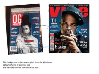
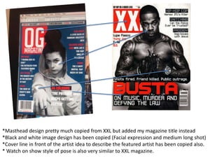
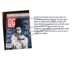
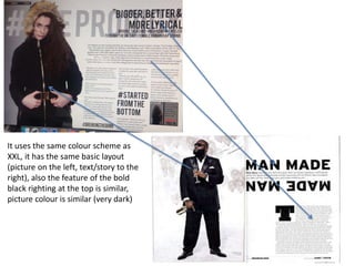
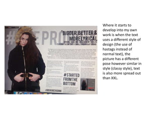
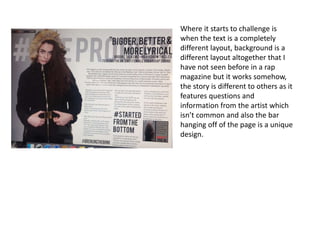
3. The background colour was copied from the Vibe issue
colour scheme is identical also
the barcode is in the same location also.
4. *Masthead design pretty much copied from XXL but added my magazine title instead
*Black and white image design has been copied (Facial expression and medium long shot)
*Cover line in front of the artist idea to describe the featured artist has been copied also.
* Watch on show style of pose is also very similar to XXL magazine.
5. *Top bar of names copied from giant magazine as it is a popular design in rap
6. Most magazine conventions
Most rap magazines have similar features
on the front cover like for instance:
Names across the top of the cover of the
magazine, a very popular red, black and
white colour scheme and most magazines
use the shot type medium longshots of
the artists.
8. It starts to develop into my own work as I
use features such as: Top bar having a grey
effect to differentiate slightly, longer and
more detailed cover lines (not as brief), pose
of the artist isn’t very common for rap
magazines and neither is the black and white
image colour scheme which is rare to see in
magazines today.
10. It doesn’t look much different my magazine
from others because I used lots of inspiration
from other magazines to develop mine but
the only complete difference I could find is
the Date being placed inside the masthead
which never happens in a rap magazine
however in this case it looks very well placed.
12. Features layout was pretty much copied from this contents page, Page numbers are the
same, the layout of the cover lines (similar amount of text), some artists/stories are
featured in both contents pages, and colour scheme is also very similar, also the design of
a cover line in front of the artist to show who the star of the magazine is.
14. It starts to differentiate when I,
Shortened the featured descriptions
as I felt they were too long, cover line
in front of the artist is larges as it
looks better and more developed, it
varies from different stories topics,
image is brighter and more
centralised and the pose is a lot more
gangster rap than the XXL magazine,
colour scheme is similar but changed
slightly to suit the genre more.
16. I implemented large letters in the background as it
gives the layout a much better design and the
cover lines fit onto the letters nicely, the contents
bar behind the artists head as it looked as if there
was too much space in the background, seperated
contents sections to featured (Most important)
and an interviews section , the blue bar at the
bottom is a nice design as it links to the front
cover so shows the front cover scheme isn’t
completely forgotten about and also the pose of
the featured artist isn’t seen in other magazines
and it was my own initiative to use this pose as it
looks very intimidating and if you look closely you
can see the flexing of his knuckles which intends
‘I’m not scared of anyone’.
18. It uses the same colour scheme as
XXL, it has the same basic layout
(picture on the left, text/story to the
right), also the feature of the bold
black righting at the top is similar,
picture colour is similar (very dark)
20. Where it starts to
develop into my own
work is when the text
uses a different style of
design (the use of
hastags instead of
normal text), the
picture has a different
pose however similar in
style (classy style), text
is also more spread out
than XXL.
22. Where it starts to challenge is
when the text is a completely
different layout, background is a
different layout altogether that I
have not seen before in a rap
magazine but the large hashtag
text works somehow, the story is
different to others as it features
questions and information from
the artist which isn’t common and
also the bar hanging off of the
page is a unique design, also the
feature of the picture story at the
bottom is much different from any
other rap magazine.