
Recommended
More Related Content
What's hot
What's hot (20)
Viewers also liked
Viewers also liked (15)
Similar to Analysis of NME (Sept 2009) Contents Page
Similar to Analysis of NME (Sept 2009) Contents Page (20)
More from asmediae12
More from asmediae12 (20)
Analysis of NME (Sept 2009) Contents Page
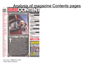
- 1. Analysis of magazine Contents pages Contents 1.NME Sept 2009 Dizzee Rascal Edition
- 2. Contents page NME (SEPT 2009) ANALYSIS NME MASTHEAD SAME COLOUR CODE BANNER AT TOP – it bold and eye catching, AS FRONT – this makes the magazine draws your eye to the ‘contents ‘when you are look professional because everything flicking through so its easy to recognise which matches, they haven't used different reds page is the contents. and blacks to the front page, its all neat. DATE – has to be the same as the date on the front, so that you know Main image is….. Smaller than that issue has the right contents the image on the front of the page. magazine, so it allows your to read the other sections of the magazine. The image and SUB HEADING BLOCKED OUT INTO writing in the centre of the page BLACK SUB SECTIONS – makes it is placed on a speaker, this ties very effective and it catches your eye up with the music theme and is straight away without you realising, a nice touch. the black boxes with the white font make it more bold. Bands are listed in red with page BRIEF HEADING +SUMMARY OF CONTENT number in black – this makes the WITH PAGE NUMBER IN RED – its letting you numbers stand out more over the know what's on the page before you go on so red writing, because the number that you have an idea of what its about. Having a is the most important information title bigger will give you an idea of what its about there. Its less effective if it was without you having to read the summary of they all one colour, and it wouldn’t be don’t want to, it gets to the point quicker. as professional if they used Although the page number is small compared to another colour scheme. the title, the red makes it stand out more. Image is edited so it looks like a Puff – this is another technique of photograph. - This is appropriate getting you to buy or subscribe to because it gives it a feel of a their magazine. Nobody said that scrap book of the bands travels, it’s the ‘UK’s no.1 gigs guide’. NME makes it more effective and gives made that up to persuade you. the image some character. links in with the theme of the introduction. PREVIOUS/FUTURE EDITIONS OF NME ARE SHOWN WITH DETAILS OF WEBSITE/PHONE NUMBER ETC – is advertising the magazine and trying Editors introduction to contents of magazine – gets you into the mood, allows you in the shop to have a taster to persuade you to subscribe by telling you if you of what the magazine features and what its like inside, without having to look at every single page. Another subscribe it works out as £1.40 per issue instead of thing is its telling you what pages what tours are on without having them in a list down the page like other £2.50 which is the price you pay in a shop. contents pages, it puts it into a structured sentences and keeps the contents page tidy.
- 3. ANALYSIS OF LAYOUT/DESIGNFEATURES OF CONTENTS PAGE The word content is placed at the top of the page so that its noticeable, and it takes up most of the top third. The contents is structured into columns, this makes it easier for the reader to get around The mini the contents page numbers introduction on and topics. the contents page gives the reader This section is helping to promote a cheaper way of affording the magazine, and by also gaining more costumers on a monthly basis. This section has a full list of all the artists featured in just this one magazine, gives an idea to a new reader of the quality of this magazine.
- 4. Contents page kerrang (feb 09) ANALYSIS CONTENTS MASTHEAD SAME EDITORS MESSAGE - this makes COLOUR CODE AS FRONT – this the magazine more personal the allows the reader to know what page the reader, it's a good use of space, they are on, also by having the ‘contents’ telling the reader all the good masthead so large you won’t miss it things featured into this issue and when you are trying to find a page. The any updates and information they colour coding from the front cover are the think the reader would be use of yellow and black, this makes the interested in. The editors message magazine front cover and contents match also acts as a little introduction to making it more professional and the magazine. effective. EXTRA - in the top right third is DATE - the date has been added on to adding a little more to the the contents page so that the reader magazine, to attract the reader, knows what issue they are reading, giving you an idea of what's and hey know how up to date the featured in that specific page, in information, gigs and interviews are. this issue it's kirk Hammett answering questions, ths helps to involve the reader. It tells you the SUBHEADINGS - the subheadings page number, trying to get the have been put into a black box with a reader to have a look. large bold yellow font, fit across the boxes to attract the readers eye to the page number and the main MAIN IMAGE - the main image is article. The page numbers are in a very large on the page so that it bold font so that it doesn't take the attract the readers attention, they reader ages to find the number, ave done this because people who making it easier for everyone. are fans of this artist will see him immediately and want to find what COLOURS OF FONTS - the page number he is on. This is an black and the yellow important thing to have on a represent the music genres contents page, images separate the that are featured in this text make it easier for the reader. It magazine. It also links with adds colour and interest, it can also the front cover and the rest tell a story and tell you who's of the theme to this issue featured in the magazine without magazine. actually saying anything. The main image on the contents page is smaller than the image on the front MINI IMAGES - the littles images used on the contents page are to tell the reader which page the specific artists are featured cover, the editor has done this on, the other contents page I analysed on the other page didn't have this. It's a unique feature to this magazine, even though because they want the front cover t other magazine contents pages have it you don't come across it as much in the music genre, because normally they have one be the most attractive and main image to attract the reader. By using mini images you get to catch the main articles, and the images help attract the eyes important page. of the reader, adding colour and making the contents page more effective. The image includes the page number and a mini introduction to what the article is about and what the artist/bands have been up to recently.
- 5. ANALYSIS OF LAYOUT/DESIGNFEATURES OF KERRANG CONTENTS PAGE The word contents has been placed at the top of the screen because its an important part of the page, its telling the reader what they are reading and what the page is about. The contents is structured into columns so that the reader finds it easy to get around the page and find the page/article they want painless and quick. The introduction/editors message is there to involve the reader and make them feel as if it’s a personal message to them. The signature at the end it effective as well because it makes it like the editor cares and out effort into the magazine. The main image and the use of the little images helps give the contents page a little more character and makes it more colourful, because a contents page is the most boring page and unless you want to find something you don’t normally bother with it much. So the editor is trying to promote it and get it noticed more.
- 6. Contents page classical FM (dec 07) analysis IMAGES – instead of having DATE - the date has been added on to just one main image to attract the contents page so that the reader the reader, classical FM have knows what issue this contents belongs decided to use six main to and how up to date it is. It is also images, this adds more colour very noticeable because its not just to the contents page, as well as numeric like the kerrang contents date, filling an extra space, and it makes it easier for the reader. making the page much more interesting from the boring MAIN HEADING – the main layout and colours scheme. heading is the same logo as the The images also include the radio channel and they have page numbers they are related also used the magazine name to, this not only fills the gaps on the contents page unlike but it makes the list of pages kerrang, so that the reader not as long and tedious and knows what magazine the attracts the reader to the main contents page belongs to. pages or pages people may skip, image is a good way of PAGE NUMBERS – the page numbers doing this. and the article names are all linking in with the magazines colour scheme of COLOURS – as I said in the other the red and white, they have done this section, the colours all match the front because it makes it more professional cover and throughout the magazine and effective, red is an elegant colour as and the font. The colour red might well as being bold and effective. The mean danger to some, but this is the font and the numbers are in a calm font December issue of classical FM which they aren't bouncing out the page at you means the colour red works well with making it look messy, but they are still the time of year linked with Christmas. easy to read and effective against the This makes people more attracted to it pale background. because it’s a special time of year and people will be getting excited at PROMOTION – the magazine everything with the Christmas theme. have added a little box to help Also classical can be to do with church promote the magazine, and and the religious side of Christmas make more people buy it that people may forget about in other monthly, but allowing the to months of the year, this will bring in a have a offer that will not only wider audience for the magazine in save them money but to rise the December because it’s the main time amount of people actually people go to church and probably the buying the magazine because only time for some. its through a yearly contract. They haven’t made the box very BANNER – the banner at the bottom of the page allows the contents page in other cases to add in a little bit extra information appealing nor have the made it when there is not a lot of space yet, although this is not a problem for this specific magazine contents, they have decided to use stand out against the other this cleverly. the red banner is keeping to the colour scheme well, however it is effective and stands out of the page, but not too writing, its just a darker red much to ruin the tone of the magazine genre. Its trying to persuade people to buy this magazine buy giving away a present, and the fonts a similar size. linked to the Christmas theme, getting everyone ready and excited.
- 7. Analysis of layout/design features of classical FM contents page The word contents has been placed at the top of the screen because its telling the reader what page they are on. The big red box the heading is in allows into be noticed because the white it very effective over the top of the red. The page numbers are all structured, going down in a list, allowing the reader to easily read the page numbers and the subheadings, it also gives a little description to what the page includes so you have a brief idea of what you should expect. It is not a confusing bunch of words that you would loose the numbers in. the images linked to the page numbers allows the reader to have a break from all the writing and almost catch the top headlines featured within the magazine. The promotion allows the magazine to increase their audience who buy their magazine, because everybody likes a bargain especially when you are new to the product. The colours used are well linked in with the calm tone the magazine wants to represent, it also allows the reader to not get confused because its not fussy it’s a very simple structure. The colours link in with the theme of the time of year the issue has come out in.