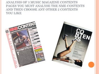
3. NME MASTHEAD SAME
COLOUR CODE AS FRONT-
CONTENTS PAGE NME BANNER AT TOP-banners such as the
(SEPT 2009) ANALYSIS
this is done as it is their logo one on the front cover usually provide
and so needs to be consistent some information that the editors of the
throughout the whole magazine magazine feel the reader needs to
as well as all other products know, in this contents page however
that they make, so that people they have placed the masthead in the
know what they are reading and banner in a large bold text that takes up
are familiar with the brand. about a 6th of the page.
DATE- this is placed on the front cover
Main image is large and and the contents page, as it is a weekly
covers quite a lot of the page. magazine the readers need to know
It is put at a canted angle to what volume of the magazine they are
make it look more informal as reading and also if they build up a
their average reader is quite collection of NME magazines they can
young. They have also placed file them in date order.
a white border around the
image to make it look more SUB HEADING BLOCKED OUT INTO
like a photograph. BLACK SUB SECTIONS- these sub
headings are used as they are bold and
easy to read, also they match the
Bands are listed in red with masthead of the magazine so it is
page number in black, this is consistent with the house style of the
because the house style of the magazine.
magazine is red, white and
black and so these colours BRIEF HEADING +SUMMARY OF
need to be used throughout to CONTENT WITH PAGE NUMBER IN
make it consistent. RED-this is quite an effective way of
having a contents page as not only does it
Image is edited so it looks like fit with the house style of the magazine,
a photograph. This is but with the small description it also gives
appropriate because it makes the viewer a bit of information about the
the image more informal and article that is in the magazine.
fits with the theme of the
magazine which is quite Indie
and rock themed and so this PREVIOUS/FUTURE EDITIONS OF
look makes the images look NME ARE SHOWN WITH DETAILS OF
more original and individual. WEBSITE/PHONE NUMBER ETC-this
is on the magazine as advertisement, it
DROP CAP- this technique is is trying to persuade the reader to
most commonly used to show subscribe to NME and receive the
where a block of text begins. But magazines weekly at a discounted
in this case it also adds to the price.
effect of the magazine and adds COPY-they have this block of text to preview one of the important
to the creative effect of the articles in the magazine and at the end of the copy it will say “(Pg 46)”
magazine. or similar and then the article will continue on the page that it says.
Sometimes the copy will have several article beginnings within it and
then will continue on several different pages.
5. ANALYSIS OF LAYOUT As well as the large vibe logo in
CONTENTS PAGE 2 the left corner the top third of the
magazine is taken up by a large
masthead saying contents. The
layout of this contents page isn’t
The contents page contains what you’d expect to see as a
the vibe logo on it as it keeps contents page, although it does
the house style consistent and look quite high class and formal
in plants the logo of the and provides the reader with all
magazine in the readers head the information they will need.
as it is a very large logo and
dominates around a quarter of
the page.
Throughout the contents page
and the rest of the magazine, Most contents pages have a
a consistent font is kept. The list of what you will find on the
font is quite a formal font and pages in the magazine and it
presents quite an upper-class usually turns out to be quite a
feel to the magazine even long list. Where as this has two
though a lot of the music in main sub-headings that the
the magazine is hip-hop and magazine feels are the most
R&B. important aspects of the
magazine. It then has a few
paragraphs underneath
The main image of the
explaining what they will find on
contents page is of a woman
certain pages.
lying on her back with her legs
in the air dominating the
bottom third of the page, her
legs are stretched into the
middle of the page. This image
draws your eyes down the
page and leads you to the text
which is conveniently placed
right by the image where your
eyes are drawn to.