1. Analysis of Articles- Double Page Spread 1-NME
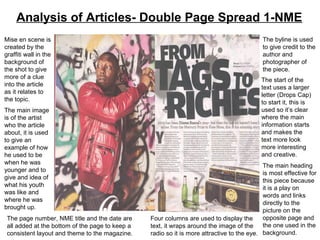
Mise en scene is The byline is used
created by the to give credit to the
graffiti wall in the author and
background of photographer of
the shot to give the piece.
more of a clue The start of the
into the article text uses a larger
as it relates to letter (Drops Cap)
the topic. to start it, this is
The main image used so it’s clear
is of the artist where the main
who the article information starts
about, it is used and makes the
to give an text more look
example of how more interesting
he used to be and creative.
when he was
The main heading
younger and to
is most effective for
give and idea of
this piece because
what his youth
it is a play on
was like and
words and links
where he was
directly to the
brought up.
picture on the
The page number, NME title and the date are Four columns are used to display the opposite page and
all added at the bottom of the page to keep a text, it wraps around the image of the the one used in the
consistent layout and theme to the magazine. radio so it is more attractive to the eye. background.
2. Analysis Of Written Article
• The article itself is basically about how the
artist, Dizzee Rascal, has changed his social
class status and how his career has gained
him fortune. It gives information on his
childhood and how his passion for music has
influenced his life and become what made his
famous and for him to achieve what he has.
• It is written in 4 short columns each of them
being about 75-100 words depending of where
they are positioned on the page.
• The main heading is quite dramatic because
of its boldness how it has been slanted making
it seem important and powerful which relates
to how the article should feel to the reader.
• The headline is a play on words so not what
the reader expected but still gives the same
meaning used in common English language
so they can relate to the text.
3. Analysis of Articles- Double Page Spread 1-NME
Two smaller
Mise en scene in pictures are shown
the background on the page so
of this photo is viewers can see
used as it links what the text is
to the groups the explaining, this is
theme and the the aesthetic part to
patterns and the page and
colours used are makes the structure
the same to what and to the page
they used on layout more
recent tours and appealing and to
events. This the eye
means that if the
viewer does not There are three
recognise the columns of text
band straight used for the article,
away they can there is a lot of text
work it out by the used so they do not
props used. need to edit or
change the way it is
The company logo displayed to be
and issue number more attractive as
are in the footer to the quality of the
keep a master text is more
layout to the The quote clip which is used on the left hand side is used to link the important for this
magazine and link pages together and to also give an idea of what others impression magazines target
each page of the band are, which influences your own view on them too. audience.
4. Analysis Of Written Article
• The article is about the band Coldplay,
mainly Chris Martin, also featuring others
artists too. The magazines interview with the
band at their studio is to look at their year of
touring, meeting with rappers, performing at
Glastonbury and mostly the information on
their recent album Mylo Xyloto and there
production and its release.
• The item is written over 3 long columns and
separated into 2 sections.
• There’s a caption added to the photos to give
a short description of who’s in the photo and
what it’s used to show in relation to the item.
• A Drops Cap is used at the start of each new
paragraph to separate them and show where
to content of the text changes slightly. This is
also done to split up the block of text so it is
easier on the eye and does not look so heavy
to the viewer.