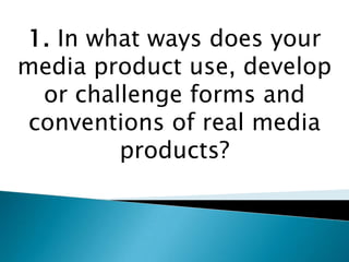
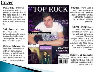
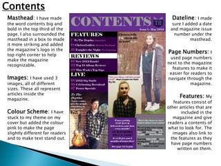
1. In what ways does your
media product use, develop
  or challenge forms and
 conventions of real media
         products?
Cover
Masthead: It follows         Images: I have used a
conventions as it is           main cover image of a
placed in the top third of   male artist and 2 smaller
the page but is not in the   images of female artists
left hand-corner. The           so that the magazine
masthead also does not         has a mixture of both
have a box surrounding                       genders.
it.
                               Cover-lines: I have
Sub-lines: My cover                 used cover lines to
lines have extra              annotate all my images
information underneath          as well as 2 others on
them called sub-lines.             the cover. The main
These give extra info on     images’ cover line is the
the cover line story.            biggest and the main
                             article inside. This sticks
                              to conventions as there
Colour Scheme: The               are lots of cover lines
colours I selected fit in
                                                  used.
with my dark, grungy
theme. I used different
shades of purple and         Dateline & Barcode:
used black and white to      I have included an issue
stand out against them.      date/number, a website
                             address, magazine price
                                       and a barcode.
Contents
Masthead: I have made              Dateline: I made
the word contents big and          sure I added a date
bold in the top third of the      and magazine issue
page. I also surrounded the         number under the
masthead in a box to made                   masthead.
it more striking and added
the magazine’s logo in the
top right corner to help
                                 Page Numbers:         I
                                  used page numbers
make the magazine
                                 next to the magazine
recognizable.
                                   features to make it
                                  easier for readers to
Images:     I have used 3        navigate through the
images, all of different                     magazine.
sizes. These all represent
articles inside the
magazine.
                                       Features: My
                                     features consist of
                                 other articles that are
Colour Scheme: I have                    included in the
stuck to my theme on my             magazine and give
cover but added the colour       readers a contents of
pink to make the page            what to look for. The
slightly different for readers      images also link to
and to make text stand out.        the features as they
                                   have page numbers
                                       written on them.
Double-Page Spread                                                   Article:   I split the article
                                                                     into 2 columns framing the
Masthead & Sub-line: My                Colour Scheme: I have         images. I surrounded them
article’s title is the artists name    kept my colour scheme         with a black box to keep the
which is surrounded in a box to        dark and grungy but used      text from blending in with
make it eye-catching. It included a    different colours such as     the background. This sticks
sub-line underneath it that            dark teal and brown. I kept   to conventions by keeping
outlines a quote from the featured     the colours black and white   articles in neat columns on
artist. I have also added the          as they stand out.            the double-page spread.
magazine logo and a ‘featured’
heading so readers know which
section they are reading.

Images:     I have made my images
side-by-side so that their
background blend into each other
and it looks like there are 2 of the
artist. This develops conventions
as this is not the usual layout of
an article.

By-line: I used a by-line under
my images to tell readers who the
article and images were created
by.

Evaluation q1

  • 1.
    1. In whatways does your media product use, develop or challenge forms and conventions of real media products?
  • 2.
    Cover Masthead: It follows Images: I have used a conventions as it is main cover image of a placed in the top third of male artist and 2 smaller the page but is not in the images of female artists left hand-corner. The so that the magazine masthead also does not has a mixture of both have a box surrounding genders. it. Cover-lines: I have Sub-lines: My cover used cover lines to lines have extra annotate all my images information underneath as well as 2 others on them called sub-lines. the cover. The main These give extra info on images’ cover line is the the cover line story. biggest and the main article inside. This sticks to conventions as there Colour Scheme: The are lots of cover lines colours I selected fit in used. with my dark, grungy theme. I used different shades of purple and Dateline & Barcode: used black and white to I have included an issue stand out against them. date/number, a website address, magazine price and a barcode.
  • 3.
    Contents Masthead: I havemade Dateline: I made the word contents big and sure I added a date bold in the top third of the and magazine issue page. I also surrounded the number under the masthead in a box to made masthead. it more striking and added the magazine’s logo in the top right corner to help Page Numbers: I used page numbers make the magazine next to the magazine recognizable. features to make it easier for readers to Images: I have used 3 navigate through the images, all of different magazine. sizes. These all represent articles inside the magazine. Features: My features consist of other articles that are Colour Scheme: I have included in the stuck to my theme on my magazine and give cover but added the colour readers a contents of pink to make the page what to look for. The slightly different for readers images also link to and to make text stand out. the features as they have page numbers written on them.
  • 4.
    Double-Page Spread Article: I split the article into 2 columns framing the Masthead & Sub-line: My Colour Scheme: I have images. I surrounded them article’s title is the artists name kept my colour scheme with a black box to keep the which is surrounded in a box to dark and grungy but used text from blending in with make it eye-catching. It included a different colours such as the background. This sticks sub-line underneath it that dark teal and brown. I kept to conventions by keeping outlines a quote from the featured the colours black and white articles in neat columns on artist. I have also added the as they stand out. the double-page spread. magazine logo and a ‘featured’ heading so readers know which section they are reading. Images: I have made my images side-by-side so that their background blend into each other and it looks like there are 2 of the artist. This develops conventions as this is not the usual layout of an article. By-line: I used a by-line under my images to tell readers who the article and images were created by.