Interactive Powerpoint_How to Master effective communication
Kerrang contents page analysis
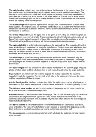
1. The main heading makes it very clear to the audience that this page is the contents page. The
font used appears to be handwritten, which makes it seem more personal to the audience. This
heading is positioned inside a black puff, which may be because rock music has connotations of
the colour black, and so this would appeal to the target audience. The text itself is white, as this
colour contrasts strongly with the black, making it stand out more. Capital letters are used as this
makes the heading seem more important.
The subheadings are also placed against black backgrounds. However the font used for these
texts is yellow. This brighter colour still contrasts with the black but is brighter and therefore more
effective for catching the audience’s attention. Yellow also links to the hallowe’en theme as it has
connotations of sickliness.
The article titles are black, as this again links to the genre of rock. They are written in capitals as
this makes them seem more dramatic. They are designed to attract the target audience who will be
fans of rock music, and so the majority of these titles contain the name of a rock band or artist.
This will attract fans of these artists and will therefore appeal to the target audience.
The main article title is written in the same yellow as the subheadings. This separates it from the
other article titles and shows that it is more of a main feature. The text size is also a lot bigger than
the other article titles, making it more of a focal point on the page. It is very vague and doesn't
really tell the audience what the article is about, which creates the element of mystery and makes
the reader want to know what it is about.
The main image is positioned directly behind the main article title, which shows that they are
linked. It shows Frank Iero covered in blood, which links to the theme of hallowe’en. This image
also doesn't give the reader much of an insight as to what the magazine is about and so adds to
the mystery.
The other images used are all related to other articles mentioned on the contents page. They are
photos of other artists and this will attract fans of rock music, thus attracting the target audience.
Page numbers are included on the contents page as this makes it easier for the reader to
navigate through the magazine. They are red, which links to the hallowe’en theme, as the colour
red has connotations of blood and gore.
A letter from the editor has been included, and it tells the audience more about what to expect in
the magazine. This seems very personal for the audience as the editor is speaking directly to them.
The date and issue number are also included on the contents page, as this helps to reader to
know how recent the content in the magazine is.
Columns are used to position the content on this page. The columns are all roughly the same size
which makes the page seem more organised. It also implies that all of the information in the
columns is all equally important. This is probably why the main article title and the main image are
not included in the columns.
The colour scheme is similar to the colour scheme of the front cover. It contains a lot of black,
white and yellow. The yellow links to hallowe’en as it appears to be sickly and disgusting, and the
black and white is used as these colour are neutral and contrast each other well.
The language used seems very conversational, which will attract the audience more as it seems
more personal.
2. Issue number
Date
Main image
Main article title
Subheadings
Main heading
Letter from the editor
Selection of images
Article titles
Page numbers