
Recommended
More Related Content
What's hot
What's hot (20)
Viewers also liked
Similar to DPS Analysis of Kerang Magazine Layouts
Similar to DPS Analysis of Kerang Magazine Layouts (20)
Recently uploaded
Recently uploaded (20)
DPS Analysis of Kerang Magazine Layouts
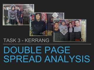
- 1. DOUBLE PAGE SPREAD ANALYSIS TASK 3 - KERRANG
- 2. LAYOUT For this magazine 3 double page spreads have been used and each one has a different layout. For the first double page spread the image takes up around two thirds of the page and the rest of the page is filled with text. For the second double page spread, one of the pages is filled with one main image, but the other one includes text. In the last double page spread the text was split into 5 equal columns; this is a good technique to use because it condenses the information and makes it easier for the reader to take in. The columns on the first double page spread and second page spread have the same width, this shows continuation through the magazine. In addition to this, a white border has been placed around each of the pages, which separates it from the rest of the magazine showing that this section of the magazine features the band Bring Me The Horizon.
- 3. TYPOGRAPHY The typography for the double page spread varies throughout. The magazine title “Spiritual healing” has been put in capitals showing that it is important and it has also been put in a large font size. The font isn’t in a typical standard font such as Arial or Times New Roman. However, an individual font has been used this makes the magazine stand out as an individual as it is unlikely that you would find another magazine with that same font. The subheading underneath gives the information a summary of what will be included in the magazine, this allows them to see if they are interested in the magazine or not. The font is very simple and clear, which makes it easier for the reader to read and understand. Furthermore, important information such as ‘Bring Me The Horizon’ has been put in bold, which makes it stand out to the reader; it also indicates the more important information out to the reader. The subheading is also in capitals, which shows that it is a key element of the magazine, however it has been put in a much smaller font. The actual article piece has been put in an even smaller font than both the subheading and title because there is more information and it allows other details to fit on the page. The interview which has been included also has separate typography compared to the rest of the magazine. The heading for that section “Black me out” is the same font as the title on the first double page spread.
- 4. MAIN IMAGE/IMAGES The main image differs in each double page spread. In the first image we are able to see the band themselves (BMTH). The shot used for this image is a full shot because we are able to see the celebrities from head to toe; which enables us to see what they are wearing. The colours of what they are wearing coordinate with the colour scheme as they are very plain and simple. The man in the middle has his hood up, which may give a negative representation of people in the music industry because stereotypically when someone is seen with their hood up they are seen as ‘thugs’. Furthermore, the image is direct address, because they are all looking directly into the camera - which engages the reader. The second image shows a mid shot of Oliver Sykes, this allows us to see him from the waist upwards, which not only allows us to see what he is wearing but we can also see his facial expressions too. This image is not direct because he is looking somewhere else, however from where he is looking we are able to tell that artificial lighting has been used because we can see it in his eyes - which is part of mise-en-scene. In addition to this, the clothes he is wearing is quite smart and good quality, which subverts us from the negative stereotype we get from his tattoos. Furthermore, on the double spread page another picture has been used in the middle of the article, this helps break up the text and enables the reader to take it all in. This picture also shows each of the 5 band members; which interacts with the reader because they recognise the people on the page. The final double page spread shows four separate images of the band members; each of the shots are mid shots which enables us to see the characters faces and facial expressions. Each celebrity is looking straight into the camera, which engages the reader. The colours of the clothes that they are wearing links in with the colour scheme and it also contrasts with the graffiti in the background of their picture as it is colourful. Also, a close up shot has been used of Oli Sykes, in the interview section, this enables the reader to see what emotions he is portraying.
- 5. CAPTIONS In each of the double page spread, captions have been used to show the reader what the images are showing. Each of the captions follow the same layout, this is because the text it has been put in is white. In addition to this, it has been put onto a black text box, which makes it easy to see. The font size is small because it isn't one of the most important things on the page. For the first two double pages the caption has been put in the top left hand corner, which makes it easier for the reader to see. However, for the other pictures the caption has been put in the bottom right hand corner. The captions also follow the house style of the double page spread as the colours are black and white.
- 6. COLOUR SCHEME The colour scheme for the magazine changes when it comes to the double page spreads. The colour scheme for this particular section of the magazine is black and white. This portrays the stereotypical ‘rock’ colours and also both black and white complement each other, which makes the magazine look more aesthetically pleasing. The background of all 3 double pages is black, and the writing is white - which makes it easy and clear to read. The interview section, which has been put in has its own little section, in which the background is in a cream colour; this separates it from the article as it is another section from ‘Bring Me The Horizon’.
- 7. DROP CAP A drop cap has been used in the article, this enables the reader to see where the article or a new section begins. In addition to this, a drop cap is useful because it helps section the articles and it makes it easier for the audience to understand. This follows the codes and conventions of magazine because at the beginning of articles a drop cap is used. The drop cap also follows the house style because the colour used is white.
- 8. GRAB QUOTE A grab quote has been used in the last two double page spreads. Grab quotes are enlarged quotes, which are used in order to grab the readers attention. The grab quotes in this magazine have been put in the same layout, this is because the have both been put in a white square (which follows the house style) and the quote has been put inside it. I think that the way it has been set out is very good because it is eye-catching and directly draws their attention to it. Furthermore, each part of the quote has been put in a different typography, this is a different technique used in a magazine, which makes it more unique and creative.
- 9. BY LINE The by line lets the reader know who composed the article and who the photographer was. From the magazine we acknowledge that “Andy Ford” was the person who took the photos for the article. The by line gives the photographer/author credit and also publicity. This is because if the articles becomes really popular and the pictures are admired, the public would want to know who created it.
- 10. PAGE NUMBERS AND BRANDING‘KERRANG!’ follows the codes and conventions of a magazine this is because it includes page numbers on each page. This related to the contents page as it helps readers navigate through the magazine. The page numbers are placed directly in the corner of the magazine this makes it easier for the audience to flick through the magazine and find the article they are looking for. In addition to this, it also follows the colour scheme of black and white, which makes the magazine seem more professional. Furthermore, the masthead has been included at the bottom of each page. This is good because it helps with branding and it also helps readers understand that this magazine came from that brand. In addition to this, if the magazine was to be scanned, people would know which company it had came from because the masthead is printed the page.