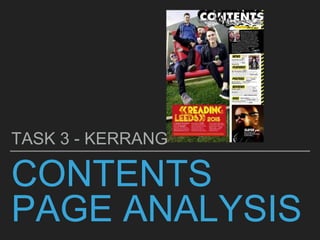
2. LAYOUT
This magazine follows the codes and
conventions of a typical magazine because
the layout it has been put into is the rule of
thirds. The first two thirds of the magazine
includes the main image and also information
about Reading and Leeds Festival. The last
and final column gives the contents of
magazine, this also includes the editor’s
letter, date and issue number. The house
style for this magazine is black, white and
yellow. These colours are very simple,
however they complement each other which
makes them stand out. By laying the contents
page out in the rule of thirds, it makes it clear
in the readers mind where they are able to
find certain things and what is happening.
3. MAIN IMAGE
In the main image we are able to see 4 boys on a giant
deck chair. The shot type used is a long shot because
it enables us to see the models from head to toe. The
image is anchored by the text underneath talking about
‘Reading and Leeds Festival’. This portrays to the
audience that the festival was very fun as each of the
young men in the image are smiling or laughing; which
portrays they are having a good time. Through mies-
en-scene we can see that the models are carrying beer
cans, which shows that at the festival they partied.
Furthermore, the image takes up the first two columns,
which shows its importance. The lighting for this
picture is natural, this is because it links into the theme
of this picture being taken at a festival. There is male
dominance on this page, which may portray that for
this magazine it is targeted specifically for men.
However, this is a stereotype because if a magazine
has a picture of a male on it; does not mean that
necessarily it is for males.
4. TITLE
The word ‘Contents’ has been put in a large
font at the top right hand corner of the
page, in the last 2 columns. The typography
which has been used is 3D and the font
colour is white. This links in with the house
style as the the most important things have
been put in white. Surrounding the title
there are various images such as a cross,
drum sticks, snakes, beer bottles, skulls
and bones. The image such as the cross
indicates something to do with the ethnicity
of this magazine being Christian because
the cross is a religious device. Furthermore,
from the megaphone and the drumsticks, it
further demonstrates that this magazine is
associated around music.
5. CONTENT
The content of the magazine has been
laid out on the very last column. The
subheading for the contents is in a black
and bold typography, which is then put
onto a yellow box; therefore bringing it out
from the other information on the
contents. The content of the magazine
takes up the middle row of the page as is
split into: news, features, posters, reviews
and gigs. Each of the editorial pillars have
been put into capitals, which shows how
significant it is. The articles, which were
coverlines on the front cover have been
put in a bold font in the contents section,
this indicates to the reader that they are
interesting.
6. EDITORIAL
Kerrang follows the codes and conventions of a typical
contents page because it includes an editorial letter
from the editor. The editorial gives the reader a brief
idea about what will be included in the magazine. The
editorial addresses the reader directly by starting off
with “HELLO READERS” this makes the audience
more involved in the magazine and makes them want
to read on and find out what this weeks issue involves.
The editorial is quite informal, which attracts the
audience because it appeals to them and is quite easy
for them to read and understand; which links in with
the target audience. Furthermore, the editorial is
signed of with the editors name ‘James’, however this
hasn't been put in the same font as the rest of the
magazine. The font of the word ‘James’ has been put
in a specific handwriting, which is the editors signature.
This makes the magazine more realistic because it
enables the reader to understand who edited the
magazine.
7. PICTURES LINK TO
ARTICLE/CAPTIONSThe picture in the very last column and in
the last row shows a picture of one of the
band members from ‘Slayer’. This is a
good magazine device to use because if
readers recognises someone on the page,
it will persuade them to buy the magazine.
The shot used in the picture is a close up,
which enables the audience to see the
character from the shoulders upwards.
There is no direct address in this picture
because we are unable to see where the
model is looking because he is wearing
glasses. The image is supported by a
caption, which informs the reader what
the picture is showing or what it is
associated with.
8. PAGE NUMBERS
This magazine doest’t follow the codes of
conventions of a magazine including page
numbers. This is because conventionally
everything which is put in the magazine is
associated with a page number. However, in
this magazine only certain articles have been
linked to a page number. The articles which
have a page number have been put in bold, this
makes it easier for the reader to navigate their
way through the magazine. Furthermore, the
picture in the bottom right hand corner is
anchored by the page number. This is a good
thing because if readers are attracted to the
picture they can directly look where to find it, as
text has been put on the picture to inform
readers that they can find an article on Slayer
on ‘Pg 44’.
9. DATE/ISSUE
NUMBERThe date and issue number has been
included in the contents page. This is
good because on the front cover it was
in a small font, however on the
contents page they are able to see it
as it is more clear. The text has been
put in the same font as the editorial
pillars; this makes the magazine flow in
a professional way because everything
is linked together. Furthermore, it
follows the house style because the
date ‘SEPT 5 2015’ has been put in
black and it is in a yellow box (making
it stand out from the page).