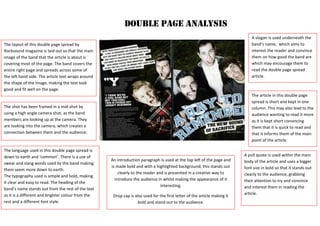
1. The layout of this double page spread by
Rocksound magazine is laid out so that the main
image of the band that the article is about is
covering most of the page. The band covers the
entire right page and spreads across some of
the left hand side. The article text wraps around
the shape of the image, making the text look
good and fit well on the page.
DOUBLE PAGE ANALYSIS
The shot has been framed in a mid-shot by
using a high angle camera shot, as the band
members are looking up at the camera. They
are looking into the camera, which creates a
connection between them and the audience.
The language used in this double page spread is
down to earth and ‘common’. There is a use of
swear and slang words used by the band making
them seem more down to earth.
The typography used is simple and bold, making
it clear and easy to read. The heading of the
band’s name stands out from the rest of the text
as it is a different and brighter colour from the
rest and a different font style.
A pull quote is used within the main
body of the article and uses a bigger
font size in bold so that it stands out
clearly to the audience, grabbing
their attention to try and convince
and interest them in reading the
article.
A slogan is used underneath the
band’s name, which aims to
interest the reader and convince
them on how good the band are
which may encourage them to
read the double page spread
article.
The article in this double page
spread is short and kept in one
column. This may also lead to the
audience wanting to read it more
as it is kept short convincing
them that it is quick to read and
that it informs them of the main
point of the article.
An introduction paragraph is used at the top left of the page and
is made bold and with a highlighted background; this stands out
clearly to the reader and is presented in a creative way to
introduce the audience in whilst making the appearance of it
interesting.
Drop cap is also used for the first letter of the article making it
bold and stand out to the audience.
2. DOUBLE PAGE ANALYSIS
Drop cap is used at the start of this
Kerrang! Magazine double page
spread, introducing and starting the
article in a creative way and making
it bold and stand out well to the
audience.
On the right hand side, a different
section, which still relates to the
band the article is about, is found
which includes reviews on the bands
new songs. This is interesting for the
audience as it involves a lot of
information provided on one page,
without making it too cramped and
with too much happening. It remains
laid out well and creatively.
This article is about a band and their
progress and news on their work and
music making within the studio. They
talk about the making of their new
album and what to expect. The
images used on the double page
spread link well with the information
in the article as it shows each of the
band members whilst in the studio
recording music. The main photo
which covers the whole of the left
page shows that and represents that
the band member is the lead band
member as he is the main focus. His
face is hidden by his hair which gets
the audience to focus on the fact
that he is holding onto a
microphone, representing to the
audience straight away what his
position and role in the band is.
The layout of the double page spread is effective and clear for the
audience to interpret. The article has been centred in the middle of the
right side page; it is in two columns suggesting to the audience that it is
short and informative. Smaller pictures are used at the bottom of the
page and layering on top of the main image which are anchorage to the
article.
A pull quote is used as the header of
the double page spread; this is
effective as it is most likely the first
thing the audience will read and
attracts their attention straight away
getting to the main point and focus
on the band.
An introduction sentence is used
underneath the pull quote giving the
reader a quick idea of what the rest
of the article is about whilst
convincing them to read it.