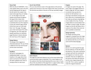
SlideShare a Scribd company logo
1 of 3
House Style
With the title of ‘CONTENTS’, it has
used capitals letters and is very thin
and tall aligning with the logo at
the left side for the reader to be
aware what page they are reading
at. For the slogan it has used
capitals and spreads throughout
the logo till the S letter from
capitals. Clearly it wants the reader
to identify what issue the magazine
is from the contents page instead
of the front cover as it will make
them ‘turn’ the page. The pages
uses similar techniques from other
Q magazines, the main page that
people would focus on would be
page 48 where it clearly indicates
the main focus of the magazine.

Use of rule of thirds
The use rule of thirds is seen in this page where at the primary
optical area it focuses on the main image of the close-up shot and
the terminal area where It focuses on the two secondary images.

Design Symmetry
The design symmetry of the
magazine is revealed from the image
at the top left where these two men
are identical with the use of mise en
scene and the body language.

Design Balance
The design of the magazine is
informally balanced. The use of text
is different from the most focused
and the other text below.
Headlines
The text of ‘140 SONGS TO
DOWNLOAD NOW!’ is the main
headline in this page where they
want to announce the audiences
the latest updated music chart or
introduce them to new music.

Imagery
4 images are used in this page. The
main image is the biggest where it’s
listed in page 48. The main image is
an extreme close-up shot of a
woman her left side face is cut
focusing on the blood running in her
face, where this is manipulated from
her make-up and eyes using lighting
at the middle of her face. The two
images below are actual photos that
are taken in events or gigs. The other
image is at the left side where this is
a picture of an album that came out
and is available to download.

Extra Features
This page has used extra features such as the mouse where they
announced what songs to download. This is done largely to tell
the audience that they should download the music now in iTunes.
Also at the very bottom of the page there is a page number along
with the masthead and the date of when it published.

Banners
Banners are used to guide the page
for the audiences. At the left side at
the features, it has used a red banner
and goes well with the masthead of
the magazine as it also has used a
red block. Also we can slightly see a
thin banner that above the features
and the main image along with the
issue 307. This is used as a guide to
make the magazine balanced.
House Style
We find the masthead is in the
contents page where this is also
gives a rough view of the page
where it says ‘this week’ which
means that the magazine is
distributed weekly. The colour
black, red and white goes together
with the masthead. The headline
starts off with an ellipsis of ‘…’ to
build tension towards the audience
who would want to know what
happened during the tour. The use
of ‘kicked off’ is a metaphor for
successful. This is done to make
this more relevant to the audiences
in which the audiences are for 18+
making this relate to them.

Use of rule of thirds
The use of rule of thirds is seen in this page where we find the
split image at the optical area and other advertisements at the
terminal area where this doesn’t bring importance to the
magazine.

Design Symmetry
Design symmetry is seen in this page
were features and index page are in
each opposite sides as well as the
images are in half to make the page
equal.

Design Balance
The design of this page is formally
balanced if we split the page
vertically we’d find both sides are
equal as one side includes index,
and features in the other.
Headlines
The main headline in this page is
‘…Oasis kicked off their world tour’
this indicates that the magazine is
focusing towards the band oasis.
Kicked off’ reveals that the tour
was successful even at the actual
footage of images. As well as the
use of ‘the moment that…’

Imagery
We can find two main imageries in
this page where they are stuck
together. Both of them are from a
band called ‘Oasis’ actual
unmanipulated pictures were taken
during the world tour. Actual lighting
is used when these pictures where
taken. Two of these people who are
the vocals of the band are wearing
opposite colours where one is
wearing black to give the rock
attitude and the other one wearing
white with acoustic guitar to give the
soft and calm attitude.

Extra Features
The issue date is over layered at the banner of the page where
this is made to be white in contrast to the black. The page also
advertises itself by wanting the audiences to ‘subscribe’ to them
to keep updated in the weekly magazine. The page also has tiny
red arrows next to the features section.

Banners
The banners used in this contents
page is shown from the top where
this links to the masthead of the
magazine underlining the phrase
‘this week’ to make this the main
section of the page where the
audiences can easily identify. The
features section at the right hand
section also does this to guide the
audiences in which page they want
to read.
House Style
The phrases ‘contents’ and ‘this
week’ both have used the same
font and colour as well as the size.
The phrase ‘Kerrang!’ has used
exactly the same masthead as
broken windows from the front
cover of the magazine with similar
font but made slightly smaller. To
give more space for the features
page and the imageries. The phrase
‘Kerrang!’ and ‘this week’ has both
used the same font but Kerrang is
slightly wider and thicker to bring
importance to the magazine.
Description fonts is more formal
than the headers and is more
suitable for reading.

Use of rule of thirds
The use of rule of thirds is seen in this magazine where we’d find
the image of the main focus of the magazine at the top and the
features at the bottom.

Design Symmetry
Design symmetry is seen in this
magazine at the bottom half where it
has used both images and equal
features of the page of what it will
include although the right side of the
page has an image of adverts.

Design Balance
The magazine is informally
balanced where both top and
bottom of the page brings
importance as these are very
important to the audiences.
Headlines
There are no big headlines unlike
the other magazines but has used
smaller headlines on the features
page with headers. This is made to
be bold where this brings
importance to the magazine as it’s
a guide for the audiences.

Imagery
At the top of the page it shows a full
imagery of a person who may be in
one of the bands or involved with
music in this kind of rock genre. The
clothes he is wearing are all black
including a cover up of sunglasses to
make him look like a ‘cool’ figure.
There’s also imagery on the left side
of the page in a close-up shot of a
man that’s looking fierce and
wearing black top to fit in the genre
of the magazine. There are also
images of magazines at the top that
also promotes other bands.

Extra Features
At the left imagery below the description, we find the signature of
his to be below to indicate to the audiences that the description is
officially made by him. Like the other magazines, it has used forms
of advertising itself by telling the audiences to subscribe to them
and delivered.

Banners
The banner is placed at the middle of
the page where this splits the section
from the top a full imagery and the
bottom where this shows the
features page and other
advertisements and main focus of
the magazine. Also the features page
where this is a guide for the
audiences to make it easier for them
to what page they want to view.

More Related Content

What's hot

Magazine contents page deconstructions
Magazine contents page deconstructionsMagazine contents page deconstructions
Magazine contents page deconstructionsljones1897
 
Contents Page Analysis - Kerrang
Contents Page Analysis - KerrangContents Page Analysis - Kerrang
Contents Page Analysis - Kerrangamydinsey
 
Flat Plan vs Existing Magazines (NME)
Flat Plan vs Existing Magazines (NME) Flat Plan vs Existing Magazines (NME)
Flat Plan vs Existing Magazines (NME) KatyMarwood
 
Kerrang contents page analysis.
Kerrang contents page analysis.Kerrang contents page analysis.
Kerrang contents page analysis.liamjamesvernon16
 
Analysing contents pages
Analysing  contents pages Analysing  contents pages
Analysing contents pages adammorris12
 
Question 1 media evaluation
Question 1 media evaluation Question 1 media evaluation
Question 1 media evaluation LW0168
 
Front Cover Analysis.
Front Cover Analysis. Front Cover Analysis.
Front Cover Analysis. tashaw_186
 
Music Magazine Contents Page Research
Music Magazine Contents Page ResearchMusic Magazine Contents Page Research
Music Magazine Contents Page ResearchPaidaMapfeka
 
Contents Page Research
Contents Page ResearchContents Page Research
Contents Page Researchbeckyjay26
 
Analysis for magazine front covers
Analysis for magazine front coversAnalysis for magazine front covers
Analysis for magazine front coversgg05047897
 
Magazine contents analysis
Magazine contents analysisMagazine contents analysis
Magazine contents analysisciarakataria
 
Analysis of Music Magazine Contents Page
Analysis of Music Magazine Contents PageAnalysis of Music Magazine Contents Page
Analysis of Music Magazine Contents Pagechaggarg1
 
Analysis of Contents Page
Analysis of Contents PageAnalysis of Contents Page
Analysis of Contents PageLterry95
 

What's hot (20)

Magazine contents page deconstructions
Magazine contents page deconstructionsMagazine contents page deconstructions
Magazine contents page deconstructions
 
Magazine Research
Magazine ResearchMagazine Research
Magazine Research
 
Contents Page Analysis - Kerrang
Contents Page Analysis - KerrangContents Page Analysis - Kerrang
Contents Page Analysis - Kerrang
 
Flat Plan vs Existing Magazines (NME)
Flat Plan vs Existing Magazines (NME) Flat Plan vs Existing Magazines (NME)
Flat Plan vs Existing Magazines (NME)
 
Kerrang contents page analysis.
Kerrang contents page analysis.Kerrang contents page analysis.
Kerrang contents page analysis.
 
Mojo
MojoMojo
Mojo
 
Analysing contents pages
Analysing  contents pages Analysing  contents pages
Analysing contents pages
 
Evaluation q1
Evaluation q1Evaluation q1
Evaluation q1
 
Question 1 media evaluation
Question 1 media evaluation Question 1 media evaluation
Question 1 media evaluation
 
Front Cover Analysis.
Front Cover Analysis. Front Cover Analysis.
Front Cover Analysis.
 
Draft annotations
Draft annotationsDraft annotations
Draft annotations
 
Evaluation q1
Evaluation q1Evaluation q1
Evaluation q1
 
Contents pages
Contents pagesContents pages
Contents pages
 
Music Magazine Contents Page Research
Music Magazine Contents Page ResearchMusic Magazine Contents Page Research
Music Magazine Contents Page Research
 
Contents Page Research
Contents Page ResearchContents Page Research
Contents Page Research
 
Analysis for magazine front covers
Analysis for magazine front coversAnalysis for magazine front covers
Analysis for magazine front covers
 
Flat Plans
Flat PlansFlat Plans
Flat Plans
 
Magazine contents analysis
Magazine contents analysisMagazine contents analysis
Magazine contents analysis
 
Analysis of Music Magazine Contents Page
Analysis of Music Magazine Contents PageAnalysis of Music Magazine Contents Page
Analysis of Music Magazine Contents Page
 
Analysis of Contents Page
Analysis of Contents PageAnalysis of Contents Page
Analysis of Contents Page
 

Similar to Contents page analysis 1

Evaluation Question 1
Evaluation Question 1Evaluation Question 1
Evaluation Question 1AlexaDippold
 
Debbie smith
Debbie smithDebbie smith
Debbie smithDebzyS
 
Contents Page Analysis
Contents Page AnalysisContents Page Analysis
Contents Page Analysisbanesybaby
 
KERRANG! - Double Page
KERRANG! - Double PageKERRANG! - Double Page
KERRANG! - Double Pageasmediac15
 
Comparing magazine front covers
Comparing magazine front coversComparing magazine front covers
Comparing magazine front coversajeetrs
 
Analysis of professional dps
Analysis of professional dpsAnalysis of professional dps
Analysis of professional dpsclaudiaohara
 
Analysis of professional dps
Analysis of professional dpsAnalysis of professional dps
Analysis of professional dpsclaudiaohara
 
Spin magazine
Spin magazine Spin magazine
Spin magazine asmediac14
 
Contents page analysis
Contents page analysisContents page analysis
Contents page analysisYenpopo
 
Mag anal 2
Mag anal 2Mag anal 2
Mag anal 2Toby16
 
Tasks 1, 2 & 3 music magazine covers powerpoint
Tasks 1, 2 & 3 music magazine covers powerpointTasks 1, 2 & 3 music magazine covers powerpoint
Tasks 1, 2 & 3 music magazine covers powerpointlindseyberrill
 
Analysing contents pages
Analysing contents pagesAnalysing contents pages
Analysing contents pagesphoebss96
 
Contents Page Analysis
Contents Page AnalysisContents Page Analysis
Contents Page AnalysisAmyShields00
 

Similar to Contents page analysis 1 (20)

Evaluation 1
Evaluation 1Evaluation 1
Evaluation 1
 
Evaluation Question 1
Evaluation Question 1Evaluation Question 1
Evaluation Question 1
 
Debbie smith
Debbie smithDebbie smith
Debbie smith
 
Contents Page Analysis
Contents Page AnalysisContents Page Analysis
Contents Page Analysis
 
KERRANG! - Double Page
KERRANG! - Double PageKERRANG! - Double Page
KERRANG! - Double Page
 
Comparing magazine front covers
Comparing magazine front coversComparing magazine front covers
Comparing magazine front covers
 
Deconstructions
Deconstructions Deconstructions
Deconstructions
 
Analysis of professional dps
Analysis of professional dpsAnalysis of professional dps
Analysis of professional dps
 
Analysis of professional dps
Analysis of professional dpsAnalysis of professional dps
Analysis of professional dps
 
Evaluation
EvaluationEvaluation
Evaluation
 
Spin magazine
Spin magazine Spin magazine
Spin magazine
 
Magazine resarch
Magazine resarch Magazine resarch
Magazine resarch
 
Contents page analysis
Contents page analysisContents page analysis
Contents page analysis
 
Mag anal 2
Mag anal 2Mag anal 2
Mag anal 2
 
Tasks 1, 2 & 3 music magazine covers powerpoint
Tasks 1, 2 & 3 music magazine covers powerpointTasks 1, 2 & 3 music magazine covers powerpoint
Tasks 1, 2 & 3 music magazine covers powerpoint
 
Analysing contents pages
Analysing contents pagesAnalysing contents pages
Analysing contents pages
 
Evaluation
EvaluationEvaluation
Evaluation
 
Evaluation
EvaluationEvaluation
Evaluation
 
Contents Page Analysis
Contents Page AnalysisContents Page Analysis
Contents Page Analysis
 
Evaluation
Evaluation Evaluation
Evaluation
 

More from JosetteHo

Question 4 as
Question 4 asQuestion 4 as
Question 4 asJosetteHo
 
Question 1 a2
Question 1 a2Question 1 a2
Question 1 a2JosetteHo
 
Q1In what ways does your media product use, develop or challenge forms and co...
Q1In what ways does your media product use, develop or challenge forms and co...Q1In what ways does your media product use, develop or challenge forms and co...
Q1In what ways does your media product use, develop or challenge forms and co...JosetteHo
 
Image manipulation
Image manipulationImage manipulation
Image manipulationJosetteHo
 
Production diary
Production diaryProduction diary
Production diaryJosetteHo
 
Double page spread draft
Double page spread draftDouble page spread draft
Double page spread draftJosetteHo
 
Story drafts 2
Story drafts 2Story drafts 2
Story drafts 2JosetteHo
 
Story drafts 1 Second Page
Story drafts 1 Second PageStory drafts 1 Second Page
Story drafts 1 Second PageJosetteHo
 
Market research report a2
Market research report a2Market research report a2
Market research report a2JosetteHo
 
Newspaper blank survey
Newspaper blank surveyNewspaper blank survey
Newspaper blank surveyJosetteHo
 
Newspaper blank survey
Newspaper blank surveyNewspaper blank survey
Newspaper blank surveyJosetteHo
 
Conventions of radio advertising research
Conventions of radio advertising researchConventions of radio advertising research
Conventions of radio advertising researchJosetteHo
 
Double page analysis 1
Double page analysis 1Double page analysis 1
Double page analysis 1JosetteHo
 
Blank Questionnaire
Blank QuestionnaireBlank Questionnaire
Blank QuestionnaireJosetteHo
 
Album Cover Analysis X3
Album Cover Analysis X3Album Cover Analysis X3
Album Cover Analysis X3JosetteHo
 
Double page spread analysis 1 and 2
Double page spread analysis 1 and 2Double page spread analysis 1 and 2
Double page spread analysis 1 and 2JosetteHo
 
Double page spread analysis 1 and 2
Double page spread analysis 1 and 2Double page spread analysis 1 and 2
Double page spread analysis 1 and 2JosetteHo
 

More from JosetteHo (20)

Q5 as
Q5 asQ5 as
Q5 as
 
Question 4 as
Question 4 asQuestion 4 as
Question 4 as
 
Question 1 a2
Question 1 a2Question 1 a2
Question 1 a2
 
Question 3
Question 3Question 3
Question 3
 
Q1In what ways does your media product use, develop or challenge forms and co...
Q1In what ways does your media product use, develop or challenge forms and co...Q1In what ways does your media product use, develop or challenge forms and co...
Q1In what ways does your media product use, develop or challenge forms and co...
 
Image manipulation
Image manipulationImage manipulation
Image manipulation
 
Question 3
Question 3Question 3
Question 3
 
Production diary
Production diaryProduction diary
Production diary
 
Double page spread draft
Double page spread draftDouble page spread draft
Double page spread draft
 
Story drafts 2
Story drafts 2Story drafts 2
Story drafts 2
 
Story drafts 1 Second Page
Story drafts 1 Second PageStory drafts 1 Second Page
Story drafts 1 Second Page
 
Market research report a2
Market research report a2Market research report a2
Market research report a2
 
Newspaper blank survey
Newspaper blank surveyNewspaper blank survey
Newspaper blank survey
 
Newspaper blank survey
Newspaper blank surveyNewspaper blank survey
Newspaper blank survey
 
Conventions of radio advertising research
Conventions of radio advertising researchConventions of radio advertising research
Conventions of radio advertising research
 
Double page analysis 1
Double page analysis 1Double page analysis 1
Double page analysis 1
 
Blank Questionnaire
Blank QuestionnaireBlank Questionnaire
Blank Questionnaire
 
Album Cover Analysis X3
Album Cover Analysis X3Album Cover Analysis X3
Album Cover Analysis X3
 
Double page spread analysis 1 and 2
Double page spread analysis 1 and 2Double page spread analysis 1 and 2
Double page spread analysis 1 and 2
 
Double page spread analysis 1 and 2
Double page spread analysis 1 and 2Double page spread analysis 1 and 2
Double page spread analysis 1 and 2
 

Contents page analysis 1

  • 1. House Style With the title of ‘CONTENTS’, it has used capitals letters and is very thin and tall aligning with the logo at the left side for the reader to be aware what page they are reading at. For the slogan it has used capitals and spreads throughout the logo till the S letter from capitals. Clearly it wants the reader to identify what issue the magazine is from the contents page instead of the front cover as it will make them ‘turn’ the page. The pages uses similar techniques from other Q magazines, the main page that people would focus on would be page 48 where it clearly indicates the main focus of the magazine. Use of rule of thirds The use rule of thirds is seen in this page where at the primary optical area it focuses on the main image of the close-up shot and the terminal area where It focuses on the two secondary images. Design Symmetry The design symmetry of the magazine is revealed from the image at the top left where these two men are identical with the use of mise en scene and the body language. Design Balance The design of the magazine is informally balanced. The use of text is different from the most focused and the other text below. Headlines The text of ‘140 SONGS TO DOWNLOAD NOW!’ is the main headline in this page where they want to announce the audiences the latest updated music chart or introduce them to new music. Imagery 4 images are used in this page. The main image is the biggest where it’s listed in page 48. The main image is an extreme close-up shot of a woman her left side face is cut focusing on the blood running in her face, where this is manipulated from her make-up and eyes using lighting at the middle of her face. The two images below are actual photos that are taken in events or gigs. The other image is at the left side where this is a picture of an album that came out and is available to download. Extra Features This page has used extra features such as the mouse where they announced what songs to download. This is done largely to tell the audience that they should download the music now in iTunes. Also at the very bottom of the page there is a page number along with the masthead and the date of when it published. Banners Banners are used to guide the page for the audiences. At the left side at the features, it has used a red banner and goes well with the masthead of the magazine as it also has used a red block. Also we can slightly see a thin banner that above the features and the main image along with the issue 307. This is used as a guide to make the magazine balanced.
  • 2. House Style We find the masthead is in the contents page where this is also gives a rough view of the page where it says ‘this week’ which means that the magazine is distributed weekly. The colour black, red and white goes together with the masthead. The headline starts off with an ellipsis of ‘…’ to build tension towards the audience who would want to know what happened during the tour. The use of ‘kicked off’ is a metaphor for successful. This is done to make this more relevant to the audiences in which the audiences are for 18+ making this relate to them. Use of rule of thirds The use of rule of thirds is seen in this page where we find the split image at the optical area and other advertisements at the terminal area where this doesn’t bring importance to the magazine. Design Symmetry Design symmetry is seen in this page were features and index page are in each opposite sides as well as the images are in half to make the page equal. Design Balance The design of this page is formally balanced if we split the page vertically we’d find both sides are equal as one side includes index, and features in the other. Headlines The main headline in this page is ‘…Oasis kicked off their world tour’ this indicates that the magazine is focusing towards the band oasis. Kicked off’ reveals that the tour was successful even at the actual footage of images. As well as the use of ‘the moment that…’ Imagery We can find two main imageries in this page where they are stuck together. Both of them are from a band called ‘Oasis’ actual unmanipulated pictures were taken during the world tour. Actual lighting is used when these pictures where taken. Two of these people who are the vocals of the band are wearing opposite colours where one is wearing black to give the rock attitude and the other one wearing white with acoustic guitar to give the soft and calm attitude. Extra Features The issue date is over layered at the banner of the page where this is made to be white in contrast to the black. The page also advertises itself by wanting the audiences to ‘subscribe’ to them to keep updated in the weekly magazine. The page also has tiny red arrows next to the features section. Banners The banners used in this contents page is shown from the top where this links to the masthead of the magazine underlining the phrase ‘this week’ to make this the main section of the page where the audiences can easily identify. The features section at the right hand section also does this to guide the audiences in which page they want to read.
  • 3. House Style The phrases ‘contents’ and ‘this week’ both have used the same font and colour as well as the size. The phrase ‘Kerrang!’ has used exactly the same masthead as broken windows from the front cover of the magazine with similar font but made slightly smaller. To give more space for the features page and the imageries. The phrase ‘Kerrang!’ and ‘this week’ has both used the same font but Kerrang is slightly wider and thicker to bring importance to the magazine. Description fonts is more formal than the headers and is more suitable for reading. Use of rule of thirds The use of rule of thirds is seen in this magazine where we’d find the image of the main focus of the magazine at the top and the features at the bottom. Design Symmetry Design symmetry is seen in this magazine at the bottom half where it has used both images and equal features of the page of what it will include although the right side of the page has an image of adverts. Design Balance The magazine is informally balanced where both top and bottom of the page brings importance as these are very important to the audiences. Headlines There are no big headlines unlike the other magazines but has used smaller headlines on the features page with headers. This is made to be bold where this brings importance to the magazine as it’s a guide for the audiences. Imagery At the top of the page it shows a full imagery of a person who may be in one of the bands or involved with music in this kind of rock genre. The clothes he is wearing are all black including a cover up of sunglasses to make him look like a ‘cool’ figure. There’s also imagery on the left side of the page in a close-up shot of a man that’s looking fierce and wearing black top to fit in the genre of the magazine. There are also images of magazines at the top that also promotes other bands. Extra Features At the left imagery below the description, we find the signature of his to be below to indicate to the audiences that the description is officially made by him. Like the other magazines, it has used forms of advertising itself by telling the audiences to subscribe to them and delivered. Banners The banner is placed at the middle of the page where this splits the section from the top a full imagery and the bottom where this shows the features page and other advertisements and main focus of the magazine. Also the features page where this is a guide for the audiences to make it easier for them to what page they want to view.