
Recommended
More Related Content
What's hot
What's hot (20)
Similar to Magazine analysis
Similar to Magazine analysis (20)
More from Shannon Huntley
More from Shannon Huntley (11)
Recently uploaded
Recently uploaded (20)
Magazine analysis
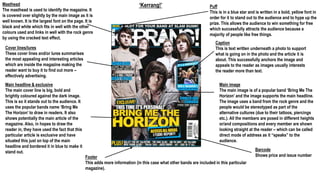
- 1. ‘Kerrang!’Masthead The masthead is used to identify the magazine. It is covered over slightly by the main image as it is well known. It is the largest font on the page. It is black and white which fits in well with the other colours used and links in well with the rock genre by using the cracked text effect. Cover lines/lures These cover lines and/or lures summarises the most appealing and interesting articles which are inside the magazine making the reader want to buy it to find out more – effectively advertising. Main headline & exclusive The main cover line is big, bold and brightly coloured against the dark image. This is so it stands out to the audience. It uses the popular bands name ‘Bring Me The Horizon’ to draw in readers. It also shows potentially the main article of the magazine. Also, in hopes to draw the reader in, they have used the fact that this particular article is exclusive and have situated this just on top of the main headline and bordered it in blue to make it stand out. Puff This is in a blue star and is written in a bold, yellow font in order for it to stand out to the audience and to hype up the prize. This allows the audience to win something for free which successfully attracts the audience because a majority of people like free things. Caption This is text written underneath a photo to support what is going on in the photo and the article it is about. This successfully anchors the image and appeals to the reader as images usually interests the reader more than text. Main image The main image is of a popular band ‘Bring Me The Horizon’ and the image supports the main headline. The image uses a band from the rock genre and the people would be stereotyped as part of the alternative cultures (due to their tattoos, piercings etc.). All the members are posed in different heights or/and compositions and every member are shown looking straight at the reader – which can be called direct mode of address as it “speaks” to the audience. Barcode Shows price and issue numberFooter This adds more information (in this case what other bands are included in this particular magazine).
- 2. ‘Kerrang!’The contents title/masthead is situated at the centre of the top of the page with the magazines title ‘Kerrang!’ positioned next to it. The use of the magazines masthead is to identify the magazine and create recognition throughout the magazine. The use of the colours white and yellow effectively stands out against the blue banner so that the reader knows what is on that page. This shows the date and the issue number – the issue number shows how pouplar the magazine is/ These are subheadings which are situated neatly on the right side of the page. These are used to order the different articles into sections which successfully makes it easier and quicker for the reader to find a particular article they want to read first.The main image features an artist of the rock genre from the well-know band, ‘We Are The In Crowd’ and is the largest image on this page. The image is rather bright which contradicts the rest of this magazines colour scheme and theme. It is instead rather “fun” and “expressive”. The artists hand positioning is almost as if reaching out to the reader and enticing them into reading that particular article. Sub-images shows previews of other articles included in the magazine. This is to stand out to the reader and make them read that particular article as images are more eye-catching than text. This is an editorial which is a comment by the editor of a magazine. This then creates a mode of address as it is involving and/or speaking directly to the audience. Page numbers make it easier for the reader to navigate through the magazine. A subscription encourages the audience to buy the magazine before even reading the magazine.
- 3. ‘Rock Sound’Puff This is a puff, although not in a large, appealing shape, it used text which is in capitals and different coloured text to stand out against the dark background. The use of the word “free” also stands out to the reader because a majority of people want free stuff and this hypes up the offer. Masthead The masthead is used to identify the magazine. It is covered over slightly by the main image as it is well known. It is the largest font on the page. It is white which stands out against the dark background and fits in well with the colour scheme used in the rock genre. Main Image The main image features different artists from different bands. The image supports the main headline. Each artist all could be stereotyped as part of the alternative cultures because of their outfits, hair, tattoos etc. All of the artists are positioned in different heights and compositions and are using aggressive facial expressions in order to potentially express themselves and to fit in with the main headlines story ‘We Predict A Riot.’ Props such as megaphones, broken glass bottles, bricks and baseball bats suggest the aggressiveness of the image and links in with the stereotypical portrayal of the violence of rock music or/and rock culture. Plus Bar This adds more information (in this case what other bands are included in this particular magazine). Barcode Presents price and issue number Main Headline The main headline is presented in a big bold font. It is coloured white which stands out against the dark image and the font is also cracked which implies it supports the articles theme and the main images atmosphere and mood of violence – linking in well with the rock genre. It uses popular different band members from different bands to draw in the reader. Strapline This includes the bands the members in the main image are from and supports the main headlines article.
- 4. ‘Rock Sound’ There is no mention of the contents page and no title shown for it. However, it does show the title of the magazine which is used to identify and spread recognition throughout the magazine. This shows the date and the issue number – due to the issue number this shows how popular the magazine is. This is the main features contents in the magazine and is positioned neatly on the left hand side of the page. Each article is page numbered and sub-headed with a name of a band. This makes it easier and quicker for the audience to find a particular article they want to read first. Page numbers are used to help the reader navigate through the magazine. This is the largest and only image used on this page of an artist from the well-known band ‘Papa Roach.’ He has piercings and tattoos which stereotypically gives off an alternative look which links in successfully with the rock genre. His facial expression would be classed as expressing himself and is quite intriguing and potentially draws the reader in.