
Recommended
More Related Content
What's hot
What's hot (20)
Viewers also liked
Similar to Nme front cover analysis
Similar to Nme front cover analysis (20)
Recently uploaded
Recently uploaded (20)
Nme front cover analysis
- 1. Nme front cover analysis
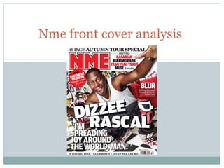
- 2. The masthead The masthead is shown to be in the first third of the magazine. It is in a large amount with the colour inside being red so that it will stand out to the target audience when they see it on the magazine stand. They have also put the masthead in the colour red so that it matches the colour scheme that is shown throughout the front cover. As well as this, the masthead is shown to a white and black line surrounding the masthead. This is used to also match the colour scheme as the selline, main cover line, puff of air, header and footer all have black and white coloured writing. The magazine is shown to be done in capital letters rather than lower case. This is so that the design is more bold and will therefore stand out to the target audience.
- 3. Sell lines The sell lines have been used to show what some of the subjects are inside and to show what they can expect from the articles that are inside the magazine. This sell lines have also been used to show the kind of musical artists that are in the magazine so that it attracts the attention of people who would not normally buy the magazine but may since their favourite music artists are inside the magazine. The sell lines are also shown to match the masthead as well as the colour scheme of the magazine by using the same font and by using the colours red, black and white. The sell lines are also used to show the niche market that the genre of the magazine is music, but is mainly used to show musical artists of different musical types. While blur has its own sell line, showing that it has been done this way as blur is more well known and more iconic, whereas many other artists shown are newer and therefore less well known, meaning they are given less attention.
- 4. footer The footer has been used to display some of the more bigger musical artists and to show a mixture of different musical genres from around the world that can be seen in the magazine. This is shown by how the footer displays rap(jay-z), electronic(the big pink), brit pop(the stone roses/Ian brown) and pop punk (paramore) and artists from both England and u.s.a. The footer is also used to grab the target audiences attention due to the bigger and more well known names that are included on the inside of the magazine.
- 5. Main image The Image is shown to be shot from a lower angle so that it makes dizzee rascal look bigger. The image conveys the media conventions by showing dazzee rascal giving direct address to the audience. The main image also suggest that the target audience will males from the age of 18 to 25 who are middle class, who live a lad like lifestyle drinking, partying, smoking etc.). This is due to the playfulness of the image and how the image does not take itself so seriously and is therefore seen as fun. However, the image does not suggest the ethnicity of the target audience as dizzee rascal has diverse supporters when it comes to race. The image is also shows a messy mise en scene, with graffiti plastering the walls, also portraying the image in the lad lifestyle.
- 6. Barcode, issue number and date. The front is shown to have a barcode, price and issue date. The price is shown so that the viewer is able to decide whether they would want to purchase the magazine based on the price the magazine has. The issue date is shown so that a first time viewer is able to see how long the magazine has been going on for, as well as showing regular readers whether this is the new issue they were expecting to get. Whereas the barcode is used so that the magazine can be scanned into a database where the price of the magazine will be added up along with the rest of the items.
- 7. Main cover line The main cover line is shown to be diagonal in big white writing. This is used so that it matches the colour scheme and so that it will grab the readers attention. The main cover line also possesses a grab quote alongside it, denoting happiness by saying he is going to spread joy around the world. This further denoted by having the image of dizzee rascal with a large smile on the cover, further perpetuating how he wants to spread happiness through his music. meanwhile the main cover line is large and spread across the whole page, showing how the cover line is in each third of the magazine, showing that it has been made large so that it grabs people attention.
- 8. header The header is shown to be saying what is inside the magazine and what kind of artists are available inside. This is used so that the target audiences interests are met with the magazine. The header also puts autumn tour special in bold. This is due to the magazine wanting to grab peoples attention, so they put the most important part of the sentence in bold.