
Recommended
More Related Content
What's hot
What's hot (19)
Viewers also liked
Similar to Front Cover Overview
Similar to Front Cover Overview (20)
Recently uploaded
Recently uploaded (20)
Front Cover Overview
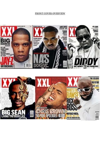
- 2. All front covers are from the front cover of XXL magazine and so they have all been designed with the intention of attracting fans of hip- hop/rap and R&B music. Through carrying out an investigation of them and by comparing them to each other, it is possible to identify shared features within them and to establish repeated patterns. The six front covers all feature typical magazine front cover conventions. We see expected general and layout conventions, such as the inclusion of a main image that dominates the front cover and sell- lines that surround the main image which relate to content inside and a masthead designed in an appropriate font. In addition to this, we see other repeated patterns. Each of the front covers features an artist or occasionally hip-hop crews as the main image. Obviously, we expect to see some kind of music artist on the front of a music magazine, but the consistent appearance of a single artist on XXL indicates that crews in hip-hop are not as popular because single artists are much more respected and seen as unique in the world of hip-hop/rap, however this is not the case with R&B. This is likely to be due to the famous say ‘money, power and respect’ which was in fact the main sell line for 50 Cents issue on XXL, hip-hop is all about being dominant and powerful and being in a crew takes that all away by sharing equity, finance and brand. Hip-hop culture is very stuborn; it is dominated by males which means sharing power, money or respect is not credible or accounted, as a result crews are not as popular today compared to the early era of hip-hop such as N.W.A, Public Enemy RUN DMC and G-unit. In each of the front covers, we can see that there is only one artist featured on the front cover. This composition is repeated consistently to indicate the importance and status of the unique artist, this is also shown by their body language and expressions as they are all different according to their own personalities in contribution to the hip-hop culture. This is, of course, a powerful and clever way of attracting the magazine’s target audience, as the artist’s own signiture personality expressions or body language is probably likely to be recognisable. This idea is taken a step further on the front cover featuring Jay-Z, positioned in the centre however slightly to the right sharing the centre with the
- 3. main sell line, in addition to being placed centrally, it is a way of showing his audience his ‘game face’ when it comes to ‘big business’. In addition, the artist featured is always male; Jay-Z is the one of the most successful rappers in the hip-hop industry and is also known for his business ventures which is another way he shows his success and power over the culture, which is the way XXL tries to achieve within each artist according to their individual personality. This applies to the smaller feature cover lines that are somehow associated or similar to Jay-Z e.g. 50 Cent. This serves to reflect the fact that the genre of hip- hop/rap – associated with agression, explicit language, arrogance and hardcore beats – is dominated by male artists. The fact that a female is not strong enough to handle the ‘big business’ of the industry, hence the reason females are unpopular in the hip-hop/rap culture. We can see other similarities in the mise-en-scene elements that are presented on each front cover. In terms of costume, the artists are united by the fact that they are all wearing either white or black, muted colours and costume that is fairly low key and relaxed (sportwear T- shirts, hoodies and sweatshirts etc) except for pop/R&B/hip-hop artist chris brown who is known for merging pop and hip-hop together coming out with a very unique style which is more widespread in terms of target audience. However, the simplicity of the clothing has been purposley achieved to show off the amount of jewlerry shown on each artist, this is done in hip-hop to prove and show wealth. This is a look that is fairly synonymous with artists within the genre of hip/hop. On one front cover, Rick Ross is wearing a white suit, which is a break away form the costume that we commonly see on XXL. This costume choice does indeed seem unprecedented, but could be a sign that the band ‘mean business’ or it could indicate his power beyond sports wear and can cross bridges to luxury suits and another type of power the industry isn’t use to, this is also related to his nick name mentioned as the sell line ‘Who’s the bawse?’refering to Rick Ross similarly known for his business ventures such as his music label Maybach Music Group. The unusual look would be more readily accepted by the audience, as Rick Ross always expresses in his music how he will be more than ‘hood’ successful which is why he is still repected and unique. However he still remains with his roots to hip-hop culture exposing the tattoos on his hands and his beard which is not usual neat for a suit and tie job. Big
- 4. dark luxury designer glasses seesm to be more popular too, maintaining the flaunt of wealth associated with this genre of music. On each front cover, the signature XXL masthead appears in exactly the same bold font and in exactly the same place. Each time, the masthead is of white letters surrounded by a red rectangle kown as a wob, establishing a bright, masculine and exciting mood. Without exception, the artist is always placed infront of the masthead so that it is not fully visible most times. This suggests the success and popularity that XXL has achieved as a publication, as it would be too much of an unwise move if the magazine was new, unestablished or did not have a loyal fanbase. Another repeated feature comes in the form of the main cover line and strapline that always sits directly across the entire XXL masthead. Each time, this is used to draw attention to the artists that will feature inside. On one of the front covers featuringJay-Z, for example, the audience is informed of his name and under it claiming he is untouchable, this tests authority and power which messes with male egos therefore intregues the readership to see whats so ‘untouchable’. A claim like this, of course, reminds us that the readership of XXL is likely to be an aspiring artist themselves. Furthermore, sell-lines feature quite brief. In the six front covers there is, alongside the main sell-line it features mainly other artists that will feature besides the artist on the main cover. It is always the name of the artist that is featured on the front as the main image, accompanied occasionally by further text, e.g. ’Big Sean. Living The Good Life’. This could be because of the fact that the frame has already been dominated by the main. It could also be due to the fact that the main artist featured is enough to sell the magazine. Finally, it could be because male audiences respond more to visuals; as we know, the core reader of XXL is male. Although there are few sell-lines as such, each front cover includes a list of more artists at the bottom that will appear inside, introduced with the word ‘plus’ and some artists that are associated with the main artist featured on the front cover. This is a great feature, as it allows the audience to see, at a glance, which artists will appear inside. The list-like structure also serves to suggest that there is a lot of artist- related content for the audience to enjoy e.g. up and coming mixtapes or exclusive interviews.
- 5. Colour-wise, XXL tends to stick to a similar colour scheme in each issue following their house style. White, Red and black feature most consistently and these three colours are accompanied by either grey or gold. Being primary colours, these will appeal to a male readership, while the use of black and white captures the heavy contrast which makes it bold, clear and simple which is visually appealing to men because of its simplicity. The red gives it brightness, especially on the masthead as it is usually covered by the artists head, which means even though its covered the brightness of the red will help pay attention to the masthead. Layout is fairly consistent across the six front covers too. As mentioned earlier, the placement of the artists featured is similar in each. Depending on the time of the issue and the artist sometimes the layout does change e.g. the latest XXL covers are the three featured at the bottom which all have in common that the sell-lines are placed as the background, compared to XXL in 2008, it is now the most recognized and most successful established hip-hop magazine which means they do not have to sell their magazine through information on the front cover to see what’s interesting but simply the image featured at the front, whether it’s the target audiences’ choice of artist to be interested in reading. However, all three do still feature clear main sell-lines of who the artist is and extra text to intrigue the readership. The remaining three at the top front covers, feature the main sell-line in the bottom left and one in the bottom center. Either way, this is a key area of the front cover where the audience’s eye will automatically go. The sell-lines are placed around the main image mostly in the left hand third not too close to the main sell-line, but where they can be seen next by the audience. The magazine does not need to use an instrumental in persuading the audience to buy the magazine as the slogan already reassures the audience that it is ‘hip-hop on a higher level’. Having carried out this overview, it is obvious that XXL has its own brand identity and signature look that can be easily recognized by its target audience. This is maintained through the repetition of stylistic and layout features from issue to issue and is a wonderful way of helping the magazine to sell and succeed.