This PowerPoint helps students to consider the concept of infinity.
Contents Page Analysis
1. Contents Page Analysis 2: Meek Mills - The Source Magazine
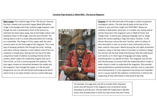
Main Image: The contents page of the ‘The Source’ features
hip-hop’s newest and successful rapper Meek Mill whose
image is the background of the contents page however, even
though the text is positioned in front of the picture no
attention has been taken away, due to the bright colours and
jewellery shown in the image, even the artist himself. The
setting seems to be in a street alley way where he is sitting
on a motorbike. The image is of the rapper with the same
costume worn on the front page of the magazine. This is one
way of showing symbiotic link through the artist, clothing
and colour scheme. However in this medium shot of him, he
composes a simple pose, leaning over the top of his bike,
using direct mode of address by looking directly into the
camera, which makes the readership imagine they are in
front of him, as if he is conversing with the audience. This
once again creates an interaction between the reader and
the magazine. Even though the rapper is in the focused
foreground, you can still see the blurred background which
seems to be in an urban location such as a street alley way.
Content: On the left hand side of the page is a black transparent
rectangular column. The title clearly states at the top of this
column in sans serif font, bright red ‘FEATURES’. Below are
subtitles in bold white, same font, in a smaller size, listing several
articles featured in this magazine such as ‘Walk of Fame’ and
‘Dawg’s Day’. It clearly uses colloquial language such as ‘dawg’
which the correct spelling is ‘dog’ this means ‘brother’. In the
African American culture the term ‘brother’ refers to others of
their kind which is seen as normal in their community and has
been used for many years. Mainly during the civil rights movement
however, today in hip-hop culture it has been re-named to ‘dawg’
this attracts the hip-hop readership because they will understand
such words, as it’s their type of language and enjoy reading
something that is so specific to them. This magazine uses formal
and informal ways to connect with the readership which creates a
wider choice in order to understand the magazine. This provides
some gratifications outlined by Bulmer and Kats such as, education
and entertainment; it is not supposed to be serious but enjoyable
so it’s a casual read for the audience. Furthermore, it informs the
readership of new information in the world of hip-hop.
For example, the page does not fail to include other important
artists that will feature in the magazine such as Kendrick Lamar,
Schoolboy Q and Ab-soul. This will allow the readership to identify
artists they already know or check out new artists they don’t know.
2. Layout: Besides the picture of the artist, there is a caption
of the page number that the artist will feature on. The size
of this page number suggests that the content on Meek
Mills is the main focal point of this issue. This will
particularly attract big fans of the artist as the magazine is
doing a special feature on him especially because he has
recently been well recognised in the industry with his
financial success and hit singles along with his albums and
mixtapes in the label Maybach Music.
Placed in front of the sub-headings are the page numbers,
clearly directing the readership to the different articles
available in the magazine. This is convenient for the reader
as they can easily find an article that they would like to read
giving them the choice of what order to read it in. For
example, the readership may want to read the light hearted
articles first before reading heavier articles like gun crime.
The magazine is simple and has a clear guide so that readers can easily find articles they wish to read.
The page also follows the consistent house style of the magazine using the colours used on the front
page such as red, white and black. This shows the edge of the genre hip-hop in the music industry. Also,
just like the front cover, the costume of the artist’s co-ordinates with the magazine’s house style which
is also makes the page look clean and professional.
The white font of the contents page states ‘MASTER PLAN’ which is
unusual as magazines usually names it ‘CONTENTS PAGE’. This goes
against the conventional features of a magazine suggesting that this
magazine is not just a booklet full of content, but a ‘MASTER PLAN’
that is something other magazine could not put together. Also, the
way the features come straight under it reveals what the master
plan has to offer and this will intrigue the audience to know why it is
superior to other magazines. On the top right-hand side of the
contents page is the issue number of the magazine; ‘NO. 254, this
suggests that vast amounts of issues published have been such a
success that they have been able to publish 254 issues. This will
make the audience aware of the magazines authority in the hip-hop
magazine market, and boosts its credibility. This will also persuade
the audience to buy the magazine illustrating to them the
popularity and high status of the magazine.
The numbers placed before the subtitles increase
numerically. These numbers are not close together, for
example after the subtitle ’60. Dawg’s Day’ follows ’68.
Ambitions of a Rider’, this connotes that the magazine has
other content in between these two articles, that hasn’t
been addressed in the contents page. Below each
subheading is a small amount of text describing to the
reader what the features will include, like a book has the
blurb at the back of it. By drip feeding the readership with
small amounts of information, they will be intrigued to see
all the content in which the magazine has to offer.
Similarly, it leaves the best till last on ‘68’ because that is
the main cover story which will create a build-up of
interest for the reader, while going through the magazine
until the end.
3. Colour Scheme: the colours used in this contents page are mainly of
black, red and white which are primary colours that appeal to a male
target audience. They are also bold and masculine, again appealing to
males and reflecting to the persona of hip-hop. These colours have
purposely been chosen not only to stand out but also because it shows
symbiotic link between the front cover and the contents page through
clothing and the masthead of the front cover with is ‘the source’ all in
black and red. This is an advantage because the readership will find it
easier to recognise the brand. It also matches the personality of the artist
Meek Mills, he is wearing a red biker leather jacket, and this shows he is
dangerous and ambitious. Also, it links to his cover line ‘ambitions of a
rider’ and that he ‘has the streets on lock’. This can be explained through
the iconography of the red motorbike, the thing that drives him to
ambition. The relation between the motorbike and the artist is through
the colours of red meaning they share qualities e.g. both being
dangerous.
Camera/Lighting: The lighting used in this shot is very
naturalistic and looks very real, which can be compared to
what the artist is trying to achieve, the background could
represent his past as it is behind him and how it was dark,
poor and scary to his present of him on an expensive
motorbike, expensive costume and jewellery which
requires no edits for the reason of realism in relation to
the story they are trying to tell. This medium shot shows
the artist and the camera angle eye-to-eye this suggests
the mode of address aimed at the readership is that the
artist and the readership are equal on some level, even
though he is successful and affluent he has come from
similar backgrounds of the target audience which means
they can aspire to be like the artist. A medium shot has
been used which is great for showing both body language
and facial expression. For example, there is a common
focus on the upper body as if we are sitting in front of
him, as he leans forward into the camera it is as if we are
communicating with the artist. His facial expression isn’t
posy at all it looks as if he is listening to someone talk.
This type of shot also shows us his wealth by visually
seeing his watch, chain and expensive costume.
The white used on this page allows the words to stand out in the page
indicating its importance. Meek Mills is wearing bright jewellery which is
conventional iconography used in a hip-hop magazine promoting his
success and wealth to the readership, the readership would aspire to be
as wealthy as it is a part of the culture and street credibility. The dull
coloured background of the streets and the poor conditions of the walls
show that he has moved on from that and is showing comparison
between then and now. It also shows just because of his fame and
fortune doesn’t mean he has forgotten about where he has come from
this can be represented through the background image of an alley way,
which scary, poor and somewhere a celebrity wouldn’t be seen in.
Font: The contents is called ‘Master Plan’, the font is a sans serif which is a common typeface to use in a
hip-hop magazine because it makes a bold and clear message. This typeface is used consistently
throughout the contents page. However, the size of the font varies according to what’s being said. For
example, titles and headings will be more bold and bigger e.g. ‘FEATURES’. Whereas the description box
of what will be in the magazine has the smallest font because it is descriptive.