Call Girls In Mumbai Central Mumbai ❤️ 9920874524 👈 Cash on Delivery
Jack rap mag contents page slides2
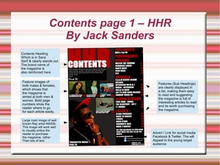
1. Contents page 1 – HHR
By Jack Sanders
Large main image of well
known Rap artist MASSI.
This image will work well
to visually entice the
reader to purchase
the magazine, rather
Than lots of text.
Contents Heading
Which is in Sans
Serif & clearly stands out.
The brand name of
the magazine is
also reinforced here
Feature images of
both males & females,
which shows that
the magazine is
aimed at both men &
woman. Bold page
numbers show the
reader where to go
for each article easily.
Advert / Link for social media
Facebook & Twitter. The will
Appeal to the young target
audience
Features (Sub Headings)
are clearly displayed in
a list, making them easy
to read and suggesting
the magazine is full of
interesting articles to read
and its worth purchasing
the magazine.
2. Contents page 1 - HHR
GENRE
I have chosen to analyse the contents page of HHR magazine. There are various ways in which you
can identify that the contents page of HHR magazine is Rap genre. Firstly, the largest image on the
page depicts an iconic image of an up and coming Rap artist MASSI wearing a tilted cap,
sunglasses and a gold chain or 'bling' around his neck. This image is an iconic sign, as he fully
represents all the stereotypes often associated with Rap artists and Rap music. The flashy jewellery
symbolises a successful, hard earned lifestyle of a typical rapper and the glamorous lifestyle they
lead. Being of Afro Caribbean ethnicity is often stereotypically linked with Rap music, as many of the
well known artists are from this ethnic group. This stereotypical image will allow the audience to
form an idea of the genre quite quickly.
TARGET AUIDENCE
The magazine is aimed at a young audience typically between the ages of 16-25, so the use of
these types of image will appeal to them. The image of MASSI used for the main picture appears to
show him as being wealthy, successful and happy, which will naturally appeal to the reader and
draw them towards the magazine. Rap lyrics often contain stories of how the artist has because
successful and the reader will associate these lyrics with the images used.
3. Contents page 1 - HHR
ICONIC, SYMBOLIC & INDEXICAL SIGNS
The main iconic image of the rapper is bold and although it is not in the centre of the magazine, it is
still in a prominent place to the bottom left hand corner of the page. The image is iconic because it
is stereotypical of how people perceive Rappers to look like. It is also a symbolic image, as it leads
the potential reader to want to find out more about the contents of the magazine. The camera angle
used is a close up and draws the reader of the magazine straight to this image. The producer of the
magazine, will want the audience to focus on the cool, flashy image they are portraying of the Rap
artist, with his expensive jewellery and nice trendy clothes. These indexical signs imply that the
Rapper lives a lavish lifestyle, which the reader will want to find out more about. Having him as the
main focus of the contents page will allow the audience to observe him, make a decision on the
genre of the magazine and then decide whether or not they will buy the magazine and want to read
it further.
4. Contents page 1 - HHR
TYPOGRAPHY, COLOUR SCHEME, CAMEREA SHOTS & LIGHTING
The lighting of the magazine shoot has been cleverly used to make the image of the rapper stand
out even more. The background of the magazine is very dark using blacks and grey, which are very
effective colours, as the audience will not distracted by the background and instead be drawn
towards the main images and headings, which will really stand out. Black is also a depressing, dark
& scary colour, which lends itself to the Rap music theme, as some of the lyrics can be quite dark.
Red lettering is often used in Rap magazine covers and contents pages, because it is a bold and
powerful colour. The colour Red represents danger, power and violence, which again can be
associated with Rap lyrics. The white lettering against the dark background also stands out.
The Contents heading is clearly placed at the top of the page, informing the reader that this is what
the page is for. It could be difficult to tell what the page was without this. The font used is bold and
stands out in an informing font, which looks more serious in comparison to the theme of the
magazine. The format is very clear as the contents page has been separated into sections i.e.
performance reviews and specials, which allows the reader to navigate the magazine easily and will
suit the target audience of young adults as don't like wasting time and want things easily
understandble.
5. Contents page 1 - HHR
SUB IMAGES / FEATURES
The other Images used are also stereotypical of the Rap music scene and will draw the reader to
the magazine. The images used are aimed at a young audience and will appeal to them. The
image of the young girl can be associated with many Rap video's and lyrics. Many Rap artists use
woman in videos and the lyrics often contain derogatory remarks about woman. The young males
in the images appear to be the same age range as the target audience, which will appeal to them.
The multiple images have page numbers next to them, so the reader knows easily where to find
each article.
PREFERRED & OPPOSITIONAL READING.
The preferred reading of this contents page highlights rappers as being all about image and wearing
flashy clothes and jewellery, to show off their glamorous lifestyle, which is often talked about in their
lyrics. This will appeal to the target audience for this magazine, as many people aspire to be
successful and own nice clothes and jewellery, which are status symbols of their wealth
The oppositional reading of this contents page is that Rap is a very arrogant and vain genre of
music that focuses too much on image rather than the music. The image of the young girl is a good
example of this, as many Rap music videos and images tend to objectify and almost de-humanize
woman This sends a negative message to teens that image is more important than hard work and
doing the right thing.
6. Contents page 2 – The Source
Main image of iconic Rap
artist Ice T, which is a
close up shot and takes
up the whole page.
This will attract fans of
Ice T and will appeal to
the target audience and
confirm the genre of the
Magazine.
Title of the magazine,
which reinforces the brand
Features/Sub Heading
are broken down
clearly, with large page
numbers, which will
appeal to the reader, as
it makes it easy to
navigate the magazine
and chose articles they
want to read easily.
The titles are catchy
with things like
“Ear to the Street”,
which makes the
reader feel the
magazine has inside
knowledge on what
Is going on.
The title for the features
is Departments, which
suggests the magazine
is modern which will
appeal to the reader
7. Contents page 2 – The Source
GENRE
The main image used for the contents page of this magazine is of a very well known and iconic Rap
artist Ice-T and will immediately stand out to the target audience for the magazine. They will be able
to identify the magazine as Rap genre straight away by this image.
TARGET AUDIENCE
Using well known artists is very common in magazines, as they are all competing for audience
numbers. If they have a well know artist on their main contents page, this will appeal to readers,
who have an appetite to learn everything they can about the artist. The main front cover and
contents page will sell the magazine, as this is what the potential reader will look at first, when
deciding if they want to make a purchase. The difference between using a well known and
established artist, verses a less well known artist can have huge affects on the reader circulation for
the magazine, pushing it from small numbers into a much larger main stream target audience. The
target audience for this magazine is between 16-25.
8. Contents page 2 – The Source
ICONIC, SYMBOLIC & INDEXICAL SIGNS
The iconic image of Ice T is very powerful as he is very well known artist, which will capture the
readers attention. The expression on his face is very hard, menacing and dark, which are all images
associated with Rap music and its lyrics.
TYPOGRAPHY, COLOUR SCHEME, CAMEREA SHOTS & LIGHTING
The camera angle used is a very close up shot, which adds to the dramatic effect. The colours
used are black and dark colours, which symbolise depressing, dark and often scary images, which
can be associated with Rap music. These types of colours are very commonly used in these types
of magazines The use of low lighting has also been very effectively used and it is only highlighting
the main image of Ice T, which makes it really stand out and gives the shot a very powerful and
emotive feel. The image symbolises Rap music, as many of the lyrics have a dark, aggressive
theme to them. The layout and font used is quite simple and is broken down into sections, which
makes it easier for the reader to navigate to the articles which interest them in the magazine. As
the colour scheme is quite minimalistic with only dark colours, red & white this makes the contents
page look simple and more music focused.
9. Contents page 2 – The Source
SUB HEADINGS
The sub title headings used highlight the main topics for the magazine and will appeal to the reader.
They are around playlists, reviews with artists and news, with headings like “Ear to the Street”.
These articles will appeal to the target reader and will encourage the person to buy the magazine as
they will want to read the articles in full. The white and red colours used for the wording of these
headings make them really stand out against the dark background. This makes it easier for the
potential reader to quickly pick out subjects which they might be interested in.
PREFERRED & OPPOSITIONAL READING
The preferred reading of the magazine is drawing the reader towards the reviews with various artists
and news stories. Having Ice T as an iconic image will really stand out to the reader. The editors of
the magazine will want to use as many relevant and up to date reviews and artists as possible.
Society has an insatiable appetite for information and they interested in the lives that Rap artists
and their associated entourage lead. In contrast the oppositional readers will believe that the
image used of Ice T and his menacing pose will give young readers a negative image.
11. A comparison
Having reviewed both contents pages for both HHR and The Source magazines I have made the
following comparisons - Both magazines are using iconic and well know Rap artists as the main
focus image for the page. The lighting in both contents pages is quite dark, which symbolises Rap
music as being quite hard, controversial and talking about dark topics. Both magazines used dark
colours for the background with bold font in red and white, which really stands out. The layout is
simple and broken down into sections for each contents page, allowing the reader to chose the
topics they are interested in easily without having to waste time, which will appeal to a young target
audience.
I feel that the first contents page for HHR magazine shows off a more positive side to Rap culture,
as the image of MASSI is quite positive, showing him smiling, with nice trendy clothes and
expensive jewellery, which gives the impression of a successful person. I think HHR magazine
would appeal to the younger end of the target market, as the images are all of younger people,
whereas The Source would appeal to the older end of the target audience as the appearance of the
contents page appears to be more serious and all about the music and featured articles. The
positive image of MASSI used in HHR, will appeal to the target audience of young people who will
have aspirations of being successful themselves. In contrast the contents page for The Source
magazine gives off a very different feel. Ice-T is shown with a very menacing look on his face
wearing a hood, which can often be associated with gangsters and a violent nature. This creates a
very serious and hard feel to the page. It reflects more on the danger, violence and gang related
lifestyle of Rappers often portrayed in Rap videos and lyrics. However the image of Ice T will also
appeal to many readers as he is such a well know and successful artist.