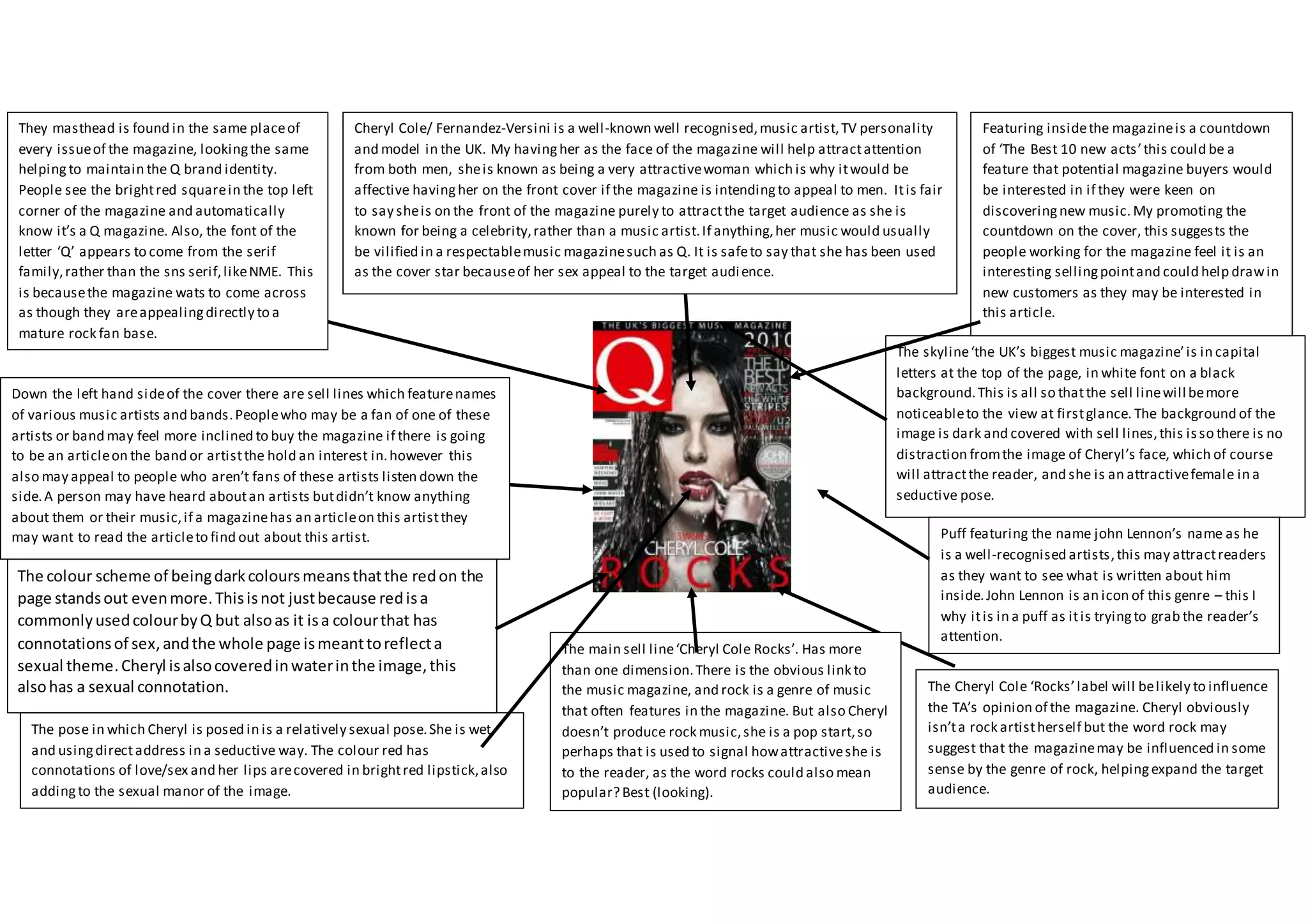
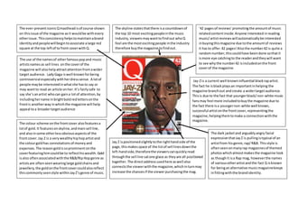
Puff featuring the name john Lennon’s name as he
is a well-recognised artists,this may attractreaders
as they want to see what is written about him
inside.John Lennon is an icon of this genre – this I
why itis in a puff as itis tryingto grab the reader’s
attention.
Cheryl Cole/ Fernandez-Versini is a well-known well recognised,music artist,TV personality
and model in the UK. My havingher as the face of the magazine will help attractattention
from both men, sheis known as being a very attractivewoman which is why itwould be
affective havingher on the front cover if the magazine is intendingto appeal to men. Itis fair
to say sheis on the front of the magazine purely to attractthe target audience as she is
known for being a celebrity,rather than a music artist.If anything,her music would usually
be vilified in a respectablemusic magazinesuch as Q. It is safeto say that she has been used
as the cover star becauseof her sex appeal to the target audience.
Featuring insidethe magazineis a countdown
of ‘The Best 10 new acts’this could be a
feature that potential magazine buyers would
be interested in if they were keen on
discoveringnew music. My promoting the
countdown on the cover, this suggests the
people working for the magazine feel it is an
interesting sellingpointand could help drawin
new customers as they may be interested in
this article.
The main sell line‘Cheryl Cole Rocks’. Has more
than one dimension.There is the obvious link to
the music magazine, and rock is a genre of music
that often features in the magazine. But also Cheryl
doesn’t produce rock music,she is a pop start,so
perhaps that is used to signal howattractiveshe is
to the reader, as the word rocks could also mean
popular? Best (looking).
The Cheryl Cole ‘Rocks’label will belikely to influence
the TA’s opinion of the magazine. Cheryl obviously
isn’ta rock artistherself but the word rock may
suggest that the magazinemay be influenced in some
sense by the genre of rock, helpingexpand the target
audience.
Down the left hand sideof the cover there are sell lines which featurenames
of various music artists and bands.Peoplewho may be a fan of one of these
artists or band may feel more inclined to buy the magazine if there is going
to be an articleon the band or artistthe hold an interest in.however this
also may appeal to people who aren’t fans of these artists listen down the
side.A person may have heard aboutan artists butdidn’t know anything
about them or their music,if a magazinehas an articleon this artistthey
may want to read the articleto find out about this artist.
They masthead is found in the same placeof
every issueof the magazine, lookingthe same
helping to maintain the Q brand identity.
People see the brightred squarein the top left
corner of the magazine and automatically
know it’s a Q magazine. Also, the font of the
letter ‘Q’ appears to come from the serif
family,rather than the sns serif,likeNME. This
is becausethe magazine wats to come across
as though they areappealingdirectly to a
mature rock fan base.
The pose in which Cheryl is posed in is a relatively sexual pose.She is wet
and usingdirectaddress in a seductive way. The colour red has
connotations of love/sex and her lips arecovered in brightred lipstick,also
addingto the sexual manor of the image.
The skyline‘the UK’s biggest music magazine’is in capital
letters at the top of the page, in white font on a black
background.This is all so thatthe sell linewill bemore
noticeableto the view at firstglance. The background of the
image is dark and covered with sell lines,this isso there is no
distraction fromthe image of Cheryl’s face, which of course
will attractthe reader, and she is an attractivefemale in a
seductive pose.
The colour scheme of beingdarkcoloursmeansthatthe redon the
page standsout evenmore.Thisisnot justbecause redisa
commonlyusedcolourbyQ but alsoas it isa colourthat has
connotationsof sex,andthe whole page ismeanttoreflecta
sexual theme.Cheryl isalsocoveredinwaterinthe image,this
alsohas a sexual connotation.
Jay-Zis a current well knowninfluential blackrapartist.
The fact he isblackplaysan importantinhelping the
magazine branchout and create a widertargetaudience.
Thisis due to the fact that youngerblack/non-white music
fansmay feel more includedtobuythe magazine due to
the fact there isa youngernon-white well known,
successful artistonthe frontcover,representingthe
magazine,helpingthemtomake a connectionwiththe
magazine.
The ever-presenticonicQmasthead isof course shown
on thisissue of the magazine asit wouldbe withevery
otherissue. Thisconsistencyhelpstomaintainabrand
identityandpeoplewillbegintoassociate alarge red
square at the top leftof ta front coverwithQ.
The use of the namesof otherfamouspopand music
artistsnamesas sell lines onthe coverof the
magazine will alsohelpattractattentionfromawider
target audience. LadyGaga iswell knownforbeing
controversial especiallywithherdresssense. A lotof
people maybe interestedinwhatshe hasto say or
may wantto read an article onher. It’s fairlysafe to
say she’sanartist whocan gaina lotof attention,by
includinghername inbrightboldredlettersonthe
frontis anotherway inwhichthe magazine will help
appeal toa broadertargetaudience
’42 pagesof reviews’promotingthe amountof music
relatedcontentinside.Anyone interested inreading
music/artistreviewswillautomaticallybe interested
inbuyingthismagazine due tothe amountof reviews
it hasto offer.42 pages! Alsothe number42 is quite a
randomnumber,thiscouldhave beendone sothatit
ismore eye catchingto the readerandtheywill want
to see whythe number42 isincludedonthe front
coverof the magazine.
The skyline statesthatthere isa countdownof
the top 10 most excitingpeopleinthe music
industry,viewersmaywanttofindout whoQ
feel are the mostexcitingpeople inthe industry
therefore buythe magazine tofindout.
The dark jacketand arguablyangry facial
expressionthatJayZ is pullingistypical of an
artistfrom hisgenre,rap/R&B. Thisstyle is
oftenseenonmanyrap magazinesof themed
photoswhichalmostmakesthe magazine look
as thoughit isa Rap mag, howeverthe names
of variousotherartistand the fact Q isknown
for beinganalternative musicmagazinekeeps
infittingwiththe brandidentity.
The colour scheme onthe frontcover alsofeaturesa
lotof gold.It featuresonskyline,andmainsell line,
and alsoinsome otherlessobviousaspectsof the
frontcover.Jay Z is a verywealthyhiphopartistand
the colourgoldhas connotationsof moneyand
expenses.The reasongoldissoprominentonthe
coverfeaturinghimcouldbe to reflecthiswealth. Gold
isalso oftenassociatedwiththe R&B/RipHopgenre as
artistsare oftenseenwearinglarge goldchainsand
jewellery,the goldonthe frontcovercouldalsoreflect
thiscommonlyseenstyle withinJayZ’sgenre of music.
Jay Z ispositionedslightlytothe righthandside of the
page,thismakesspace of the listof sell linesdownthe
left-handside,thereforethe viewerscanquicklyread
throughthe sell line satone glace as theyare all positioned
together.The directaddressusedhere as well also
connectsthe viewerwiththe magazine,whichinturnmay
increase the chancesif the viewerpurchasingthe mag.
Movingon fromlookingatmagazinesproducedbyQ,
as youcan see thisisa magazine producedbyNME
and there are a fewcleardifferences.The most
noticeable differentfeature betweenthe two
magazinesare theiriconicmastheads.The redNME
mast headinthe top leftof the page iseverpresent
throughouteverycopywhichhelpsmaintainthe NME
brand identity.
Liam Gallagher,one of the mostinfluential,controversial
and well knowmusicartistsinrecenthistory. He will no
doubtable be putdownas a legendof isera. The fact that
he is so well knownandisa legendwithinthe music
industrywill drawattentiontothe coverof the magazine
as soonas it isviewedbya memberof the public.
Howeverhe isn’tonlyknownforbeingalegend.Infacthe
drewquite a lotof attentiontohimself inanegative/
controversial light, whichisanotherreasonforwhyhaving
himon the frontwill gain attention.Usuallyif amagazine
has chosentofeature an artist on the coverit means
informationoraninterviewregardingthatartistwill
feature inside themmagazine.Due the controversial
nature of Gallagherandhowhe is knownforbeing
outspoken,people maysee himonthe frontandfeel more
inclinedtopurchase the magazine astheywantto see
whathe has to say,as he has a reputationbeingout
spoken.
The photo of GallagherisI blackand white howeverthe
majorityof the importanttextsurroundinghimisinred
(some isalsoinblack andwhite).Thismaybe because
the photoof Gallagherisso bigand due to his
reputationmostof the attentionof the viewerwill end
of onGallagher,the textsurroundinghimwillbecome
irrelevant. Howeverbymakinghimblackandwhite and
the textaroundhimred takessome of the focusoff him
and pullsitback ontothe textas well.This issothe text
becomesrelevantasa feature onthe cover as well and
isn’tforgottenaboutandoverlookeddue tothe fact
Liam Gallagherfeaturesonthe front.
The cover alsofeaturesnamesof otherwell-knownalternative/indie
rock bandsas sell lines.Examplesof otherfeaturingartistsinclude…
Arctic Monkeys,TwoDoor CinemaClubandLana Del Rey.Thisalso
offersa pointof interestforabroader TargetAudience asif they
aren’tparticularlyinterestedinGallagherthenthe magazine offers
contenton more currentmusic. Thiswill helptoappeal toa younger
target audience, asLiamisfromOasiswhoare an olderband,
youngerfansof indie rockmay notbe sucha huge fanof his,
therefore byincludingalistof currentindie rockbandsas sell lines,
ensuresthatthere issomethingforall agesof indie rockfanson the
cover.
The biggesttextonthe page isthe
word‘Liam’by ensuringthathisname
isbiggerthan the mast headNME are
essentiallyglorifyinghimand
suggestingthathe isbiggerthanthe
magazine.Thisisdue to the fact he is
fromwhat isconsideredthe most
importantandflagshipindie rock
bands.
As I’ve mentionedonthispage
before Liamisknownforbeing
controversial. Wellnextto
‘Liam’inbig redfontit states
that he ‘answersyourquestions’
whichsuggeststhathe will be
speakingabouttopicsthatthe
readerwouldbe interestedin
hearhim speakabout.Thisagain
isan incentive forthe readerto
purchase the magazine.
Anotherreasonforthe use of blackand white forthe image of Liam
isdue to the fact Liamis iconicwithinthe indierockgenre,sothe
blackand white reflectshisimportance andthe facthe has been
producingmusicformany years,almostmakinghisappearolder
than he is.
Liam iswearingsunglasses
and notmakingdirect
address,whichisunusual for
a cover star.Usuallydirect
addressisto connectthe
viewerwiththe magbut
Liam doesn’tdothisas him
intentionallynotmakinga
connectionwiththe viewer
reflectshiswell-known
arrogance.
Front Cover Analysis

Front Cover Analysis

  • 1.
    Puff featuring thename john Lennon’s name as he is a well-recognised artists,this may attractreaders as they want to see what is written about him inside.John Lennon is an icon of this genre – this I why itis in a puff as itis tryingto grab the reader’s attention. Cheryl Cole/ Fernandez-Versini is a well-known well recognised,music artist,TV personality and model in the UK. My havingher as the face of the magazine will help attractattention from both men, sheis known as being a very attractivewoman which is why itwould be affective havingher on the front cover if the magazine is intendingto appeal to men. Itis fair to say sheis on the front of the magazine purely to attractthe target audience as she is known for being a celebrity,rather than a music artist.If anything,her music would usually be vilified in a respectablemusic magazinesuch as Q. It is safeto say that she has been used as the cover star becauseof her sex appeal to the target audience. Featuring insidethe magazineis a countdown of ‘The Best 10 new acts’this could be a feature that potential magazine buyers would be interested in if they were keen on discoveringnew music. My promoting the countdown on the cover, this suggests the people working for the magazine feel it is an interesting sellingpointand could help drawin new customers as they may be interested in this article. The main sell line‘Cheryl Cole Rocks’. Has more than one dimension.There is the obvious link to the music magazine, and rock is a genre of music that often features in the magazine. But also Cheryl doesn’t produce rock music,she is a pop start,so perhaps that is used to signal howattractiveshe is to the reader, as the word rocks could also mean popular? Best (looking). The Cheryl Cole ‘Rocks’label will belikely to influence the TA’s opinion of the magazine. Cheryl obviously isn’ta rock artistherself but the word rock may suggest that the magazinemay be influenced in some sense by the genre of rock, helpingexpand the target audience. Down the left hand sideof the cover there are sell lines which featurenames of various music artists and bands.Peoplewho may be a fan of one of these artists or band may feel more inclined to buy the magazine if there is going to be an articleon the band or artistthe hold an interest in.however this also may appeal to people who aren’t fans of these artists listen down the side.A person may have heard aboutan artists butdidn’t know anything about them or their music,if a magazinehas an articleon this artistthey may want to read the articleto find out about this artist. They masthead is found in the same placeof every issueof the magazine, lookingthe same helping to maintain the Q brand identity. People see the brightred squarein the top left corner of the magazine and automatically know it’s a Q magazine. Also, the font of the letter ‘Q’ appears to come from the serif family,rather than the sns serif,likeNME. This is becausethe magazine wats to come across as though they areappealingdirectly to a mature rock fan base. The pose in which Cheryl is posed in is a relatively sexual pose.She is wet and usingdirectaddress in a seductive way. The colour red has connotations of love/sex and her lips arecovered in brightred lipstick,also addingto the sexual manor of the image. The skyline‘the UK’s biggest music magazine’is in capital letters at the top of the page, in white font on a black background.This is all so thatthe sell linewill bemore noticeableto the view at firstglance. The background of the image is dark and covered with sell lines,this isso there is no distraction fromthe image of Cheryl’s face, which of course will attractthe reader, and she is an attractivefemale in a seductive pose. The colour scheme of beingdarkcoloursmeansthatthe redon the page standsout evenmore.Thisisnot justbecause redisa commonlyusedcolourbyQ but alsoas it isa colourthat has connotationsof sex,andthe whole page ismeanttoreflecta sexual theme.Cheryl isalsocoveredinwaterinthe image,this alsohas a sexual connotation.
  • 2.
    Jay-Zis a currentwell knowninfluential blackrapartist. The fact he isblackplaysan importantinhelping the magazine branchout and create a widertargetaudience. Thisis due to the fact that youngerblack/non-white music fansmay feel more includedtobuythe magazine due to the fact there isa youngernon-white well known, successful artistonthe frontcover,representingthe magazine,helpingthemtomake a connectionwiththe magazine. The ever-presenticonicQmasthead isof course shown on thisissue of the magazine asit wouldbe withevery otherissue. Thisconsistencyhelpstomaintainabrand identityandpeoplewillbegintoassociate alarge red square at the top leftof ta front coverwithQ. The use of the namesof otherfamouspopand music artistsnamesas sell lines onthe coverof the magazine will alsohelpattractattentionfromawider target audience. LadyGaga iswell knownforbeing controversial especiallywithherdresssense. A lotof people maybe interestedinwhatshe hasto say or may wantto read an article onher. It’s fairlysafe to say she’sanartist whocan gaina lotof attention,by includinghername inbrightboldredlettersonthe frontis anotherway inwhichthe magazine will help appeal toa broadertargetaudience ’42 pagesof reviews’promotingthe amountof music relatedcontentinside.Anyone interested inreading music/artistreviewswillautomaticallybe interested inbuyingthismagazine due tothe amountof reviews it hasto offer.42 pages! Alsothe number42 is quite a randomnumber,thiscouldhave beendone sothatit ismore eye catchingto the readerandtheywill want to see whythe number42 isincludedonthe front coverof the magazine. The skyline statesthatthere isa countdownof the top 10 most excitingpeopleinthe music industry,viewersmaywanttofindout whoQ feel are the mostexcitingpeople inthe industry therefore buythe magazine tofindout. The dark jacketand arguablyangry facial expressionthatJayZ is pullingistypical of an artistfrom hisgenre,rap/R&B. Thisstyle is oftenseenonmanyrap magazinesof themed photoswhichalmostmakesthe magazine look as thoughit isa Rap mag, howeverthe names of variousotherartistand the fact Q isknown for beinganalternative musicmagazinekeeps infittingwiththe brandidentity. The colour scheme onthe frontcover alsofeaturesa lotof gold.It featuresonskyline,andmainsell line, and alsoinsome otherlessobviousaspectsof the frontcover.Jay Z is a verywealthyhiphopartistand the colourgoldhas connotationsof moneyand expenses.The reasongoldissoprominentonthe coverfeaturinghimcouldbe to reflecthiswealth. Gold isalso oftenassociatedwiththe R&B/RipHopgenre as artistsare oftenseenwearinglarge goldchainsand jewellery,the goldonthe frontcovercouldalsoreflect thiscommonlyseenstyle withinJayZ’sgenre of music. Jay Z ispositionedslightlytothe righthandside of the page,thismakesspace of the listof sell linesdownthe left-handside,thereforethe viewerscanquicklyread throughthe sell line satone glace as theyare all positioned together.The directaddressusedhere as well also connectsthe viewerwiththe magazine,whichinturnmay increase the chancesif the viewerpurchasingthe mag.
  • 3.
    Movingon fromlookingatmagazinesproducedbyQ, as youcansee thisisa magazine producedbyNME and there are a fewcleardifferences.The most noticeable differentfeature betweenthe two magazinesare theiriconicmastheads.The redNME mast headinthe top leftof the page iseverpresent throughouteverycopywhichhelpsmaintainthe NME brand identity. Liam Gallagher,one of the mostinfluential,controversial and well knowmusicartistsinrecenthistory. He will no doubtable be putdownas a legendof isera. The fact that he is so well knownandisa legendwithinthe music industrywill drawattentiontothe coverof the magazine as soonas it isviewedbya memberof the public. Howeverhe isn’tonlyknownforbeingalegend.Infacthe drewquite a lotof attentiontohimself inanegative/ controversial light, whichisanotherreasonforwhyhaving himon the frontwill gain attention.Usuallyif amagazine has chosentofeature an artist on the coverit means informationoraninterviewregardingthatartistwill feature inside themmagazine.Due the controversial nature of Gallagherandhowhe is knownforbeing outspoken,people maysee himonthe frontandfeel more inclinedtopurchase the magazine astheywantto see whathe has to say,as he has a reputationbeingout spoken. The photo of GallagherisI blackand white howeverthe majorityof the importanttextsurroundinghimisinred (some isalsoinblack andwhite).Thismaybe because the photoof Gallagherisso bigand due to his reputationmostof the attentionof the viewerwill end of onGallagher,the textsurroundinghimwillbecome irrelevant. Howeverbymakinghimblackandwhite and the textaroundhimred takessome of the focusoff him and pullsitback ontothe textas well.This issothe text becomesrelevantasa feature onthe cover as well and isn’tforgottenaboutandoverlookeddue tothe fact Liam Gallagherfeaturesonthe front. The cover alsofeaturesnamesof otherwell-knownalternative/indie rock bandsas sell lines.Examplesof otherfeaturingartistsinclude… Arctic Monkeys,TwoDoor CinemaClubandLana Del Rey.Thisalso offersa pointof interestforabroader TargetAudience asif they aren’tparticularlyinterestedinGallagherthenthe magazine offers contenton more currentmusic. Thiswill helptoappeal toa younger target audience, asLiamisfromOasiswhoare an olderband, youngerfansof indie rockmay notbe sucha huge fanof his, therefore byincludingalistof currentindie rockbandsas sell lines, ensuresthatthere issomethingforall agesof indie rockfanson the cover. The biggesttextonthe page isthe word‘Liam’by ensuringthathisname isbiggerthan the mast headNME are essentiallyglorifyinghimand suggestingthathe isbiggerthanthe magazine.Thisisdue to the fact he is fromwhat isconsideredthe most importantandflagshipindie rock bands. As I’ve mentionedonthispage before Liamisknownforbeing controversial. Wellnextto ‘Liam’inbig redfontit states that he ‘answersyourquestions’ whichsuggeststhathe will be speakingabouttopicsthatthe readerwouldbe interestedin hearhim speakabout.Thisagain isan incentive forthe readerto purchase the magazine. Anotherreasonforthe use of blackand white forthe image of Liam isdue to the fact Liamis iconicwithinthe indierockgenre,sothe blackand white reflectshisimportance andthe facthe has been producingmusicformany years,almostmakinghisappearolder than he is. Liam iswearingsunglasses and notmakingdirect address,whichisunusual for a cover star.Usuallydirect addressisto connectthe viewerwiththe magbut Liam doesn’tdothisas him intentionallynotmakinga connectionwiththe viewer reflectshiswell-known arrogance.