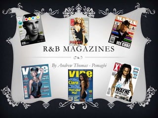
2. R&B MAGAZINE
Here relating to the R&B
genre the celebrity (Nas) has
serious face emphasising the
mise en scene of the
magazine. I can see it is a well
known magazine (XXL) as the
central image covers the L.
Nas’ name written in big which
would attract the target audience
of this magazine
Limited use of colour here
especially that they are dark and
grimey linking with the genre
of the magazine.
Nas is wearing a big silver chain
which would automatically attract
the target audience
The names of other celebrities in the
R&B industry in the cover story as it
would attract different niche
audience as not all people of the
target audience may be interested in
Nas.
3. R&B MAGAZINE
Barcode clearly stated on the
magazine
Central image covers the
masthead probably showing that
is a well known magazine
Blue, red and black main colours
used of the cover. Mise en scene:
ecstatic colours used relating
with the Masthead of VIBE also
linking with the music genre thus
attracting the target audience
T.I who is a famous R&B
celebrity used as central image
and covering most of the
magazine. Tilted hat and with a
scrunched up and serious face
with hands folded used to attract
the target audience.
T.I. names written in big
attracting target audience
and main story written in
bold under it. Mise en
scene: not only one colour
used in the text making it
more interesting to read
and more eye-catching
when looking at it.
4. R&B MAGAZINE
Masthead written in bold and is the
biggest text on the cover page. All
in one colour (red)
Jay z a famous R&B celebrity
as the central image and his
name clearly written in the
main story which is also in
big text and not close to the
other cover stories on the
page.
Jay z is presented to have a
serious straight face with
no emotion. Wearing all
black with black beads
around neck showing how
he is superior and
respected figure in R&B.
Mise en scene: cover stories
linking with the music genre
of the magazine e.g. LCD
sound system
(advertisement used here
which would attract the
target audience)
5. R&B MAGAZINE
Featured stories, subjects which may
pop up in the magazine
Vibrant colours used here however
limited use nut still attracts audience
as it relates to the music genre of the
magazine.
Rick Ross name written in big,
attract the words ‘ross’ and ‘boss’
rhyming together. Next in
importance to the mast head as
his name is in the main cover
story and is almost same size in
text. He is also wearing a suit
which is not a norm of someone
who is a celebrity of that genre.
Masthead/title text written in bold
and a different colour to the other
text on the page highlighting its
importance Banner – grabs attention to the
reader not too much text and
gives an interesting insight of
what yet to come in the
magazine
Issue date written in small
date to masthead
6. R&B MAGAZINE
GQ, which stands for
gentleman's quarterly which is a
up market lifestyle magazine.
As you can see the central image is used
effectively as is linked with the magazine
name. This is shown through the mix of
Kanye West who is a famous R&B rapper
who normally dresses in urban clothes is
wearing a suit with a sharp haircut and
what I would say an approachable face
which is contrasted to the scrunched up
and serious face which is normally in an
R&B magazine.
Cover stories involve other big
R&B stars whose names are
written in a bold and bigger text
different to the smaller different
colour text (light blue) under it.
Furthermore you can see from
the magazine that it is up
market through the limited use
of colour: blue, white and black
especially with blue and white
which are simplistic and elegant
colours relating to the audience
at focus.
Also the celebrities name written
in bold highlights the relevance of
the magazine which links to the
central image and draws attention
to the target audience.
8. POP MAGAZINE- TOP OF
THE POPS
Masthead covered by central
images perhaps showing the
importance of the central
image (Justin Bieber being a
famous celebrity amongst
teenagers). Also it shows that
it is a well known magazine as
the whole title doesn’t have to
be shown.
A lot of pink used perhaps
attracting the target audience
(girls from 14 and under)
Barcode and issue date clearly
shown at the bottom of the
magazine
A lot of images used
contrasting to a normal
adult magazine relating to
the target audience as it may
be to attract children 6 to 14
Compared to an R&B
magazine in images people are
smiling perhaps relating to the
genre of the magazine,(pop)
9. CLASSIC ROCK
Featured story at the top
of the magazine in a
different colour to
masthead
The font of the Masthead has
it own rocky font contrasting
to the other R&B magazine as
they where vibrant or
simplistic also the main colour
of the magazine is grey and
the central image, who is Jimi
Hendrix a famous classic rock
artist, his face is edited to a
black colour to match the
colour of the magazine thus
suiting the genre of the
magazine which classic rock.
Gifts at the top left of the
magazine written in bold and
could clearly be seen on the
magazine, something which
would attract customers.
Barcode at the bottom of the
page
Limited use of colour relating to the
theme of magazine, colours which are
not to vibrant as such things wouldn’t
attract the target audience.
10. COUNTRY ROCK
Barcode with the team rock logo
which is often placed on rock
magazine
Dolly Parton a famous
Country Rock musician as the
central image. Her importance
is highlighted as she takes
most of the magazine and
feeds into a bit of the
magazine. Furthermore to
attract target audience she is
dressed in the usual country
rock clothing. Contrasting to
an R&B magazine she is
smiling probably to show the
simplicity of the genre as
country rock may be a calming
music.
Not a lot of cover stories on
the magazine perhaps
highlighting importance of
the central image as her being
good enough to attract the
target audience to buy the
magazine.
The font of text in the rock
is different to the font on
the country perhaps
showing theirs a hard side
and softer side to country
rock
11. BLUES MAGAZINE
Contrasting to a R&B magazine
a lot of different interesting
fonts are used here perhaps
linking with the cool vibe of the
genre which is blues. Blues being
music that one would relax to
Abbreviations illustrate the
attention to the target audience
as only one who is interested in
the genre of music and listens to
it would normally know what
B.B. means.
Masthead is a different colour
to the rest of the text on the
page, in a graffiti font
something which would relate
to the genre of music and
would attract and be of
interest to the target audience.
Central image takes most of the
magazine I would suggest that he
is the B.B. KING. He is
presented smoking while playing
the guitar perhaps relating to the
soothing atmosphere of the
genre. Also the picture is taken in
black and white, linking to the
blues being an old school type of
music.
12. HOUSE MAGAZINE
Vibrant colours used
associating with the genre of
music to the magazine.
Promotions at the top
of page, clubs being
something that of high
interest to those who
listen to house music.
Free gift clear at the top left of
page, persuading customer to
buy magazine.
Masthead relating to the genre
of music, ‘mixmag’ generally
linking with house music as you
often mix beats together to
make a song.
Cover stories made in same
colour to the title, mise en
scene as the colour pink will
show that it is of importance.
Central image used to attract the
audience, Calvin Harris’ name
written in bold and is the biggest
text of the page (after the
masthead) showing him being of
high importance on the magazine.
He is also wearing funky glasses
and simplistic clothing thus
relating to the genre of magazine
and matching Calvin Harris’
persona.