
Recommended
More Related Content
What's hot
What's hot (17)
Viewers also liked
Viewers also liked (20)
Similar to Nme contents page
Similar to Nme contents page (20)
More from asmediac14
More from asmediac14 (20)
Recently uploaded
Recently uploaded (20)
Nme contents page
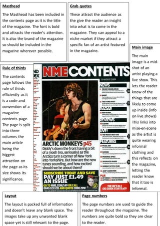
- 1. Masthead The Masthead has been included in the contents page as it is the title of the magazine. The font is bold and attracts the reader’s attention. It is also the brand of the magazine so should be included in the magazine wherever possible. Rule of thirds The contents page follows the rule of thirds efficiently as it is a code and convention of a magazine contents page. The page is split into three columns the main article being the biggest attraction on the page as its size shows its significance. Grab quotes These attract the audience as the give the reader an insight into what is to come in the magazine. They can appeal to a niche market if they attract a specific fan of an artist featured in the magazine. Layout The layout is packed full of information and doesn’t leave any blank space. The images take up any unwanted blank space yet is still relevant to the page. Main image The main image is a mid-shot of an artist playing a live show. This lets the reader know of the things that are likely to come up inside (info on live shows) This links into mise-en-scene as the artist is quite wearing informal clothing and this reflects on the magazine, letting the reader know that it too is informal. Page numbers The page numbers are used to guide the reader throughout the magazine. The numbers are quite bold so they are clear to the reader.