9953330565 Low Rate Call Girls In Rohini Delhi NCR
Media contents analysis
1. Main Heading/ Title
The heading is branded for the reader to
remember what they are reading. The
masthead is after the magazines name because
it is not as important as the magazine itself.
The colour of the “contents” is black and white
to make the “NME” stand out even more. This
is useful because the name of the magazine is
highlighted. The font in the title is harsh to
reflect the genre of rock music. This adds
interest to the reader..
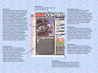
Main Image
The shot type on this image is a medium long
shot (MLS) to show the subject in the image
and their pose. The Mise-en-scene describes
the genre of the magazine by adding things
that are stereotypical to the genre. For
instance, in this photograph there is a female
dressed in a particular way with dark makeup
and bleach blonde hair. This connotes the
genre of rock which is contributed throughout
the magazine. This means that the magazine is
aimed at those who have an interest in rock
music. The bus in the background links to the
text below the image as it is about touring. The
image is at an angle to show to the formality of
the magazine. The angle is perceived as
informal in contrary to a formal magazine
where everything would be orderly. The
boarder around the image relates to the genre
of the magazine. The boarder around the
“Touring special” looks like metal-Which
relates to the genre of the magazine overall.
Page Numbers
The page numbers in the contents page are
easily located for the reader. In the “Touring
special” the page numbers are mentioned after
the artists/specials. This is effective as the
reader can easily locate the page they want to
see. Aside on the right, the house style is
closely followed by the table of contents. The
layout features look like they are there each
issue.
Target Audience
The magazine looks like its audience is
for young, straight, Caucasian males who
enjoy rock music. The masculine colours
scheme and the fact that there is a
woman on the main image represents the
sexuality of the audience that the
magazine is trying to target. All of the
images of people are of Caucasian
ethnicity, this means that it appeals to
white people more than other ethnicities.
Brand Identity
Below, the magazine advertises itself by
adding a subscription box. This means that a
reader can follow up with their updates. This is
appealing because nowadays the public are
consumed by technology and this is a good
strategy for broadening their audience.
Issue number
The issue number tells the reader what
number of magazine it is.
Sub Headings
The sub headings tell the reader what the theme of
the text is. The sub headings have to be short and
catchy for the reader to be interested. They help the
reader see where each section is and how to get to it.