
Recommended
More Related Content
What's hot
What's hot (18)
Viewers also liked
Viewers also liked (20)
Similar to Nme contents page analysis
Similar to Nme contents page analysis (20)
Recently uploaded
Recently uploaded (20)
Nme contents page analysis
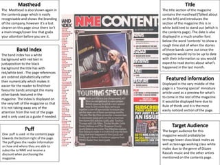
- 1. The Masthead is also shown again in the contents page which is easily recognisable and shows the branding of the company, however it’s a lost clearer on this page since there isn’t a main image/cover line that grabs your attention before you see it. The band index has a white background with red text in juxtaposition to the black background the title has with red/white text . The page references are ordered alphabetically rather then numerically which makes it easier for the reader to find their favourite bands amongst the many other bands featured in the magazine. The index Is displayed on the very left of the magazine so that it is not taking away any of the attention from the rest of the page and is only used as a guide if needed. One puff is used in the contents page towards the bottom right of the page. The puff gives the reader information on how and where they are able to subscribe to NME and receive a discount when purchasing the magazine. Displayed in the very middle of the page is a ‘touring special’ miniature article used as a preview for what’s to come in the rest of the magazine. It would be displayed here due to Rule of thirds and it is the most easily noticed section of the page. The title section of the magazine contains the masthead (Talked about on the left) and introduces the section of the magazine this is in white bold text to stand out (which is the contents page). The date is also displayed in a much smaller font below the word ‘contents’ to show a rough time slot of when the stories of these bands came out since the magazine would try to be up to date with their information so you would expect to read stories about what’s happened in the last month. The target audience for this magazine would probably be teenage lower class black males as well as teenage working class white males due to the genre of Dizzee Rascals music and the other artists mentioned on the contents page.
- 2. The Masthead is also shown again in the contents page which is easily recognisable and shows the branding of the company, however it’s a lost clearer on this page since there isn’t a main image/cover line that grabs your attention before you see it. Also the white and black border that is used in the masthead’s colour scheme helps it stand out so that the masthead doesn’t blend into the red background. The band index has a red background like the title has which could represent that this part of the magazine is just as important as the main title section of the magazine. The page references are ordered alphabetically rather then numerically which makes it easier for the reader to find their favourite bands amongst the many other bands featured in the magazine. Several puffs are also used in/besides the band index. The puffs in the index give information about prizes that readers are able to win while the puff towards the left of the band index gives information on how to save 20% on your next issue of NME. A picture of the editor and a few words from him could be used to make the magazine more real. Rather then it just being something just put together it shows someone who worked on the magazine and made it all happen giving some life to the magazine they’ve created. The title section of the magazine contains the masthead (Talked about on the left) and introduces the section of the magazine this is in white bold text to stand out (which is the contents page). The date is also displayed in a much smaller font above the word ‘contents’ to show a rough time slot of when the stories of these bands came out since the magazine would try to be up to date with their information so you would expect to read stories about what’s happened in the last month. The target audience for this magazine would probably be for teenagers (mainly males) who are lower/middle class. These teens may be in a gothic or mainstream type of social group/lifestyle and would be mainly interested in rock/metal music.