
Recommended
More Related Content
What's hot
Viewers also liked
Viewers also liked (20)
Similar to Contents evaluation
Similar to Contents evaluation (20)
More from asmediac14
More from asmediac14 (20)
Recently uploaded
Recently uploaded (20)
Contents evaluation
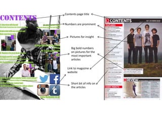
- 1. Contents page title Numbers are prominent Pictures for insight Big bold numbers on pictures for the most important articles Link to magazine website Short bit of info on the articles
- 2. For my background I used a Photoshopped image. From comparing my contents page to the ‘Q’ one I realise it would have looked better and more professional with a plain background. The layout for ‘Q’ used the rule of thirds very effectively my layout doesn’t really follow this making it less conventional for a contents page. My contents page includes more social networking links than the ‘Q’ page this is because of the difference in time when they were both produced. This shows how magazines may have adapted throughout the years. The ‘Q’ magazine includes the masthead on the contents page this is following a code and convention of a contents page. My page does not have this. I should have added this as it would make my page more proficient. In the ‘Q’ contents page they have the date at the top of the page. I did not include this in my contents page. All of the images included in the ‘Q’ contents page have been Photoshopped before being added to the page. I also did this for my contents page as it makes the images look more enhanced. The Numbers on the pictures are in a big bold font to make them more prominent. ‘Q’ also does this as it is a code and convention it also helps the audience know which articles are the most important. My article titles are in chronological order, once again because it is a code and convention of a contents page.