
Recommended
More Related Content
What's hot
What's hot (19)
Similar to Front cover overview
Similar to Front cover overview (20)
More from anthonyy12
Recently uploaded
Recently uploaded (20)
Front cover overview
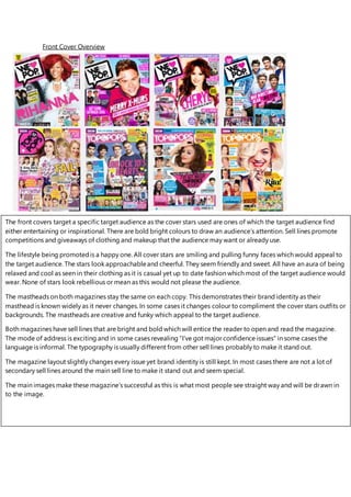
- 1. Front Cover Overview The front covers target a specific target audience as the cover stars used are ones of which the target audience find either entertaining or inspirational. There are bold bright colours to draw an audience’s attention. Sell lines promote competitions and giveaways of clothing and makeup that the audience may want or already use. The lifestyle being promotedis a happy one. All cover stars are smiling and pulling funny faces which would appeal to the target audience. The stars look approachableand cheerful. They seem friendly and sweet. All have an aura of being relaxed and cool as seen in their clothing as it is casual yet up to date fashion which most of the target audience would wear. None of stars look rebellious or mean as this would not please the audience. The mastheads on both magazines stay the same on each copy. This demonstrates their brand identity as their masthead is known widely as it never changes. In some cases it changes colour to compliment the cover stars outfits or backgrounds. The mastheads are creative and funky which appeal to the target audience. Both magazines have sell lines that are bright and bold which will entice the reader to open and read the magazine. The mode of address is exciting and in some cases revealing “I’ve got major confidence issues” in some cases the language is informal. The typography is usually different from other sell lines probably to make it stand out. The magazine layout slightly changes every issue yet brand identity is still kept. In most cases there are not a lot of secondary sell lines around the main sell line to make it stand out and seem special. The main images make these magazine’s successful as this is what most people see straight way and will be drawn in to the image.