
Recommended
More Related Content
What's hot
What's hot (19)
Viewers also liked
Viewers also liked (11)
Similar to Front cover conventions
Similar to Front cover conventions (20)
Recently uploaded
Recently uploaded (20)
Front cover conventions
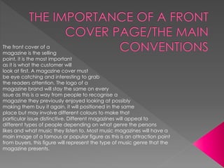
- 1. The front cover of a magazine is the selling point, it is the most important as it is what the customer will look at first. A magazine cover must be eye catching and interesting to grab the readers attention. The logo of a magazine brand will stay the same on every issue as this is a way from people to recognise a magazine they previously enjoyed looking at possibly making them buy it again, it will positioned in the same place but may involve different colours to make that particular issue distinctive. Different magazines will appeal to different types of people depending on what genre the persons likes and what music they listen to. Most music magazines will have a main image of a famous or popular figure as this is an attraction point from buyers, this figure will represent the type of music genre that the magazine presents.
- 2. The main image on a front cover of a magazine is what attracts the reader and draws them in, making it a very important part of the cover. One way of doing this is having a current popular artist as this will automatically be a selling point. After looking into different music and school magazines the usual way a cover photo is taken is from the waste up, it is mainly a photo of one person in particular, although this does vary in music when having a cover involving a group/band. The main image should be positioned taking up most of the page but also making sure that there is space around the sides and at the top for sell lines and the masthead. The space in the background will be filled with text explaining what will be inside the magazine, this is supposed to attract the readers making them intrigued and want to read the articles. The main image should relate to the main story that is advertised in the magazine as this is the largest way of attraction and must be the most interesting. Also to make to reader attracted to the cover most magazines have the artist looking directly into the camera, Asif they are making eye contact with the buyer as this is shown to be a way of drawing in the reader. All magazines must look professional to do this they must follow a colour scheme throughout meaning the main image must tie in with the text, using similar colours.
- 3. The masthead one of the most important parts of a front cover of a magazine. It is usually positioned at the top of the page as it follows the conventions of the ‘Z’ rule. The mast head is the fist thing that a person would look at when picking up a magazine as it connotes the genre and style of the magazine itself. It will give an idea of what type of artists, music, and articles etc that will be presents throughout. The masthead must be large and bold to attract the readers attention, to make them want to buy that magazine rather than any other. It must be short ad catching as this will allow people to remember the name. Usually the masthead of magazines will differ slightly but change in style if they are a series. Each issue will be made to be recognisable for readers. A masthead can be of any colour and style depending on the style the magazine wishes to portray. The masthead will have the largest font out of all of the text on the cover as it is the name/title of the magazine representing its style so it must be clear to see.
- 4. The logo of a magazine is very important as they allow the magazine to become recognisable to all readers, this can become a selling point as it makes the magazine have value. Each magazine has a unique logo this allows it to be recognised easier. Usually the logo of a magazine will be placed in the same place on the cover to all the rest of the issue to make it noticeable. The logo is very important on the cover of a magazine as it makes the magazine a statement, the brand adds business selling more copies. The logo is a way of being able to know the genre and style of a magazine without having to read anything making it a popular way of advertising.
- 5. The sell lines are normally positioned wither above or below the masthead, there purpose is to give the reader a quick incite on what the magazine will be featuring and what the is about overall. The use of a sell line is to sell the magazine by advertising its main articles and stories by using catching short sentences, in a music magazine is usual for it to have names of artists as this attract people who like that artists or there style of music. It may also use words to make the issue sound unique and an interesting read , words such as ‘exclusive’ and ‘special’.
- 6. A cover line is positioned down the left hand side or the right hand side of the magazine cover, that are surrounding the main image following the conventions of a magazine. The use of s cover line is to promote the articles inside the magazine, the use short statements and slogans to attract the reader. They are used to intrigue the reader and make them want to read the stories inside. often magazines use the same slogans and words as cover lines again. This is because of the success they have had before, they feel that as it has attracted many readers before it will do it again.
- 7. The main cover line has the largest typeface out of the rest of the text apart from the masthead this is due to it being the second thing the writer would want the viewer to read after the masthead. The main cover line is advertising the magazines biggest story, they choose the one that they feel is most popular, this could be popular celebrity at the time or a statement about a most talked about issue/article. The main cover line usually is linked to the main image on the cover as this further promotes the story. The main cover line is made to stand out using bold text usually in a different font or colour than the rest of the cover lines to make it stand out even further although it Is usually the same colour as the masthead.
- 8. The colour scheme of a magazine is important as it can represent the genre and style of the magazine. For example a pop magazine would use pinks and light blues where as a rock magazine would use red, back and white. This is to appear appealing to there target audience. Different colours represent different genres. The colours used can vary the presentation of the magazine making it look professional. Different magazines use different colours depending on the niche audience they want to attract depending on the content of the magazine. The colour scheme of a magazine also ties with the main image portraying the type of image they wish to show. Although some colours are used to contrast others and to make them stand out among the page o that the most important text will grab the readers attention.
- 9. The strip is positioned along the top or the bottom of the front cover. The job of a strip is to show a lost of what the magazine consist of. This could be stories written about, artists included or particular games that are inside, they are usually only a list of single words. They are written to attract the reader and show them the amount of different articles and people that they can read about if they were to buy the magazine.
- 10. The bar code is usually placed at the bottom of the magazine, it is usually quite small as it is not something that needs to be seen, this is also because it follows the conventions of the ‘Z’ method. The reason they are positioned at the bottom of the page is because of the fact that this is the last place hat the reader will look. They are small as a barcode is not a selling point of a magazine , although they must be there as this is how you buy the magazine and it helps to keep track of how many magazines have been brought showing which ones are most popular.