Magazine Analysis
•Download as PPT, PDF•
0 likes•77 views

The magazine uses bright colors and shapes related to the theme of an upcoming movie to attract its target audience of 8-14 year olds. The text is designed to draw readers in with promises of winning prizes and gradually shrinking text that hides the content. Familiar logos and characters from the movie are prominently featured to make the magazine immediately recognizable and entice customers to buy it.

Recommended
More Related Content
Viewers also liked
Viewers also liked (19)
Similar to Magazine Analysis
Similar to Magazine Analysis (20)
More from NoNameRequired Pictures
More from NoNameRequired Pictures (8)
Recently uploaded
Recently uploaded (9)
Magazine Analysis
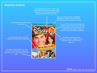
- 1. Magazine Analysis Big, eye catching writing, immediately allowing the audience to know what this particular issue of the magazine is about. Colours represent the theme of the movie, these colours are bright and vibrant which will stand out to the target audience of the age group between 8-14 year olds. The shape surrounding the text represents a ‘winners’ badge, giving the impression that it is a top quality magazine. The word ‘Win’ will entice the audience to by the magazine because they may have the chances of winning something. The text gradually gets smaller, hiding the content, so that it will draw consumers in. Recognisable logo used to attract customers. The bottom of the magazine is in the theme of a comic/film strip, stating that this weeks issue of the magazine is about a film. NNR EQUIRED, a Nick, Ting, Jay Production Characters faces help make the magazines image easily recognisable.