
Recommended
More Related Content
What's hot
What's hot (20)
Viewers also liked
Viewers also liked (20)
Similar to Front cover codes and conventions
Similar to Front cover codes and conventions (20)
Recently uploaded
Recently uploaded (20)
Front cover codes and conventions
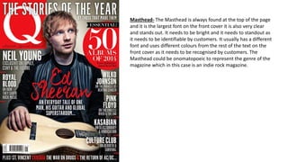
- 1. Masthead- The Masthead is always found at the top of the page and it is the largest font on the front cover it is also very clear and stands out. It needs to be bright and it needs to standout as it needs to be identifiable by customers. It usually has a different font and uses different colours from the rest of the text on the front cover as it needs to be recognised by customers. The Masthead could be onomatopoeic to represent the genre of the magazine which in this case is an indie rock magazine.
- 2. Main Image- The Main image is located in the centre of the front cover and in this case it is an Image of a band which relates to this issue of KERRANG magazine. The main image is usually a medium close-up and it is clear and stands out to the customer. The band will be told to dress around the colour scheme which the journalist wants the magazine to be set around or the journalist will work around the colour scheme which the band wear on the day of the photoshoot. No text covers the faces off the band as it would ruin the image if text was to cover the faces and it would not be aesthetically pleasing to the customer.
- 3. Main Headline- The Main headline is bold and usually seen at the top of the page and it stands out from the rest of the text on the front cover. It is unique and it has a different font to the rest of the text as it is changed so that there is no copy right being made.
- 4. Cover-lines The cover-lines are used to give the customer an insight to what is in the magazine, they are bold and are usually shown in the same colour as they are connected to each other also they are the same colour to ensure they fit around the colour scheme of the magazine. Cover- lines never cover the subjects face so that both the subject and the cover-lines stand out to potential buyers.
- 5. Positioning statement- The positioning statement is used to attract potential buyers by adding extra information about the contents of the magazine. It is located at the top of the page and is read from left to right. The positioning statement gives potential buyers an incentive to buy the magazine as it makes the magazine seem interesting. On this magazine it states ‘survive valentine’s day: You’re favourite stars tell you how’.
- 6. Splash- The splash is usually bright in colour and usually show an offer which gives the potential buyer incentive to buy the magazine. On this magazine there are two splash’s one is showing an offer saying that there is a free CD inside this issue and the other splash is giving an insight to an exclusive feature in this magazine.
- 7. Barcode- The barcode is used to show the buyer how much the cost of the magazine is, it is used to scan the magazine to ensure the customer pays the correct price. It is usually located on the bottom right hand side of the front cover but on this magazine it is at the bottom in the centre. The price and issue date can also be found on the barcode, this tells the buyer when the magazine came out and what issue the magazine is.
- 8. Skyline- The skyline is used to give potential buyers an incentive to buy the magazine, it is similar to the positioning statement because they both give out exclusive information about what is inside the magazine. It is located at the bottom of the front cover and is usually bright so that is stands out from the rest of the front cover. On this magazine it talks about You Me At Six.