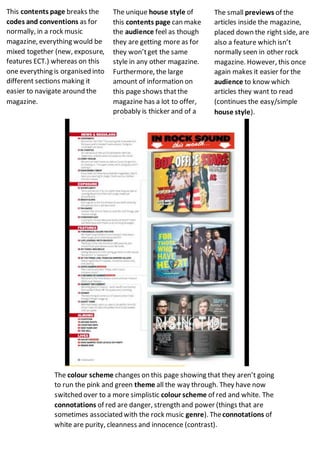
1. This contents page breaks the
codes and conventions as for
normally, in a rock music
magazine, everything would be
mixed together (new, exposure,
features ECT.) whereas on this
one everything is organised into
different sections making it
easier to navigate around the
magazine.
The small previews of the
articles inside the magazine,
placed down the right side, are
also a feature which isn’t
normally seen in other rock
magazine. However, this once
again makes it easier for the
audience to know which
articles they want to read
(continues the easy/simple
house style).
The colour scheme changes on this page showing that they aren’t going
to run the pink and green theme all the way through. They have now
switched over to a more simplistic colour scheme of red and white. The
connotations of red are danger, strength and power (things that are
sometimes associated with the rock music genre). Theconnotations of
white are purity, cleanness and innocence (contrast).
The unique house style of
this contents page can make
the audience feel as though
they are getting more as for
they won’tget the same
style in any other magazine.
Furthermore, the large
amount of information on
this page shows thatthe
magazine has a lot to offer,
probably is thicker and of a
higher quality.