
Recommended
More Related Content
What's hot
What's hot (20)
Viewers also liked
Viewers also liked (11)
Similar to Notion magazine contents page analysis
Similar to Notion magazine contents page analysis (20)
Recently uploaded
Recently uploaded (20)
Notion magazine contents page analysis
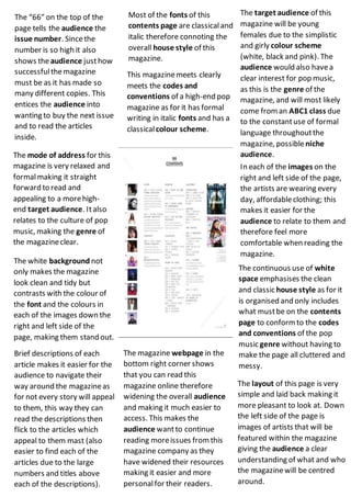
- 1. The layout of this page is very simple and laid back making it more pleasant to look at. Down the left side of the page is images of artists that will be featured within the magazine giving the audience a clear understanding of what and who the magazinewill be centred around. Most of the fonts of this contents page are classicaland italic therefore connoting the overall house style of this magazine. The target audience of this magazine will be young females due to the simplistic and girly colour scheme (white, black and pink). The audience would also havea clear interest for pop music, as this is the genre of the magazine, and will most likely come from an ABC1 class due to the constantuse of formal language throughoutthe magazine, possibleniche audience. In each of the images on the right and left side of the page, the artists are wearing every day, affordableclothing; this makes it easier for the audience to relate to them and therefore feel more comfortable when reading the magazine. This magazinemeets clearly meets the codes and conventions of a high-end pop magazine as for it has formal writing in italic fonts and has a classicalcolour scheme. The mode of address for this magazine is very relaxed and formalmaking it straight forward to read and appealing to a morehigh- end target audience. Italso relates to the culture of pop music, making the genre of the magazineclear. The “66” on the top of the page tells the audience the issue number. Sincethe number is so high it also shows theaudience justhow successfulthemagazine must be as it has made so many different copies. This entices the audience into wanting to buy the next issue and to read the articles inside. The continuous use of white space emphasises the clean and classic house style as for it is organised and only includes what mustbe on the contents page to conform to the codes and conventions of the pop music genre without having to make the page all cluttered and messy. The white background not only makes the magazine look clean and tidy but contrasts with the colour of the font and the colours in each of the images down the right and left side of the page, making them stand out. Brief descriptions of each article makes it easier for the audience to navigate their way around the magazineas for not every story will appeal to them, this way they can read the descriptions then flick to the articles which appeal to them mast (also easier to find each of the articles due to the large numbers and titles above each of the descriptions). The magazine webpage in the bottom right corner shows that you can read this magazine online therefore widening the overall audience and making it much easier to access. This makes the audience wantto continue reading moreissues from this magazine company as they have widened their resources making it easier and more personalfor their readers.