
Recommended
More Related Content
What's hot
What's hot (20)
Viewers also liked
Viewers also liked (20)
Similar to Cover deconstruction
Similar to Cover deconstruction (20)
Recently uploaded
Recently uploaded (20)
Cover deconstruction
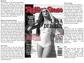
- 1. Colour: Red font on top of a greyscale background makes the magazine’s masthead and cover line stand out significantly and make it instantly recognisable as the reader’s eyes are instantly drawn to it. The colour scheme of red, white and black used throughout makes the magazine appear very professional. Masthead The masthead is the main focus/selling point of the magazine therefore it is imperative that it stands out. However the masthead falls behind the main image indicating that the artist on the cover is the main selling point. The use of this also exaggerates the fact that Rolling Stone is a well established name and will still be easily recognisable despite the fact that a part of it is covered. Feature Image: The main image draws readers in by the main artist making direct eye contact with the camera – staring directly at the reader. The cover features a modern artist however has connotations of Old Hollywood through the use of greyscale and clothing she wears – something typically you would expect to see from a star like Marilyn Monroe. Also linking to her style of her music which fans of the artist will recognise. Font The same font has been used consistently which gives the magazine a mature and professional feel which will appeal to the target audience as this magazine is aimed at older people (late teens onwards) Main cover line/sub-heading Underneath the main cover line of the artist’s name, the sub-heading “inside story on a modern day icon” features which teases the reader and makes them think that if they were to buy the magazine they would be told exclusive information about the artist which will appeal to the artist’s fans a lot. In addition, the sub-heading is in italics which stresses this to the reader and the word ‘icon’ has been underlined in red which makes it stand out more and links back in with the old Hollywood imagery and the contrast between iconic people and modern day music. Cover lines: The cover lines on the left hand side include a list of other artists that will also be featured within the magazine; this is done to tease the reader or to entice them to buy the issue even if they aren’t necessarily a fan of Lana Del Rey on the feature image. The text has been kept to a minimum to ensure that the cover does not look cluttered.
- 2. Masthead: ‘AP’ appears at the top of the magazine clearly standing out making the logo instantly recognisable. The white logo stands out against the dull, grey background instantly catching the attention of passers by. Main image: The feature image again draws readers in by the direct use of eye contact as though they are staring directly at the reader. Also, similarly part of the masthead is covered by the main image however this time by only one of the artists. This suggests that the other members are insignificant in comparison to the lead singer and they aren’t as recognisable therefore they fall behind. Main cover line: Using a bold yellow font in line with the theme, the main cover line features the band’s name across the page contrasting with the dull colours behind and making it stand out significantly and easy to spot on the shelves. Subheading: The technique of teasing/intriguing the reader has been used again to make them want to read on and purchase the magazine. The use of “Music is all we have” pulled directly from the band’s interview will make the reader want to learn the context of this quote, especially their fans as it implies they are going to be told information they won’t find anywhere else. Also, the use of “Why pop-punk needs 5 Seconds Of Summer” may appeal to those who aren’t familiar with this band but still are a fan of pop punk music/the bands that usually feature in this magazine, therefore AP are not just only targeting this issue towards 5 Seconds Of Summer fans. Font/colour: Like the previous cover, fonts are kept to a minimum however there is yellow text to highlight the important aspects of the magazine/what the magazine is trying to sell to their audience. The use of more than one font gives the impression that it is quite a laid back, fun magazine and not extremely sophisticated, attracting their younger target audience. Important information such as ‘exclusive’ and the featured bands have been printed in yellow to ensure they stand out and look appealing. Cover lines: Names of bands that are featured in the magazine have also been included on the cover to again entice the reader to buy the issue even if they aren’t a fan/familiar with the featured artists on the cover. The magazine is ensuring to appeal to a wide audience, not just 5 Seconds Of Summer fans. Although similar to the previous cover by including a list of artist’s names, this magazine has also included additional information on the contents of their magazine within the cover lines such as “exclusive posters”. “revisiting classics from” and “+ more” to further persuade the reader to buy the issue and read about it.
- 3. Masthead: Unlike the two previous covers, this magazine does not follow the usual magazine conventions of the masthead being placed at the top of the magazine. By placing the masthead on the left hand side instead it gives the cover a unique look and sets it apart from the other magazines on the shelves. It also allows the main image to take up the majority of the page suggesting that they may be relying on the artist on the cover to sell the issue rather than just relying on the brand itself. The name ‘Billboard’ itself already suggests to the reader who may be unfamiliar with the name that the magazine features current mainstream artists that are in the Billboard charts. Cover lines: The cover lines have been placed in the top right corner in a very small font to indicate that the main focus/selling point of the magazine is the artist on the cover and to not take the reader’s attention away from the main image. Essential Information: The magazine’s essential information (issue date, website) have also been placed in very small font under the masthead to ensure that the reader does not get distracted away from the main image. This magazine does not appear to have a price on the cover suggesting their target audience is perhaps older with a disposable income and do not have to worry about the price of magazines/more middle class. Main cover line: Instead of featuring the artist’s name as most magazine’s do, the featured artist has been labelled as a ‘prodigy’ before even being introduced to the reader. This suggest that the artist is so iconic that people should already know her name, and those who do not are missing out therefore will want to read on and find out more about her Main sub-heading: The subheading contains phrases such as “adoration of every icon in music” and lists a number of her recognisable achievements to show to the reader that this artist is very significant in pop culture and that if they aren’t familiar with her they should read on and find out more. Feature image: Similar to the previous covers, direct eye contact has been used again to engage the reader and grab their attention. However this main image takes up the majority of the page and assuming you have knowledge of current music and well known artists, it is presumed you will already know who Lorde is therefore the big image has been relied on to sell the magazine to the reader. Fonts/colour scheme: A gradient grey background has been used effectively to ensure that the masthead and the main image stand out as much as possible. The white font of the masthead and the cover artist’s fair skin exposed creates a contrast and makes both look very clear. The subheading has been efficiently placed behind the cover artist’s black clothing to ensure that the important part of the cover can be easily read. The magazine has kept a neat colour scheme of white, grey and featured the artist’s name in the same colour orange as the artist’s clothing to look more aesthetically pleasing. Although more than one font has been used, the overall layout of the magazine still looks neat and uncluttered due to the minimal text on the page.