Kotlin Multiplatform & Compose Multiplatform - Starter kit for pragmatics
How effective continuity
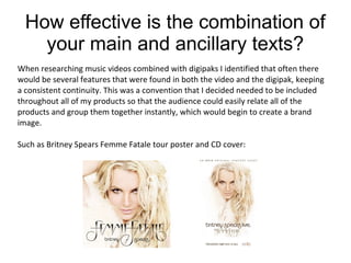
1. How effective is the combination of
your main and ancillary texts?
When researching music videos combined with digipaks I identified that often there
would be several features that were found in both the video and the digipak, keeping
a consistent continuity. This was a convention that I decided needed to be included
throughout all of my products so that the audience could easily relate all of the
products and group them together instantly, which would begin to create a brand
image.
Such as Britney Spears Femme Fatale tour poster and CD cover:
2. I identified that often brands and artists will keep one if not several continuous
themes throughout all of their media products. Such as Drake and his owl motif to
advertise his Take Care album;
This is something that I was keen to use in my products as it would provide the
basis for my creative decision making for all of the products. I decided to use a
theme of bright colours and nature throughout the video, digipak and advert. As
the goal of my multimedia campaign is to promote equal rights and homosexual
marriage. Bright colours are a common connotation of homosexuality and nature is
inferred as pure, both concepts I attempted to convey in my products.
3. When researching I found that it is very important to provide strong continuity
between all your media products, particularly the digipak and advert, in order to
achieve a successful multimedia campaign.
4. I noticed that one way in which these products achieve continuity is the regular use of
the same type of font on each product. This is a convention I adopted and used on my
products.
On each of my products I used a font called Desdemona as I found it stood out when
placed against other items but still appeared sophisticated, which is a regular
convention of digipaks and adverts from my genre. By using the same font on each of
my media products I believe it makes them look more sophisticated due to there not
being several contrasting fonts clashing against each other, which is something I was
keen to avoid.
I used a font called Desdemona on the digipak and the
magazine advertisement to show continuity between
my multimedia campaign.
I also noticed that the Drake advert uses features from the digipak for the album to
provide continuity. This was the basis for our creative decision making when
brainstorming ideas for my advert.
5. Another way in which I kept continuity between my products was by using the
same location for the images of the inside cover and the narrative aspects of the
video. This kept continuity from the inside cover to the video as in both products it
is clear that it is set in a forest because in both trees are clearly visible denoting
that it is set at a outdoor location.
By using this location on both my digipak and advert it allows the audience to make
an instant link between the media products as locations are one of, if not, the most
important feature in our media products. Therefore producing in my opinion an
effective combination of my main and ancillary texts.
6. Another way in which I kept continuity between my products was by using the
same location for the images of the inside cover and the narrative aspects of the
video. This kept continuity from the inside cover to the video as in both products it
is clear that it is set in a forest because in both trees are clearly visible denoting
that it is set at a outdoor location.
By using this location on both my digipak and advert it allows the audience to make
an instant link between the media products as locations are one of, if not, the most
important feature in our media products. Therefore producing in my opinion an
effective combination of my main and ancillary texts.