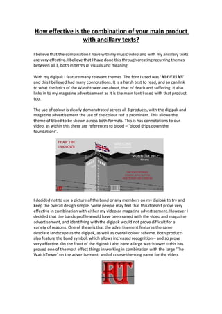
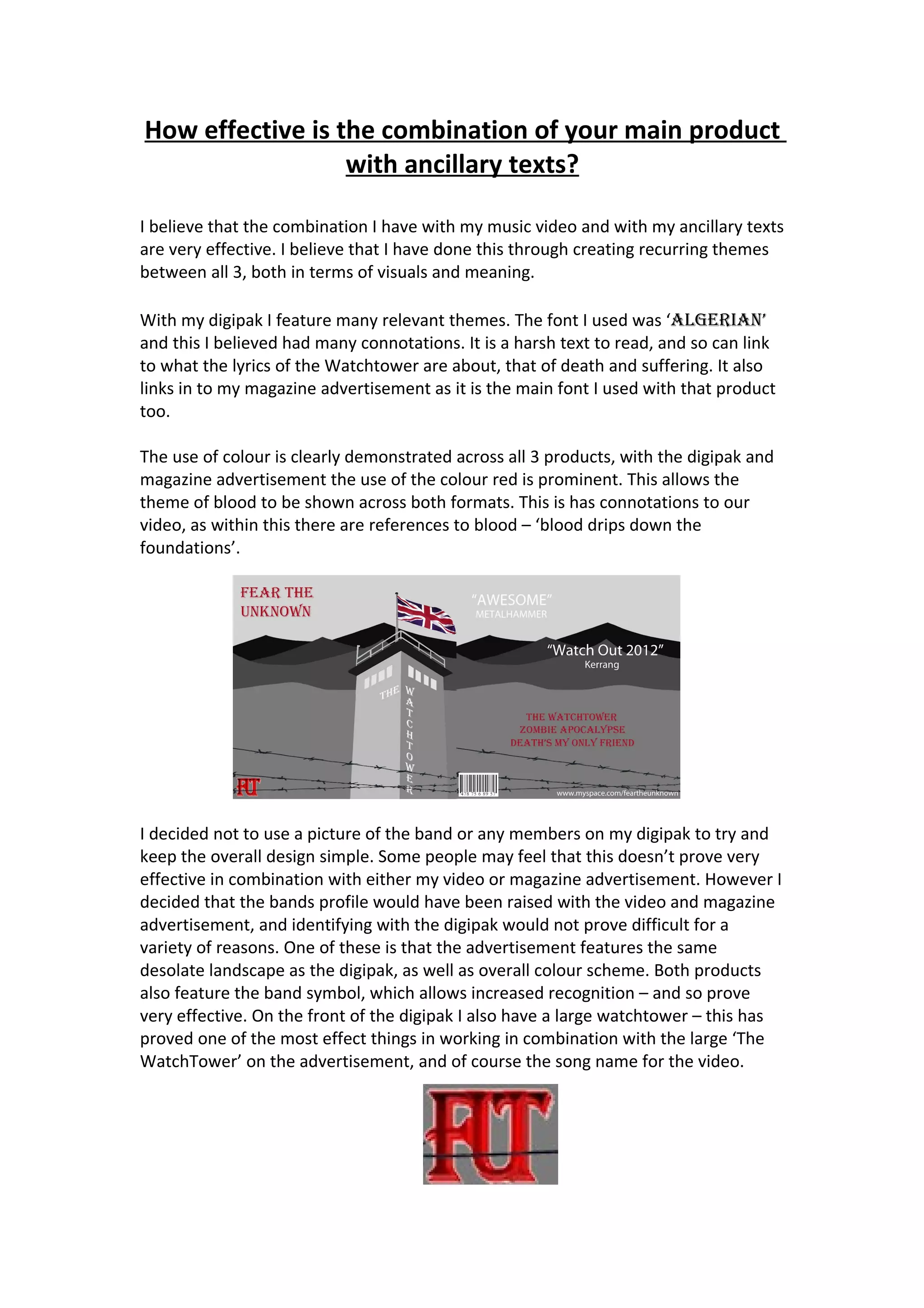
The author believes that the combination of their music video, digipak, and magazine advertisement are effective through recurring themes of visuals and meaning across all three products. The font, color scheme of red, and themes of death, suffering, and blood are consistently featured. While the digipak does not include an image of the band, the video and advertisement help raise the band's profile and recognition through shared elements like landscape, color scheme, and band symbol. Different photos of the band are used to convey that they have more than one song. Dark and harsh lighting from a scene in the video is also recreated in the digipak and advertisement to connect the pieces.


![Question eval[1]](https://cdn.slidesharecdn.com/ss_thumbnails/questioneval1-101121155948-phpapp02-thumbnail.jpg?width=640&height=640&fit=bounds)
![Question eval[1]](https://cdn.slidesharecdn.com/ss_thumbnails/questioneval1-101121155138-phpapp01-thumbnail.jpg?width=640&height=640&fit=bounds)
![Question eval[1]](https://cdn.slidesharecdn.com/ss_thumbnails/questioneval1-101121152443-phpapp02-thumbnail.jpg?width=640&height=640&fit=bounds)


