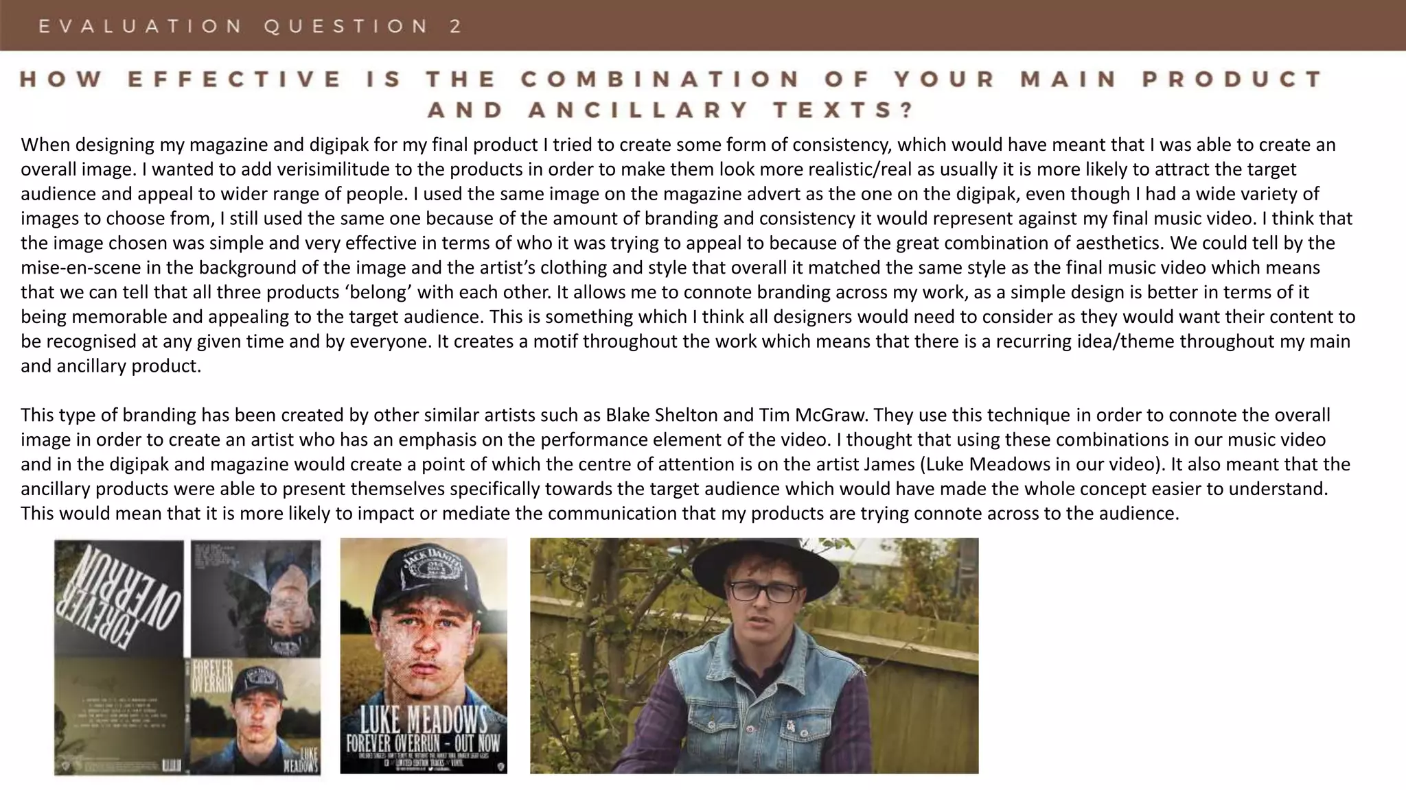
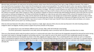
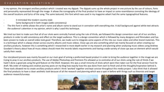
Procuring digital preservation CAN be quick and painless with our new dynamic...
Â
Evaluation Question 2 - FINAL
1. Evaluation Question 2
How Effective is the Combination of Your Main Product and Ancillary Texts?
When designing my magazine and digipak for my final product I tried to create some form of consistency, which would have meant that I was able to create an
overall image. I wanted to add verisimilitude to the products in order to make them look more realistic/real as usually it is more likely to attract the target
audience and appeal to wider range of people. I used the same image on the magazine advert as the one on the digipak, even though I had a wide variety of
images to choose from, I still used the same one because of the amount of branding and consistency it would represent against my final music video. I think that
the image chosen was simple and very effective in terms of who it was trying to appeal to because of the great combination of aesthetics. We could tell by the
mise-en-scene in the background of the image and the artistâs clothing and style that overall it matched the same style as the final music video which means
that we can tell that all three products âbelongâ with each other. It allows me to connote branding across my work, as a simple design is better in terms of it
being memorable and appealing to the target audience. This is something which I think all designers would need to consider as they would want their content to
be recognised at any given time and by everyone. It creates a motif throughout the work which means that there is a recurring idea/theme throughout my main
and ancillary product.
This type of branding has been created by other similar artists such as Blake Shelton and Tim McGraw. They use this technique in order to connote the overall
image in order to create an artist who has an emphasis on the performance element of the video. I thought that using these combinations in our music video
and in the digipak and magazine would create a point of which the centre of attention is on the artist James (Luke Meadows in our video). It also meant that the
ancillary products were able to present themselves specifically towards the target audience which would have made the whole concept easier to understand.
This would mean that it is more likely to impact or mediate the communication that my products are trying connote across to the audience.
2. Minimal styles and locations are used across my ancillary products, which means that the final project hasn't got a range of different elements. This creates a
recurring motif across my products. Also it means that the products donât jump around everywhere. This may be the case for other music genres, however, within
the country genre conventionally, it is kept simple as long as itâs effective and has a straightforward meaning. The ancillary products stay consistent with the shots
and always link back to the establishing shot of the video which is where it all began. The same or similar locations are used in the final music video, digipak and
magazine advert. This again shows a sign of branding as everything is always recurring (a motif is shown as the recurring idea; the locations always go back to where
the audience are familiar with). When creating our video, we wanted to integrate an American themed style while keeping the British culture alive with the mise-en-
scene used e.g. clothing and background. This shows verisimilitude throughout our video has we used certain aspects of the cultures fort example the bar in the
background for the American aspect of the video and the allotments for the British culture as the background includes British vegetables and fruit as well as British
fields which was obvious to the audience of what we wanted to connote/imply when filming. This shows generic conventions throughout all the shots. The country
genre has been represented in some way whether it was mise-en-scene or the type of shots used. Overall it links to the overall culture and allows us to create a
brand behind this which can be used in our ancillary products.
Only one artist was featured in the video as the song is classed as a single. Again, because of this only one artist was featured in the other branding products
(magazine advert and digipak). Ancillary products support the primary activities of the project.
- Itâs a great way to cross-over between different pieces of work. Adds a little Verisimilitude to the footage.
- The artist's personality is represented in the video, which will hopefully create a connection with the audience and allow them to relate.
There are a few elements which made the products stand out in contrast with each other. One of which was the typography alongside the textured font which during
the project had created an ideology throughout my branding materials. It also made the name of the album and artist more recognisable towards the target
audience. Another element was the baseball cap shown in the video, digipak and magazine advert. This is something which really stands out and is an important
factor in attracting the audience to the final project and making sure that all three branding materials link to the country genre in some way. Itâs a standout feature
against everything else which is something which may encourage a number of people to become influenced by the work as it attempts to be relatable especially to
everyday life.
3. In my opinion, the strongest ancillary product which I created was my digipak. The digipak sums up the whole project in one picture by the use of colours, fonts
and personality represented through the image. It allows the iconography of the final product to have an impact or some resemblance connoting the ideology of
the overall locations and lyrics of the song. The same textured, thin font which was used in my magazine advert had the same typographical features.
- It mimicked the modern country style
- Same background in both images (adds consistency)
- The thin font in white allows the artist's name and album name to stand out in connation with everything else. A dull background against white text attracts
the audience's attention in my opinion, which is why I used this technique.
We tried our best to make sure that all of our shots were centrally framed using the rule of thirds, we followed this design convention over all of our ancillary
products in order to add consistency and effect on the target audience. This is a design convention which is followed by many designers and filmmakers and has
been proven to make an overall video look good. Therefore, we made sure to integrate some aspects of this into our music video and other brand materials. This
is a technique which is always shown across country albums and music videos. Close-ups are also something which we mainly focused on when creating our
ancillary products, however this is something which I researched in more depth earlier in my research and planning when analysing music videos using Andrew
Goodwinâs theory about how all music videos should meet the records labels requirements and having a wide variety of close-ups was an element which would
satisfy their needs.
Our storyboard process was mainly focused on our main goal of aiming a preformed based product in order to bring the audience together in the image we are
trying to pray in our ancillary products. The use of Adobe Photoshop and Premiere Pro allowed us to centralise all of our shots using the rule of thirds if we
hadn't done a good job using the grid feature on the DSLR. However, this was a small minority of shots which were then taken out for the final version front he
draft. My order of making and creative journey posts on my blog how exactly how this was done from start to finish and all the thoughts/inspiration behind it.
These tools allowed me to create ancillary products which I think âworkedâ together and kept concise throughout this media project. I also think that it allowed
the final products to have a clean aesthetic look because of all the research and planning which was a spot in before with things such as theorists and target
audience research/surveys.
4. An element which we could have included in our music video was to add some intro and outro text to introduce and conclude the video. The text would have
included things such as the name of the song and credits to the record label. The reason we didn't do this is that we thought that it would have driven the video
slightly away from the country. Country music videos don't always follow this standard convention in their ancillary products for a number of reasons; It makes
the video seem more put together rather than natural, drives the focus away from the main visuals/can act as a distraction. Our videos began straight into the
storyline and what the lyrics/context of the video was about, which is something that country videos always do as they are usually based on a true story. It was
more important to us to make sure that the lyrics represented the visuals correctly as that was a more important convention for our genre and music video in
general (research and planning had more information about this and the overall country genre). We don't think that this was too big of an issue as a lot of
professional music videos also donât do this, especially modern country ones. We did, however, give all the credits necessary on the digipak so at least it was on
one of my ancillary products which is something all existing products do.
James (Luke Meadows in the video) made sure that similarly styled photography, locations and clothing were represented across the whole project. Another
element which was also important was that as we opted for a performance based video we needed to make sure that it was connoted across the whole project
which would have created familiarity and a memorable moment for the audience watching.
In our ancillary products, we followed some stereotypes which we thought would suit the audience and have a great/consistent impact on the country genre. An
example would be the artist/locations. I believe that the average country listener would greatly relate to the song as it is based on a true story which has the
context of something which could have happened to anyone. Itâs based on everyday life which is a conventional element to see in country music videos. It has a
direct formal link with the lyrics which also helps portray this image across to the audience.
The colours in our music video were very similar to the ones in my digipak and magazine advert. They followed the same structure, symbolic code (what it was
trying to convey) for the countryside which created a connection between the artist and the song while performing. Something else which was similar in my
ancillary products was the baseball cap which was worn in all three. This was something which we thought would have been original but at the same time linking
all three products together which we knew it was something which we should focus on. The designs for my magazine and digipak were mainly aimed towards a
majority male audience which is something I also gathered from my research and planning, however, the figures are really close between males and females who
listen to country. In my opinion, I think that the overall branding relates more towards a male audience. However, the use of colours photos does not limit the
ancillary products to be targeted to a predominately male audience only and can be viewed and enjoyed by everyone else.