2. How many pages are devoted to the reviews?
What does this suggest?
The magazine has 97 pages. This particular review
has only one page devoted to it. The Populaire review
is on page 53 which is relatively in the middle.
This may suggest that it is perhaps an independent
film. They may not have enough money to pay for the
extra magazine pages unlike the ‘Man of Steel’
review. Also that it may not be a big block buster film
aimed at a large number of people.
3. The reviews are seen as chapters in the
magazine? What does this tell you?
The fact the reviews are seen as chapters in the
magazine highlights the move to the digital age.
People no longer will have to buy a magazine they
can just read it online, on their own comfort and on
may platforms like mobile phones, ipad, and laptop.
4. What do you notice about the general style and
layout?
The general style and layout is like a normal
magazine. They have pictures form the film and the
text about the film. They also have their own rating
system.
5. Layout
Firstly right at the top they have the picture from the film.
Then underneath the picture they have the logo, magazine logo, the
director and the stars and the release date.
Then they have the text that takes up two and a half columns.
Then they have the rating system
Lastly on the side it says ‘review’.
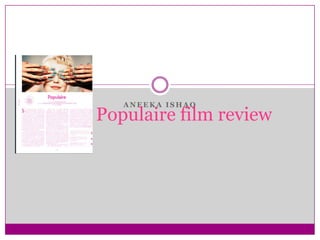
6. Images
The image is at the top of the page, it is probably
taken from the film and is the only image there.
This particular image creates enigmas as the
characters eyes are covered and makes the audience
question who she is and why her eyes are covered?
The image is bright and has high key lighting in
order for it to stand out on the page.
7. Colours
The main colors of this review are pink and white
and then the colors in the picture.
The pink and white may have been used to keep the
color scheme simple, they may have also picked the
colors in order to make the picture stand out.
The pink may have been used to portray some
themes of the film as there is romance in it which is
aimed at females therefore that’s why the pink may
have been used.
The pink colored text make it slightly hard to read on
paper therefore the audience can read it online.
8. Fonts
For the font Serif and San Serif have been used.
The title is in San Serif making it easier to read and
stand out it is also in bold.
The ‘directed by’ and ‘starring’ are in italics and the
names are in bold showing their importance.
The text starts with a bold indent letter and the text
is in San serif .
9. Structure
The review starts of with some historical context of
the film.
Then is goes on to some opinion on how ‘beautifully
constructed’ the film is.
The next two paragraphs go on the explore the theme
of the film and gives a gist about what happens in the
film.
It then goes on to talk about the director and their
previous work, lastly it generally sums up what they
thought which was mostly positive even though they
said ‘although’.
10. Rating system
The unique thing about Little White Lies magazine is
that it has like side column in chronological order
including anticipation, enjoyment and retrospect,
this also what the Populaire review has. It is rated
out of 5
11. Language style
Long complex sentences as there is a lot of detail with
rare short sentences.
The mode of address is very formal, there is no chatty
language.
The specialist language used is words like
‘editing/writer/director/filmmaking/narrative.’
Adjectives have also been used e.g. ‘breezy romantic
farce’. Words like ‘klutziness’ this is informal and almost
personifies the film giving it character and a voice.
Direct address has been used in second person to address
the reader.
Metaphors and simile have also been used. For example
‘bringing spectators sport’.
12. How effective do you think the review is.
I think the review is quite effective as it tells us about
the film and what it is about. The image used also
gives a clue and raises questions about the film.
However they give an opinion which is quite biased
maybe they should let the people decide for them
selves.
13. How does the review reflect the magazine?
The review highlights the identity of the magazine as,
it is quirky and chatty and informal. Just like the
magazine with the very unique front covers.
And it also offers interviews and sell magazines
online giving their audience more information.
14. How will it be to emulate the style of the review.
I personally think in terms of the layout, in a
magazine style will be quite easy to layout on the
page along with the rating system.
However I think the actual language of the review
will be a bit difficult as everyone has their own style,
therefore it may prove difficult to stick to that.