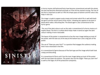
1. In horror movies old fashioned fonts have become conventional and with this photo
the text had become distorted and looks as if the ink has started running. The size of
the font is important as well as it fills the empty space at bottom and the colour also
helps it stick out.
The image is made to appear quite creepy and sinister which fits in well with both
the genre and the actual name of the movie. I drawing also appears to be done it
blood which adds a disturbing feel. The blood again is also conventional of the
horror genre.
The use of the dark colours such as the reds is conventional of a horror movie as it
implies blood. The font is in white which helps make it stand out again the dark
colours making it more noticeable.
The layout of the poster is conventional as has the main image tasking up most of
the poster, with the text out of the way at the bottom but is also a big part of the
poster.
The use of “Have you seen him?” is a question that engages the audience making
them more interested in the film.
It is conventional of genre because of the font type and the image which both look
creepy and disturbing.
It is conventional of form and it has the main image taking up most of the poster
with the text down the bottom. The poster also has the slogan “Have you seen him”
as well as the logos of all the production companies.
2. The “Friday the 13th” at the bottom of the poster looks as if it was drawn on
making it conventional. The blood on the number 13 is also conventional as blood
is a very common sight in a horror film. The text at the bottom of the poster is
small and plain which keep the focus on the main aspects of the poster.
The main image of the poster is two images in one, it shows the scene of some
people in the woods in the outline on the main villain. The main villain holds a
knife with blood dripping onto the title in his hand which shows that he is the
villain, the bloody knife is very conventional of a horror movie. The image also
does not include the villains face showing that the real identity is unknown which
is also very conventional.
The colour scheme of the poster is overall very bleak and dark following the
conventional them of horror movies. The only thing in the poster that has colour
that stands out is the red of the blood. The blood stands out because violence is a
main conventional feature of a horror films so it makes the poster very
conventional.
The layout of the poster is very conventional as the main focus is the image so it is
placed it the middle with the text above and below it. The poster also uses route
of the eye as it goes from text to image to text as well as having the block text and
the logos of the companies involved at the bottom of the poster.
The language used involves words such as “”doomed” which is quite heavy handed
and well as saying things such as “nothing will save them”. Both quotes are saying
that the people in the film are already as good as dead so we are expecting them
to die in the film.
It is conventional of the genre as it has an image of dark creepy woods at night as
well as having the blood on the knife. It is also conventional as the face of the
main killer is not show due to his identity not wanting to be revealed in the poster.
It is conventional of form as it uses the route of the eye as well as having the main
image big and in the middle of the page. The use of the text at the top of the page
is also conventional of form as it gives the audience a little Insight as to what’s
going to happen making them want to watch the film.
3. The font style of the magazine looks roughed up and has rips in the text
looking as it has already been through a horror mayhem of its own which
suits this genre really well. The colour of the font is also important as the
colour is a red-ish orange that could be used to represent blood.
The main image shot is a mid-shot of the main protagonist in the film
“psycho”. The image is just of him with a creepy smile that enforces the
name of the film. The way the main protagonist looks can give some
insight the type of villain he is and how kills making the audience more
interested in the film. Near the bottom of the page it looks as if the page
has been torn off which makes the magazine also looks like it has been
through some sort of mayhem suiting the genre.
The colour of this magazine isn’t conventional of a normal horror
magazine because it is a light blue, however the colour of the masthead
and cover live resembles blood which is more conventional. The colours
of the other fonts are white which although doesn’t suit the genre it
helps it stand out and makes it easier to read.
The layout of the magazine uses the route of the eye so it would go from
masthead to image to cover line. The image is the main focus of the
magazine so it is positioned in the middle of the magazine taking up most
of the room making it more noticeable. The bar code it also position at
the bottom of the cover out of the way as well as other information less
interesting to the audience.
The language used in the magazine consist of mainly shot phrases as well
as directors names as the audience will only glance at the magazine.
The magazine is conventional of form as it used the route of the eye with
the layout as well as having all of the necessary information such as the
barcode. It is also conventional as it has a big main image surrounded by
small cover stories.
The magazine is conventional of genre as the font colour is red
representing blood and it also includes a creepy and unsettling image a
main villain from a film.
4. The font of the masthead looks as if it has been painted on which
looks a lot like dripping blood which links into horror as well as violent
imagery. The cover story font also looks worn away giving it the
decaying look.
The images in this magazine are very conventional. The main image is
of a zombie decaying and looking horrible with one if his eyes cut and
bleeding, this is also violent imagery that suits the genre perfectly and
will also draw the audience in. There are other images that are also
like this such as the nun skeleton praying the scaly monster, all very
conventional. There is also a blood splat at the top right of the cover
which also fits in with the genre.
The main colours of the fonts on the magazine is white and yellow
which helps make the font stand out making it more noticeable to the
audience. The colour of the blood in the top right corner is a bright
shade of red which also makes it stand out.
The layout of the magazine follows the route of the eye. It also has a
big main image taking up a large portion of the cover which will attract
the attention of the audience. At the bottom of the cover it include a
strip to show all the other information that there isn’t enough room
from keeping it out of the way. In the top right it also puts in the
number and price of the magazine, it is in this position so that when
following the route of the eye it is one of the first things seen.
The language of the magazine includes short phrases giving a little
information on the stories on the inside of the magazine. At the top of
the cover it has “blood, guts, gore and more” which are words
common with the horror genre.
The magazine is conventional of form as it includes the route of the
eye as well as a large image taking up a large portion of the cover
there to attract attention.
The magazine is conventional of genre because of the violent imagery
to attract attention and some violent language.