
Recommended
More Related Content
What's hot
What's hot (20)
Similar to Catfish and the bottlemen
Similar to Catfish and the bottlemen (20)
More from Taggar97
More from Taggar97 (15)
Recently uploaded
Recently uploaded (20)
Catfish and the bottlemen
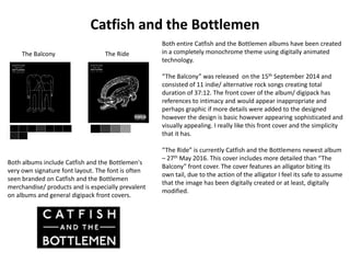
- 1. Catfish and the Bottlemen Both entire Catfish and the Bottlemen albums have been created in a completely monochrome theme using digitally animated technology. “The Balcony” was released on the 15th September 2014 and consisted of 11 indie/ alternative rock songs creating total duration of 37:12. The front cover of the album/ digipack has references to intimacy and would appear inappropriate and perhaps graphic if more details were added to the designed however the design is basic however appearing sophisticated and visually appealing. I really like this front cover and the simplicity that it has. “The Ride” is currently Catfish and the Bottlemens newest album – 27th May 2016. This cover includes more detailed than “The Balcony” front cover. The cover features an alligator biting its own tail, due to the action of the alligator I feel its safe to assume that the image has been digitally created or at least, digitally modified. The Balcony The Ride Both albums include Catfish and the Bottlemen's very own signature font layout. The font is often seen branded on Catfish and the Bottlemen merchandise/ products and is especially prevalent on albums and general digipack front covers.
- 2. The Balcony The Ride The basic black and white monochrome colour palette that the front cover has is also featured on the back cover. This consistency I personally think is important for a successful and visually pleasing album/ digipak. To add the colour contrast again looks professional. The barcode for “The Balcony” has been positioned latitude/ landscape, central of the album/ digipack. The barcode for “The Ride” has however been positioned longitude/ portrait along side the very bottom right of the album/ digipack back cover. Regardless of where the barcode is positioned both album back covers look equally as well crafted. The long and thin barcode has been used due to the graphology of the text, specifically the text that states each song name (Located on the back cover) The space between each letter of the text is quite substantial – especially compared to the letter spacing in block of text at the bottom of the back cover. To add the barcode is almost as long as the song name, so the barcode matches and compliments the text well. The spine for the albums match the rest of the album/ digipak in style and simplicity. The spine has the band name then the album name and finally the cereal number which is located at the bottom of the spine. The albums CD/ Disk shows an almost identical image to that which is on the front cover. I like this idea as it has a direct and clear reference to the album in which the disc belongs to.
- 3. Catfish and the Bottlemen – Here are a variety of Catfish and the Bottlemen digipak front covers. Each have been digitally animated using a computer software. To add, each are in a pure black and white monochrome theme which makes the front covers looks simple and sophisticated. I really like the album artwork and the way the digipak front covers have been designed. I would certainly like to use some features from the styling of these digipak covers when I make my own. Here is an example of a magazine advert for the band, Catfish and the Bottlemen. This advertisement illustrates the persona that the band is trying to portray. The monochrome black and white close up photos are traditional for indie/ alterative rock bands. The advertisement is very brief with the information that it provides however I feel that it acts more so to notify the possible audience/ viewer of who Catfish and the Bottlmen are as means for a fan base to expand which is inevitably the intention and goal for bands, especially bands that have recently formed.