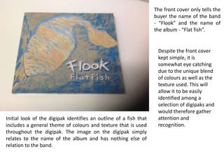
1. The front cover only tells the
buyer the name of the band
- “Flook” and the name of
the album - “Flat fish”.
Initial look of the digipak identifies an outline of a fish that
includes a general theme of colours and texture that is used
throughout the digipak. The image on the digipak simply
relates to the name of the album and has nothing else of
relation to the band.
Despite the front cover
kept simple, it is
somewhat eye catching
due to the unique blend
of colours as well as the
texture used. This will
allow it to be easily
identified among a
selection of digipaks and
would therefore gather
attention and
recognition.
2. When you first open the
digipak, you are
essentially introduced to
the band as well as some
basic information on the
production of the album.
On the left of the digipak
it says “Welcome to
Flatfish.” and identifies
itself as the first studio
album from Flook.
Beneath this, it gives all
the information the band
itself such as when it was
formed along with the
members of the band.
On the right hand panel, it is somewhat similar to the
introduction-type panel. However the right panel gives some
information on the technicality of the recording. Which again
may be interesting to more technical music lovers as they may
be able to get some background information on certain
mixing producers as well as the studio they recorded at.
This allows the customer
to relate to the band on a
more personal level as
well as being able to
identify each person
contribution to the album.
3. The second section of the
digipak is kept somewhat
simple. As one panel is
completely taken up by
the CD tat contains the
music, they only had the
left side to use.
On the panel, it simply
identifies the name of
each song on the CD
along with who arranged
the tracks and
accompanied with a
copyright infringement.
This panel will simply
allow the customer to see
what songs are on the CD
and may wish to skip to
their favourites as well as
being able to identify
who helped create the
4. Similar to the second
panel of the
digipak, the back of it
simple lists the name of
the songs but with a lot
less detail. Although it
does have the addition
of the track time.
Throughout the entire digipak, the theme is kept consistent which includes
the font, size of the font and the background colours. The texture and
colours and consistent throughout and allows it to be easily identifiable and
easily related to the band and their album.