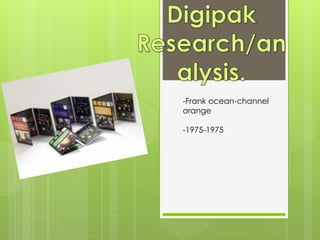
2. What is a digipak?
A digipak is a type of packaging for CDs or
DVDs, typically made from cardboard
with an internal plastic holder for one or
more discs. It is a cheaper and greener
way for companies to produce albums on
a large scale to sell.
3.
4. When looking at the digipak for the album including the original version of the song ‘Girls’ on, you can Immediately
tell that the band themselves are of the indie/alternative genre due to the black and white theme that is featured
throughout the digipak. This colour scheme is eye-Catching and it successfully demonstrates how the colours-black,
white and Grey can connote to a specific image the band wants to portray.
The illuminated white light placed behind the band name ‘1975’ helps to emphasize the band as it brings it to the
forefront of the cover. By doing this, it gives the impression that the band name is standing out, physically-leading to it
being eye-catching.
The colour black is the background colour for all sections of the digipak. In contrast, the writing on all sections is
printed in white. I feel this is another decision used to make the text stand out by by maintaining the tone of the text.
Following on from this, the font used with the writing of’1975’ is distinctive and acts as a trademark for their name. this
makes the album recognizable and their image consistent.
A key generic feature of this digipak is that the band has decided to not have themselves feature on it. Normally
indie/alternative bands rely on their image being set up by simplistic tones and themes through font and colour-as
previously discussed. One of the reasons why this may have been done, is due to The 1975’s song: ‘girls’ along with
the rest of their music, all carry a ‘pop’ music feel. To ensure that the 1975 are seen as alternative, these typical genre
conventions have been applied. However, the contrast between the music and their image, leads to the alternative
genre which appeals to a broader audience.
5. The text on the inside cover of the digipak continues the theme of the indie band. It
uses the same colour scheme is the front cover to do this. This keeps their image
consistent whilst fulfilling the audiences expectations.
On the back of the digipak, the songs are central and listed with the shortest
named songs at the top and the longer named songs at the bottom. I feel that this
is done to attract attention to the songs, also ensuring that they are clearly seen on
the black background. The font used is the same font used on the front cover with
the bands name. this also keeps the tone consistent.
Finally, the CD itself is a very dark shad of grey-almost black, with ‘The 1975’written
in the same font it was written in on the front cover, however in black rather than
white.
I feel that for the music video and band that I am producing, I will use some of the
generic features used within this digipak. As I am using the song ‘Girls’ from this
album, it’s already established that the band is of the indie/alternative genre,
therefore I will use the idea of not having the band on the font of my digipak, also I
will use the grey scale theme. As ‘Girls’ does hold a pop tone too, I am going to
add colour splashes to the writing or image I chose to use on my digipak. This
hopefully will fuse/indicate that the band/song is alternative rather than just indie.
Colour is normally associated with pop so I feel it would work well.
6. The design of this digipak is very
simplistic. The albums title is: ‘Channel
orange’. The theme of the digipak
reflects this as its orange.
It is a ‘less is more’ approach when it
comes to this digipak and I feel this is
also reflecting the artists intention of
the messages within his music. The
front cover of the digipak consists of
the name of the album, a feature box
and a parental advisory/explicit logo.
The font of the title is written to
represent an online print as its very
bold and capitalised. This links to the
digipak being of a ‘channel’ for
example a radio channel or something
similar. The blurring of the word
‘channel’ suggests that the music in
the album could be seen as having a
controversial message/meaning as its
unclear. The genre of the artist: Frank
Ocean, is contemporary R&B. this
genre normally contains music with
explicit words, therefore this is why the
warning has been placed in the
bottom corner. The feature box tells
the audience what songs or
collaborations are on the CD. This is a
common feature digipaks use,
especially of this genre as it attracts
the audience to the artist most
popular tracks or collaborations.
The back cover is plain orange with a
bright blue strip along the right-hand
side of it. The blue strip contains
information on the artist and the
producers of the digipak/album. This
is used to promote the companies
and artist in a formal and professional
way.
7. The inside folds out into three separate panels with The
panel on the right side has a small poster of the artist Frank
Ocean which is held with the disc itself. The fact that there
is a poster, suggests that the digipak format was more
appropriate for this and it could make the album more
valuable and attractive to the audience.
One of the inside panels include a photograph of a big
house, another includes of a picture of a piece of
jewellery. These may have been used as ‘living grand’ with
‘bling’, is stereotypical of contemporary R&B as genre,
The CD of the digipak is still very simplistic. Although, it has
extra added shine to it which links to the idea of ‘living
grand’ as it makes it look new and expensive. The font of
the words is written in orange and an added ‘insert/eject’
symbol has been placed at the top of the disc. This could
imply that the artist wants the the disc to be played and
possibly not ejected.
In terms of the whole digipak, I feel that I demonstrates a
successful and generic portrayal of the music and image
of ‘Frank Ocean’.
I feel that I will consider using images on the inside of my
digipak to help attract the audience, however images that
will reflect the indie/alternative genre that I’m creating.