
Recommended
More Related Content
What's hot
What's hot (19)
Viewers also liked
Viewers also liked (14)
Similar to DIGIPAK ANALYSIS
Similar to DIGIPAK ANALYSIS (20)
More from Tyler Bishop-Harris
More from Tyler Bishop-Harris (7)
Recently uploaded
Recently uploaded (15)
DIGIPAK ANALYSIS
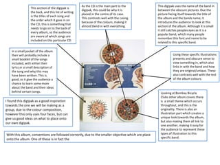
- 1. I found this digipak as a good inspiration towards the one we will be making as a group, due to the colour composition, however this only uses four faces, but can give us good ideas on what to place onto our own digipak. As the CD is the main part to the digipak, this could be why it is placed in the centre of its case. This contrasts well with the casing because of the colours, making it almost blend in with everything. This digipak uses the name of the band in between the obscure pictures. Due the picture facing itself towards the title of the album and the bands name, it introduces the audience to look at this section of the album. Although it is small it still catches peoples eyes as it is a popular band, which many people remember this font and name to be related to this specific band. Using these specific illustrations presents and obscure sense to view something in, which also links in with the band and how they are original/unique. These also contrasts well with the rest of the album colours. This section of the digipak is the back, and this list of writing is the titles of each song and the order which it goes in on the CD, this is something that needs to go on to the back of every album, so the audience are aware of which songs are included on this particular CD. In a small pocket of the album their will probably include a small booklet of the songs included, with either their lyrics or a small description of the song and why this may have been written. This is good, as it give the audience a chance to learn some more about the band and their ideas behind certain songs. Looking at Bombay Bicycle Clubs other album covers there is a small theme which occurs throughout, and this is the originality. There is also an illustration part which creates a unique look towards the album, but also making them all link to one another, making it easy for the audience to represent these types of illustration to this specific band. With this album, conventions are followed correctly, due to the smaller objective which are place onto the album. One of these is in fact the
- 2. Alt J’s album artwork is very illustrated producing a unique display for the image. Other than the image there is no other type of illustration on the front of the album, making it as simplistic as it possibly could. Even though it does not include the title of the band included on the front, it is easy to recognise which band this album is made by, purely because of the artwork. The design of the CD case is similar to the type of case that I would like to produce and this is because of the simplicity of the design and casing. There is also the aspect of it being eco friendly, as the materials being used can be recycled, and there has not been a lot of it used. However the digipak we have decided we would like to make is a six sided pack. The way this has been organised is simple yet affective towards its targeted audience, because of how the inside is presented and made. In an almost professional and unique way. Comparing this artwork to Bombay Bicycle Clubs, it shows that the front cover of albums are to be bright and eye catching, giving something to remember about the album, but often the names seem to not be included. I think that the image on this particular casing relates well to the type of music Alt J produce. This could link with the music and it being how the music flows. The main image for this album is again shown on the booklet to the CD. This ties the album together but also, due to the simplicity inside, it brings a small amount of illustration. This is the albums name, but it is printed small because it is minimalistic, therefore makes sure there is more focus pointed towards the image, which leaves to guide the audiences imagination. Which links in with the lyrics of the songs, as they are not straight forward and saying what they mean, give an inner meaning.
- 3. Mystery Jets have used a lot of simplicity within the album. One of these is the colour of the whole of the album, as this doesn’t attract too much attention, but makes it interesting to look at due to the image that is also used. The colours which are used are contrasting against each other, which makes sure that the red coloured sections stand out more in the rest of the album, as the colours are very plain on the background. Using the name of the album cover ‘Radlands’ this links in with the name of the film ‘Badlands’ which is a Texas themed film, therefore links to why there is the outline of the Texas map outlining the image of the band. This uses iconography as they will straight away link to this film, but also using the same fonts through the album again uses this technique. I think the importance is shown through the fact that the name of the album is produced larger than the name of the band, and also covers part of the name slightly. Conventions used on this digipak, conform correctly because of the icons that they have placed on the bottom of the back cover to the album cover. These include the barcode and the producers which have signed the band. However the way that the images try to represent the band themselves is slightly less confirmative. This is because of the way that they are almost showing that the band is American, when they are originally based in England. However they are American-styled with the way that their music is, and the sounds they produce. The album is a convention of the band with it being quite plain, however the band are not plain, they use a straight forward sound as they are quite simple, but however unique, as you are unlikely to hear another band with the same type of sound.