
Recommended
More Related Content
What's hot
What's hot (20)
Viewers also liked
Similar to Contents Page Analysis 2
Similar to Contents Page Analysis 2 (20)
More from StephanieAlabi
More from StephanieAlabi (20)
Recently uploaded
Recently uploaded (20)
Contents Page Analysis 2
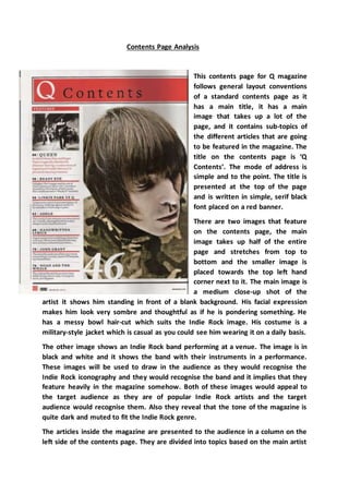
- 1. Contents Page Analysis This contents page for Q magazine follows general layout conventions of a standard contents page as it has a main title, it has a main image that takes up a lot of the page, and it contains sub-topics of the different articles that are going to be featured in the magazine. The title on the contents page is ‘Q Contents’. The mode of address is simple and to the point. The title is presented at the top of the page and is written in simple, serif black font placed on a red banner. There are two images that feature on the contents page, the main image takes up half of the entire page and stretches from top to bottom and the smaller image is placed towards the top left hand corner next to it. The main image is a medium close-up shot of the artist it shows him standing in front of a blank background. His facial expression makes him look very sombre and thoughtful as if he is pondering something. He has a messy bowl hair-cut which suits the Indie Rock image. His costume is a military-style jacket which is casual as you could see him wearing it on a daily basis. The other image shows an Indie Rock band performing at a venue. The image is in black and white and it shows the band with their instruments in a performance. These images will be used to draw in the audience as they would recognise the Indie Rock iconography and they would recognise the band and it implies that they feature heavily in the magazine somehow. Both of these images would appeal to the target audience as they are of popular Indie Rock artists and the target audience would recognise them. Also they reveal that the tone of the magazine is quite dark and muted to fit the Indie Rock genre. The articles inside the magazine are presented to the audience in a column on the left side of the contents page. They are divided into topics based on the main artist
- 2. that features in them or the topic of the specific article. This suggests that the readership is interested in many famous Indie Rock artists and news related to them. The readership’s interest is sparked as they see the names of the famous Indie Rock artists and they would want to read on to find out what the article is about. The text and page numbers are presented in a list/column going down the page according to what page they are on. The layout of the contents page is the same in every issue of Q magazine and this is used to maintain brand identity as the audience would see the contents page and realise that it is in fact Q magazine. On the contents page, the main image is placed on the right hand side of the page and takes up half of the page. The text is placed on the left hand side of the page and goes down in a column. The layout may have been placed like this because the reader looks at the left side first so they would read the information first then they would recognise the artist in the main image and it would make them want to read on more. The layout is simple and structured so this could suggest that Q magazine as a publication is also quite structured in the way they present their articles and content. The colour scheme of the contents page is white, red and black. This is featured in the background, on the text and in the title. These colours are typically used in the Indie Rock genre of music and it implies that the audience are simple yet edgy but can also like the alternative side of Indie Rock music. The colours are used to maintain brand identity as they will probably be used throughout the magazine on articles and on the front cover. They are also probably used because they stand out on the white background and make it look modern and current. Most of the information on the contents page is put into blocks or boxes and this gives the impression of the hard rock side of Indie Rock music and also the magazine and readership. The font used is ‘Times New Roman’ and a simple sans- serif black font. The ‘Times New Roman’ font gives a sophisticated effect to the magazine and makes it look more professional. The fonts and typefaces used on the contents page are used to maintain brand identity as it will probably be consistent throughout the magazine and on the front cover. The mode of address of the magazine is quite formal and direct as if they want you to know quickly what is going to be in the article or interview so that you would want to read it soon after. This is shown where it says that Adele is a ‘pre-eminent soul diva’ and this would make the audience want to find out why. The magazine’s name ‘Q’ is presented in a larger, script, white font at the top of the contents page. The name of the magazine was originally ‘Cue’ but was changed to ‘Q’ and this was meant to represent the cueing of a song or getting ready to play a song. This shows that the magazine is prioritized in celebrating music.