
Recommended
More Related Content
What's hot
What's hot (20)
Similar to Analysis of magazine content page rolling stones
Similar to Analysis of magazine content page rolling stones (20)
Recently uploaded
Recently uploaded (20)
Analysis of magazine content page rolling stones
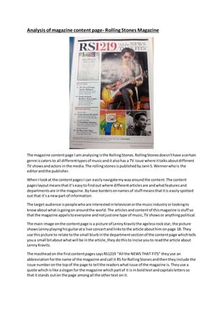
- 1. Analysis of magazine content page- Rolling Stones Magazine The magazine content page I am analysing is the Rolling Stones. Rolling Stones doesn’t have a certain genre is caters to all different types of music and it also has a TV issue where it talks about different TV shows and actors in the media. The rolling stones is published by Jann S. Wenner who is the editor and the publisher. When I look at the content pages I can easily navigate my way around the content. The content pages layout means that it’s easy to find out where different articles are and what features and departments are in the magazine. By have borders on names of stuff means that it is easily spotted out that it’s a new part of information. The target audience is people who are interested in television or the music industry or looking to know about what is going on around the world. The articles and content of this magazine is stuff so that the magazine appels to everyone and not just one type of music, TV shows or anything political. The main image on the content page is a picture of Lenny Kravitz the ageless rock star, the picture shows Lenny playing his guitar at a live concert and links to the article about him on page 18. They use this picture to relate to the small blurb in the department section of the content page which tells you a small bit about what will be in the article, they do this to incise you to read the article about Lenny Kravitz. The masthead on the first content pages says RS1219 “All the NEWS THAT FITS” they use an abbreviation for the name of the magazine and call it RS for Rolling Stones and then they include the issue number on the top of the page to tell the readers what issue of the magazine is. They use a quote which is like a slogan for the magazine which part of it is in bold text and capitals letters so that it stands out on the page among all the other text on it.
- 2. The whole magazine has a colour scheme to stick by which is red, black and white or grey through-out contents page and the rest of the magazine they use them colours. The colours they use are neutral colours they do this to attract both men and women to read there magazine. Through-out the magazine they have a certain font they have to use which is serif they use this out the magazine and for every new issue. They use different sizes for different part of the article for example they put the name of the article in bold, black text and make the text bigger than the small blurb under it so that the headline stands out on the page and to get your attention. All of the cover lines that where featured on the front page are on content page so you can see what that article will be about and what page they will be on. The layout is very simple and organised as all of the text on the page is down one side they have the and on the other side they use three photos that are related to the articles that are featured on that content page, they use a photo of Lenny Kravitz, a photo of two of the main charters of Adventure Time and the 3rd and final photo that is featured on the content page is of a young Smokey Robinson. The artist on the content page include John Oliver, Smokey Robinson, Koch Brothers, Lenny Kravitz and U2. The articles are that are featured on the contents page are based on these artist and are also based on film reviews and different television shows. By having different types of articles in the magazine helps to attract a wider audience to read and buy the magazine. By having all types of music, TV shows and political issues in the magazine give the magazine a wider audience. The main cover line is about John Oliver and says “John Oliver is mad as hell” under the cover line there is a small blurb of what is going to be in the article about John Oliver and under the blurb it tells you who wrote the article and what page the article will start on. The magazine is representing a number of different social, ethnic and political groups on the contents page. The magazine is representing Lenny Kravitz as an ageless rock star and saying that he doesn’t age they use a photograph of him play his guitar at a concert, they are representing him as a rock god of his age. By looking at this magazine I can take in some of the aspect of this contents and use them to make my own contents page and my own cover. By doing this helped me see what real magazines do and how they attract the audience they are aiming for. I will know continue on to do an analysis of a cover page and a contents page.