
Recommended
More Related Content
What's hot
What's hot (20)
Viewers also liked
Viewers also liked (17)
Similar to Task 2 detailed analysis of music magazine
Similar to Task 2 detailed analysis of music magazine (20)
More from Jordan Band
More from Jordan Band (15)
Recently uploaded
Recently uploaded (20)
Task 2 detailed analysis of music magazine
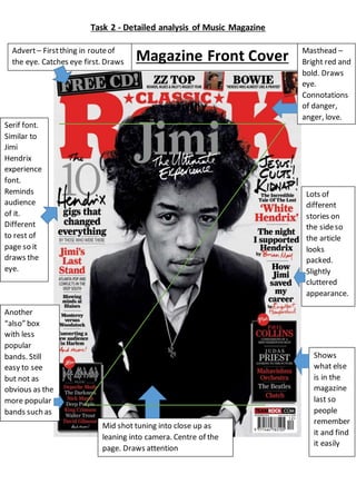
- 1. Task 2 - Detailed analysis of Music Magazine Masthead – Bright red and bold. Draws eye. Connotations of danger, anger, love. Advert– Firstthing in routeof the eye. Catches eye first. Draws people in. Mid shot tuning into close up as leaning into camera. Centre of the page. Draws attention Serif font. Similar to Jimi Hendrix experience font. Reminds audience of it. Different to rest of page so it draws the eye. Shows what else is in the magazine last so people remember it and find it easily Another “also” box with less popular bands. Still easy to see but not as obvious as the more popular bands such as ‘Phil Collins’, ‘The Beatles’ and ‘Jimi Hendrix’ Lots of different stories on the sideso the article looks packed. Slightly cluttered appearance. Magazine Front Cover
- 2. Task 2 - Detailed analysis of Music Magazine Colour: The only colours are Red, Black, White and grey. The red connotes danger and anger. It also makes the audience notice it first. The other colours are neutral and contrast well with the red. The black and white photo makes it feel older. Layout: The layout of the magaizne is very central. The layout follows the route of th eye as the headline is the first thing that you see. This is then followed by the picture right in the center so it draws the readers eye. The route of the eye is finished with the bigger ‘also’ box which lets people know what else is in the magazine and they remember it. Language: The language used in the magazine is very simple and professional. This makes everything easy to read and appealing to the eye as it is simple. Typography: The font used is a serif font, this fits with the ‘Classic Rock’ theme as serif fonts are more classical and whimsical. This makes the font seem older which the classic rock is. The font is still quite blocky however which makes it seem masculine and powerful which are associated with rock. The headlines of the articles at the side are made of mostly sans serif fonts which make them look easy to read and less important than the title. Certain words in headline ae in serif fonts which make them stand out more making them look important and key points such as “hendrix”. Images: There is only one image on the album cover and it is a close up of Jimi Hendrix in black and white. This makes the reader automatically know who the main article will be about and what genre of music the magazine is. The image is a close up which cleary shows off the artist showing how important he is to the magazine. The image also covers part of the magazine title. This shows that he is more important than the name of the magazine and it could show that the articles on artists are the main selling point of the articles and not the brand name.
- 3. Task 2 - Detailed analysis of Music Magazine Conventions: The magazine cover is conventional as it features one big image of the artist and no other images. It is also conventional as there are several smaller articles on show around the outside. The masthead is also conventional as it is a bright colour that draws the eye and it is quite large.
- 4. Task 2 - Detailed analysis of Music Magazine ContentsPage Names of articles Title of page Centre article. Main attraction Image in centre. Takes up most of the page. Main attraction Quite dull colour scheme. Black white and grey. Small amount of red
- 5. Task 2 - Detailed analysis of Music Magazine Colour: The colours are dull and neutral colours of black, white and grey. These match the front cover of the magazine and are quite neutral colours. This makes the magazine fit with the classic rock feel as it makes the magazine seem older. The few bits of red add colour to the picture and draw the eye to the important articles. Layout: The layout is quite neat with the image taking up most of the left hand side and the actual contents taking up the right. This cleanly splits the page in two and makes it look neat. The top bar with the masthead in it is slightly diagonal which makes the page look slightly messier. Language: The language used is similar to th front cover in that it is quite simple and professional making it easy to read. Typography: All the numbers are in a serif font which draws attention to them and makes them look important. All the words are in a sans serif font which makes them look simple and proffesional. The reason they are like this is because the contents page needs to be easy to read. Images: The only image is of Bruce Springsteen’s back with a guitar hanging off it. The image is in black and white which fits with the front cover and theme of classic rock as the black and white makes the image look older. The guitar is associated with rock music so the inclusion of it in the image further indicates that this is a rock magazine. Conventions: The contents page is conventional as it has the contents in a sans serif and the image is of a rock musician.
- 6. Task 2 - Detailed analysis of Music Magazine Double page spread Sans serif font. Professional Big masthead. Draws attention. Sans serif fontfor mainarticle. Big image on secondpage
- 7. Task 2 - Detailed analysis of Music Magazine Colour: The colours used are black, white, yellow and grey. The black, white and grey fit with the front cover and contents page and make the image look older and fits with the classic theme. The yellow draws the eye and also connotes hazard which makes the artist seem dangerous which fits with the rock theme. Layout: The entirety of the right page is a picture of the artist which clearly shows who the article is about. The left page is the actual article and the article itself is very small. Most of the page is taken up with the masthead. This shows that this is the most important part of the article. Language: The language used in the extract is different to the rest of the magazine as it uses more complex language. For example “Through Neil Young’s career crises, personal upheavals and sonic adventures one thing never changes: his belief in the power of untrammelled expression.” This shows a lot more complex language than the rest of the magazine as there are a lot more unique adjectives such as ‘sonic’. Typography: The fonts used are sans serif fonts which make the article look more professional and masculine which fits with the connotations of the rock genre. The quote/masthead is the largest which draws the eye to the title. The rest of the text is in the same font but it is a lot smaller. Images: The image used is of Neil Young playing guitar. This fits with the article as it is about Neil Young and the guitar is conventional for rock so this fits with the magazine. The image is in black and white which fits with the classic theme of the magazine. Conventions: The double page spread is quite unconventional as one of the pages is completely filled with an image. This is unconventional as a double page spread is usually mostly article. It is conventional as it has a page with and article on it and the title is in big font to draw attention.
- 8. Task 2 - Detailed analysis of Music Magazine