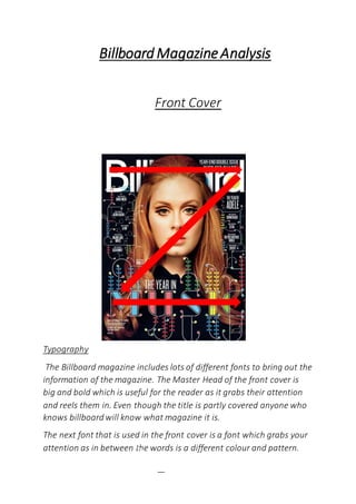
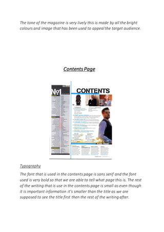
Difference Between Search & Browse Methods in Odoo 17
Task 2
1. BillboardMagazineAnalysis
Front Cover
Typography
The Billboard magazine includes lots of different fonts to bring out the
information of the magazine. The Master Head of the front cover is
big and bold which is useful for the reader as it grabs their attention
and reels them in. Even though the title is partly covered anyone who
knows billboard will know what magazine it is.
The next font that is used in the front cover is a font which grabs your
attention as in between the words is a different colour and pattern.
2. Off that font style are little lines which connect to other words which
are to do with this article. The rest of the writing in this magazine is
small but bold so it’s the last thing you see before you read the inside
of the magazine. The colour of the font could connote happiness as it
uses bright colours which help bring the writing out from the rest of
the front page.
Layout
The layout of the front cover is neatly ordered it may seem like it is all
cluttered u but it really isn’t. The layout of the music video uses route
of the eye to display all the important information which the reader
needs to see before opening up the magazine. At the top of the
magazine you have the title which is important as it will be the first
thing the reader sees as it tells them what magazine it is. Then in the
middle of the magazine you have a picture of an artist which shows
the reader what type of music is included in the magazine. Ten e last
thing which completes the route of the eye is the word music at the
bottom which will be the last thing that grabs the attention of the
reader before they read the contents page.
Colour
The Main colour which is used in the Billboard magazine cover is black,
the entire background in this magazine is black this is useful for the
magazine as it allows the other colours to pop through. For example
most of the writing used in this magazine is in the colour white so the
black background helps the writing pop out so that the reader is able
to see it.
Image
3. The image that has been used in the billboard magazine cover is a
picture of Adele which is in the middle of the magazine which suggests
to us that Adele is the main focus of this magazine article.
The shot that has been used for this photo is a close up of Adele, the
reason for this shot type is it wants the reader to see Adele up close
and actually look at her, look at her face to see what expression it
holds.
Mise-en-scene has a big role in this photo, the makeup, the hair and
the outfit that Adele is wearing in this photo suggest to the reader
that she dresses quite formally, like she dresses to impress.
The background in which the photo is taken suggests to us that when
the photo was taken she was doing a photo shoot which tells us that
she doesn’t actually always dress up this formal.
Mode Of Address
The languagethat is used on the front cover is very formal and is used
to try and grab the attention of the reader so that they get drawn in
and want to read the rest of the magazine. The words ‘The year in
music’ draws people in as it makes people interested and makes them
want to know how this is the year of music.
In this magazine cover lines aren’t really used it allows the magazine
to be free and more unique. So instead of everything being all neat
and tidy in this magazine the information is spread all out but still
looks presentable.
The mode of address in this magazine is very formal and does not
include inappropriatelanguage or slang. The magazine speaks to its
audience in a relaxed manner, in order to give the audience a wave of
relaxation so that they can just sit quietly and read this magazine and
get away from anything that’s hectic.
4. The tone of the magazine is very lively this is made by all the bright
colours and image that has been used to appeal the target audience.
ContentsPage
Typography
The font that is used in the contents page is sans serif and the font
used is very bold so that we are able to tell what page this is. The rest
of the writing that is use in the contents page is small as even though
it is important information it’s smaller than the title as we are
supposed to see the title first then the rest of the writing after.
5. The colour of the title that is used in the contents page is black as the
white background helps bring it out more so that you are able to see
the title clearly. This is the same with the rest of the writing the white
back ground helps bring the writing out so colours don’t clash and that
you can clearly see the writing. The title fonts on the contexts page is
quite masculine and its it was for females it would be curvy and
elegant but if it was for both men and women then you would expect
it to be plain and simple but in this case it is more masculine then it is
feminine.
Layout
The content pages layout if very neat and clear for the target audience
to see, on the left hand side you have no.1 songs for people to see
which could maybe suggest to them that they should listen to them.
The songs are out lined by box sets so they are kept neatly and made
to not look scruffy. On the right hand side of the layout page you have
all the different page numbers and what they include on each page.
The right hand side is organized very neatly as you have the page
numbers and what is on each page in columns so that your eyes read
downwards. Then at the bottom on the contents page you have events
and others things which have been neatly placed in columns again.
Colour
The colour of the contents page is very simple and basic but have a
colour coordinated theme towards it. For example the contents page
uses whites, blacks, greys and blue which all fit together to make the
contents page look simple but colourful and lively at the same time.
Images
The main image that is used on the contents page is the lead singer of
killers Brandon Flowers the shot type that is used for the photo of him
6. is a wide shot to see what he looks like but then uses a low angle to
look up to him. This is used to make him seem like a powerful artist.
The outfit he is wearing is quite smart looking which would make
people think as you connotes the killers to be a rock band who wear all
black but yet here you have the leader singer looking very smart and
professional.
Conventions
One convention that is used in the contents page is that it includes the
information which is in the magazine. This is conventional for a
magazine as it allows the reader to see what is included in the
magazine before they open it up and read it.
Another convention that is used in the contents page of this magazine
article is the fact it uses pictures to show what is also included in the
magazine, but it does not include any writing it just shows the target
audience that on that page it will talk about this person or thing. This
7. is conventional as it shows the reader what will be in the magazine
article.
Typography
The master head of this double page spread it sans serif and is big and
bold so it is the first thing the reader sees when they ready this double
page. The ‘I’ at the start of the writing is called a drop cap and this is
used at the start of a text to make it stand out from the rest of the
text. The cover line is slanted and bold so that it help stand out from
the cover story so that the reader reads that fist and then the cover
story so they can get a brief story on what the cover story is about.
The colour of the text (black) is used so it can stand out from the grey
background which is used. The first letter of each word in the
headlined is capitalized to emphasise what it is talking about. The
slant to the writing gives of a feminine vibe to the article and suggests
that this article is mainly aimed at teen girls and older women who
enjoy reading about Adele.
Layout
The layout of the double page spread is organised very neatly as at the
top you have the topic title and then you have the head line of the
article straight after followed by the cover line and then the cover
story. The layout is done this ways so once you have read the first bit
so the topic title your eyes follow to the next important thing and so
on until you have read the article. Then at the side you have a big
picture of Adele to show the readers who the article is talking about.
Colour
The colour of the article is very simple and fits together with the rest of
the page it uses colours like greys, whites and blacks to create that
simple but elegant look towards the article. The colour also gives the
8. double page spread quite a professional look overall. The reason why
all the writing in this article is black and it used so it pops out from the
grey background that is used. The colour scheme also fits in well with
the photo as the photo is in a black and white filter.
Image
The image that has been used in this article is a close up of Adele’s
face this is used so that the reader can see up close what Adele looks
like and can see the emotion on her face. By looking at her face she
looks very serious maybe sending out a message to people saying that
she is a serious singer and person. The picture that has been used as
well has been put in a black and white filter so that it is able to fit in
and coordinate with the rest of the article. The makeup she is wearing
in the photo suggests to us that she likes trying to look her best
whether it’s for a photo shoot or just in general she likes making her
appearance look neat and professional.
Language
The languagethat has been used in the article is very formal and
professional as it would not look good for either Adele or the
magazine is they wrote in slang and used swear words in their articles.
The languageused is also professional and uses very descriptive words
to describe Adele. The article also uses a pull quote in their article. A
pull quote is when the article adds a quote from the artist they are
talking about in their article.
Conventions
This double page spread is conventional as it includes a picture of an
artist who the article is talking about. This is conventional as without a
picture showing who the article is about if someone who doesn’t know
who Adele is won’t know what they look like at there is no photograph
to show them.
9. Another convention that is used in this article is that it has a drop cap
at the start of the sentence to emphasis the cover story more. This is
conventional for an articles as most articles use them in their
magazines articles to emphasis the rest of the writing in the article.